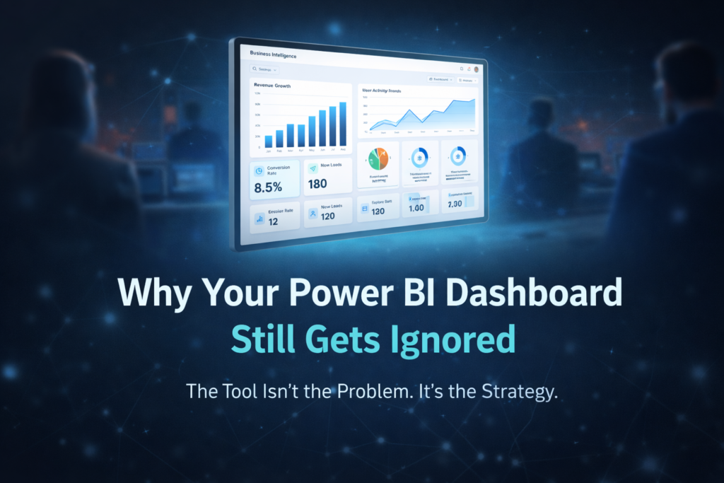
You don’t need another dashboard.
You need clarity that leads to action.
That’s exactly where Tableau consulting experts make the difference. Many companies adopt Tableau expecting instant insights, but end up with scattered reports, slow performance, and inconsistent metrics. The tool isn’t the problem — the approach is.
Without the right strategy, even powerful platforms fail to deliver business value.
Why Businesses Struggle Even After Adopting Tableau
Most teams jump straight into Tableau dashboard services without defining what success looks like. They build visuals before aligning on KPIs, connect data without cleaning it, and scale dashboards without structure.
The result?
– Reports that don’t match across teams
— Slow dashboards that frustrate users
— Confusing calculations no one wants to touch
— Decision-making delays despite “having data”
This is where business intelligence consulting becomes essential — not for building more dashboards, but for building the right ones.
14 Reasons to Invest in Tableau Consulting
1. Handle Growing Data Without Chaos
With Tableau data integration, businesses can unify multiple data sources into a single, reliable system.
2. Turn Raw Data Into Visual Clarity
Strong data visualization services simplify complex datasets into insights anyone can understand.
3. Build User-Friendly Dashboards
Through interactive Tableau dashboards, even non-technical teams can explore data confidently.
4. Improve Performance at Scale
Experts ensure faster load times with Tableau Server Optimization, avoiding lag and crashes.
5. Create Consistent Business Logic
A structured approach ensures all reports align using custom Tableau reports and shared definitions.
6. Enable Advanced Calculations
A Tableau LOD Calculation Expert helps build precise, scalable calculations for deeper insights.
7. Support Financial Decision-Making
With Tableau for Finance Dashboards, leadership teams gain clarity on revenue, cost, and profitability.
8. Automate Reporting Workflows
Using Tableau automation services, teams reduce manual effort and reporting delays.
9. Improve Data Exploration
Flexible filtering and slicing in Tableau KPI dashboards help uncover trends quickly.
10. Accelerate Data Processing
With optimized pipelines and analytics and reporting consulting, insights arrive faster.
11. Enhance Team Collaboration
Centralized dashboards improve alignment across departments.
12. Access Enterprise-Level Capabilities
Through enterprise Tableau solutions, businesses scale analytics without breaking systems.
13. Customize Visual Experience
High-quality design through Pixel-Perfect Tableau Visuals improves usability and adoption.
14. Build a Long-Term Data Strategy
With analytics strategy services, Tableau becomes more than a tool — it becomes a decision engine.
From Dashboards to Decision Systems
The real value of Tableau isn’t in charts — it’s in decisions.
When implemented correctly, Tableau supports data-driven decision making by aligning metrics, improving trust, and reducing delays. Instead of reacting to reports, teams act on insights in real time.
This shift turns dashboards into decision-ready data visualization systems that drive measurable outcomes.
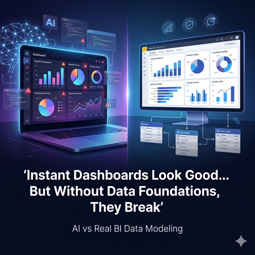
The Foundation Most Teams Skip
Here’s the uncomfortable truth:
Even the best dashboards fail without structure.
Without a Unified Reporting Data Model, businesses face inconsistent metrics. Without clean pipelines, insights are delayed. Without alignment, dashboards become noise.
That’s why successful implementations focus on:
– Clean data architecture
— Defined KPIs
— Scalable models
— Clear visualization strategy
This is the difference between dashboards people look at… and dashboards people actually use.
Building for Scale, Not Just Speed
Many teams want quick results. But speed without structure leads to rework.
With the right approach, businesses can combine:
– Tableau consulting experts for strategy
— custom analytics solutions for flexibility
— interactive Tableau dashboards for usability
This creates systems that grow with the business instead of breaking under pressure.
What ROI Actually Looks Like
When Tableau is implemented correctly, results show up fast:
– Faster reporting cycles
— Reduced manual work
— Improved decision speed
— Higher data trust across teams
This is what ROI-driven reporting solutions are meant to deliver — not just insights, but impact.
Final Thought
Tableau is powerful. But power without direction creates complexity.
The real advantage comes from knowing what to build, how to structure it, and how to scale it.
At visualizexpert.com, the focus is on helping businesses move from scattered dashboards to structured, decision-driven analytics systems.
Because in the end, success doesn’t come from having more data —
It comes from making better decisions with it.