Most companies invest in data analytics services, collect massive datasets, and still struggle to answer simple business questions. Reports pile up. Dashboards multiply. But decisions? Still slow.
That’s where data visualization services change the equation.
Instead of drowning in spreadsheets, the right visualization approach — powered by Python — helps teams see patterns, spot risks, and act faster. But not all tools are created equal.
Let’s break down 12 powerful Python libraries and, more importantly, how they actually fit into real business decision-making.
Why Visualization Matters More Than Ever
Raw data doesn’t drive outcomes.
Data visualization for decision making does.
Without clear visuals:
- Teams misinterpret metrics
- Leaders delay decisions
- Opportunities slip through
Modern businesses rely on interactive business dashboards and executive analytics dashboards to stay competitive. But behind every great dashboard is a strong visualization layer.
Python libraries play a key role here — especially when paired with custom analytics solutions and scalable BI systems.
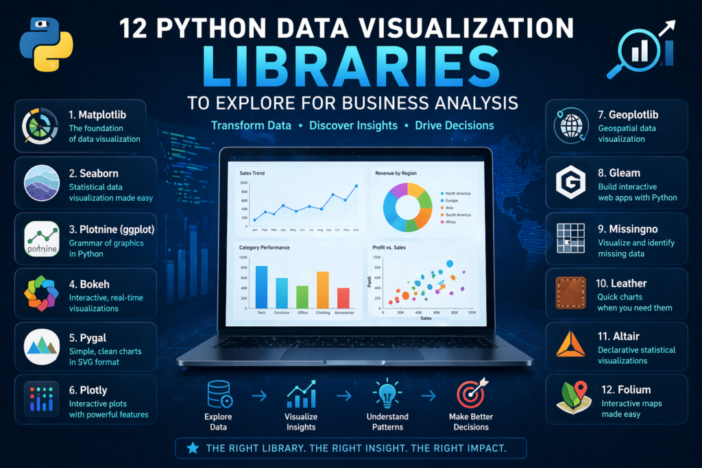
1. Matplotlib: The Foundation Layer
Matplotlib is where most data journeys begin.
It’s powerful, flexible, and widely used in analytics and reporting consulting. But it’s not built for speed or aesthetics.
Use it when:
- You need full control over charts
- You’re building base-level visuals
- You’re supporting Power BI data modeling workflows
Think of it as infrastructure — not the final product.
2. Seaborn: Better Visuals, Less Effort
Seaborn builds on Matplotlib but adds clarity.
It simplifies complex datasets and creates cleaner visuals, making it ideal for:
- Trend analysis
- Statistical insights
- Early-stage KPI dashboard services
For businesses, this means faster interpretation without heavy customization.
3. Plotly: Interactive and Business-Ready
Plotly brings interactivity to life.
It’s widely used in interactive dashboard design and real-time data dashboards because it allows users to:
- Hover for insights
- Filter data dynamically
- Explore trends in real time
This is where visualization starts becoming actionable.
4. Bokeh: Real-Time Data Exploration
Bokeh is built for live data environments.
It supports streaming and dynamic updates, making it ideal for:
- Monitoring systems
- Performance monitoring systems
- Operational dashboards
When paired with real-time data syncing APIs, it becomes a powerful decision engine.
5. Plotnine (ggplot): Structured Storytelling
Inspired by R’s ggplot2, Plotnine focuses on layered storytelling.
It’s useful for:
- Analytical deep dives
- Structured reporting
- Supporting data storytelling services
For teams that want clarity in complexity, this library delivers.
6. Pygal: Lightweight and Web-Friendly
Pygal is simple but effective.
Its SVG-based charts are perfect for:
- Reports
- Presentations
- Lightweight dashboards
It works well in environments where speed matters more than scale.
7. Altair: Declarative and Clean
Altair focuses on simplicity and logic.
Instead of writing complex code, you define “what” you want — not “how” to build it.
This aligns well with:
- Decision-ready data visualization
- Business-friendly reporting systems
It’s ideal for teams that want fast, clean outputs.
8. Geoplotlib: Location-Based Insights
Geographic data tells powerful stories.
Geoplotlib helps businesses visualize:
- Regional performance
- Market expansion
- Supply chain movement
It’s especially useful in enterprise data visualization strategies.
9. Folium: Interactive Maps for Business Use
Folium takes mapping further with interactivity.
Businesses use it for:
- Customer distribution analysis
- Logistics tracking
- Market segmentation
Combined with data integration services, it creates real business value.
10. Missingno: Fixing Data Before Visualizing
Bad data leads to bad decisions.
Missingno helps teams identify:
- Missing values
- Data inconsistencies
- Structural gaps
It plays a key role in data quality anomaly detection and ensures dashboards remain reliable.
11. Gleam: Turning Analysis into Apps
Gleam transforms Python scripts into interactive apps.
This reduces dependency on developers and supports:
- Self-service analytics
- Faster experimentation
- Scalable analytics strategy services
12. Leather: Fast and Minimal
Leather is built for speed.
It’s perfect when:
- You need quick visuals
- Design isn’t the priority
- You’re prototyping ideas
Not every business problem needs complexity.
Where Most Businesses Go Wrong
Here’s the reality:
Using the right library doesn’t guarantee success.
Many companies still struggle because:
- There’s no unified reporting data model
- Metrics aren’t standardized
- Data isn’t aligned across systems
This leads to:
- Conflicting dashboards
- Low adoption
- Poor decision-making
Even the best visuals fail without structure.
From Python Libraries to Business Impact
Python tools are just one piece of the puzzle.
To truly unlock value, businesses need:
- Automated data pipeline engineering
- Clean data foundations
- Strong KPI frameworks
This is where business intelligence consulting becomes critical.
By combining Python visualization with:
- Power BI dashboard development
- custom Power BI reports
- Tableau dashboard design
Organizations can move from analysis to action.
The Role of Strategy in Visualization
Visualization without strategy is decoration.
A strong approach includes:
- Strategic BI roadmap development
- Clear business objectives
- Defined KPIs
This ensures every dashboard serves a purpose.
Not just insight — but action.
Building Scalable Visualization Systems
Modern businesses don’t rely on one tool.
They build ecosystems using:
- Cloud data warehouse integration
- API-driven systems
- Scalable pipelines
This allows:
- Real-time insights
- Cross-team alignment
- Faster decisions
And most importantly — consistent data.
Turning Insights Into Decisions
The goal isn’t better charts.
It’s faster decisions.
With the right setup:
- Teams stop guessing
- Leaders act with confidence
- Businesses move faster
That’s the real power of combining Python with data visualization services.
Conclusion: Tools Don’t Drive Decisions — Systems Do
Python libraries are powerful.
But on their own, they’re not enough.
What matters is:
- How your data is structured
- How your KPIs are defined
- How your dashboards are used
At Visualizexpert.com, the focus isn’t just on building visuals — it’s on building systems that drive decisions.
From Power BI consulting services to advanced visualization strategies, the goal is simple:
Turn data into clarity.
Turn clarity into action.
Because in the end, businesses don’t win with more data —
They win with better decisions, made faster.
Leave a Reply