APIs are the backbone of modern applications, but when they slow down, everything slows down with them. This is where data visualization services play a critical role. Instead of guessing what’s wrong with your APIs, visualization helps you see performance issues in real time and act on them instantly.
Most businesses today rely heavily on APIs for connecting systems, fetching data, and powering dashboards. Yet, many teams still struggle with performance bottlenecks because they lack visibility into what’s actually happening behind the scenes. Raw logs and backend metrics don’t always tell the full story. Visual insights do.
When combined with strong API Integration Services, data visualization transforms complex API metrics into actionable intelligence that teams can use to optimize performance, reduce failures, and scale efficiently.
Why API Performance Issues Go Unnoticed
API problems rarely start as major failures. They begin as small inefficiencies — slightly higher latency, occasional failed requests, or inconsistent response times. Over time, these issues grow and start affecting dashboards, reports, and decision-making systems.
Without proper visibility, teams often rely on reactive debugging instead of proactive monitoring. This leads to:
- Delayed insights across dashboards
- Inconsistent reporting across teams
- Increased dependency on engineering for troubleshooting
- Poor user experience in analytics tools
This is where interactive business dashboards and real-time data dashboards change the game. Instead of waiting for issues to escalate, teams can monitor API health continuously and act before performance drops.
How Data Visualization Improves API Performance
At its core, data visualization simplifies complexity. It converts technical API metrics into visual patterns that anyone — from developers to business leaders — can understand.
For example, instead of scanning logs, a BI dashboard solution can instantly show:
- Response time trends over time
- Error rate spikes
- API usage patterns
- Load distribution across systems
This shift enables faster decision-making and better collaboration between technical and non-technical teams.
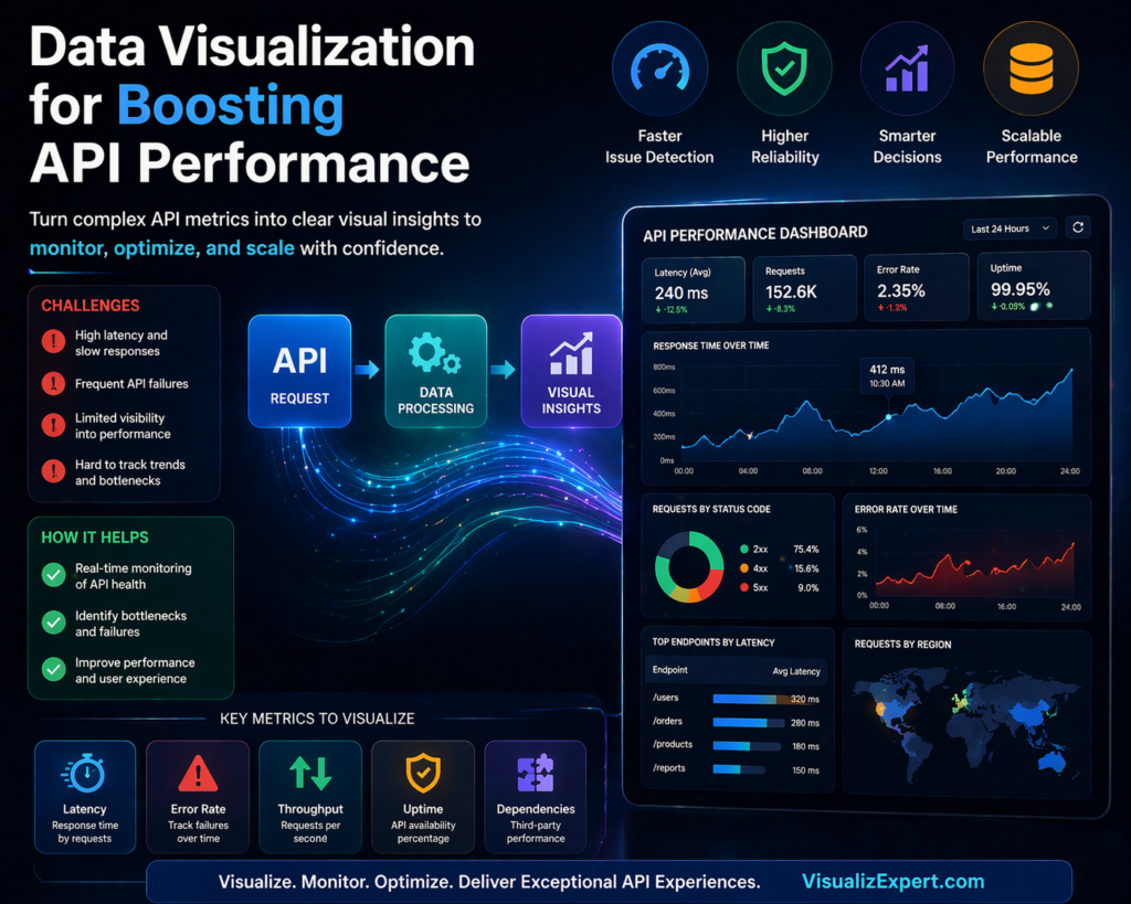
Key API Metrics You Should Visualize
To truly optimize API performance, you need to focus on the right metrics. Visualization makes these metrics easy to track and interpret.
- Latency: Visualizing response time helps identify delays caused by network or server processing
- Error Rates: Tracking failed requests highlights reliability issues
- Throughput: Shows how many requests your API handles over time
- Uptime: Helps monitor availability and system reliability
- Dependency Performance: Tracks third-party service impact
When these metrics are integrated into enterprise data visualization, teams gain a complete picture of system health without digging into raw data.
Building Scalable API Monitoring with Data Visualization
Creating a scalable monitoring system requires more than just charts. It requires a structured approach that combines data pipelines, integration, and visualization.
First, APIs must be connected through reliable data integration services so that data flows seamlessly into analytics platforms. This ensures that performance metrics are always up to date.
Next, businesses need automated data pipeline engineering to process and transform API data efficiently. Without automation, monitoring becomes inconsistent and difficult to scale.
Finally, visualization layers such as Power BI dashboards or Tableau dashboard services bring everything together. These dashboards provide real-time insights that decision-makers can trust.
This structured approach ensures that API performance monitoring is not just reactive but continuously optimized.
The Role of Real-Time Data in API Optimization
Static reports are no longer enough. API performance changes constantly, and businesses need real-time visibility to keep up.
With real-time data syncing APIs, teams can monitor performance as it happens. This enables:
- Instant detection of performance drops
- Faster troubleshooting and resolution
- Improved system reliability
- Better user experience
Real-time insights also enhance decision-ready data visualization, allowing leaders to act on accurate, up-to-date information instead of outdated reports.
Choosing the Right Visualization Tools
Not all tools are built the same. The right platform depends on your business needs, data complexity, and scalability goals.
Many organizations rely on Power BI consulting services to build structured dashboards that integrate seamlessly with Microsoft ecosystems. Others prefer Tableau visual analytics for deeper exploration and storytelling.
Regardless of the tool, the goal remains the same: turning raw API data into meaningful insights through interactive dashboard design.
The best setups often combine multiple tools with a strong backend powered by cloud data warehouse integration, ensuring performance and scalability at every level.
Common Mistakes in API Performance Visualization
While data visualization is powerful, poor implementation can lead to misleading insights. Some common mistakes include:
- Overloading dashboards with too many metrics
- Ignoring data quality and consistency
- Lack of proper data modeling
- Delayed data updates due to weak pipelines
To avoid these issues, businesses should focus on building scalable data models and maintaining a unified reporting data model that ensures consistency across dashboards.
From Monitoring to Optimization
Visualization is not just about tracking performance — it’s about improving it.
Once API performance data is visualized effectively, businesses can:
- Optimize caching strategies to reduce load
- Improve server response times
- Identify bottlenecks in data pipelines
- Reduce failed request rates
Over time, this leads to better system efficiency and stronger analytics performance.
Organizations that invest in analytics strategy services and structured BI systems often see significant improvements in both API reliability and business decision-making.
How Visualization Drives Better Business Decisions
API performance doesn’t just impact developers — it affects the entire organization.
Slow APIs lead to delayed dashboards. Delayed dashboards lead to poor decisions.
By implementing data visualization for decision making, businesses can ensure that insights are always accurate, timely, and actionable.
This is especially critical for leadership teams relying on executive analytics dashboards, where even small delays can impact strategic decisions.
Conclusion
APIs and data visualization are no longer separate components — they work best when integrated into a unified system. When done right, they give businesses real-time visibility into performance, helping teams identify issues early, optimize faster, and make confident decisions.
Instead of relying on delayed reports or manual debugging, organizations can leverage visualization to clearly understand API behavior, reduce inefficiencies, and scale analytics with precision.
With the right combination of data analytics services, API Integration Services, and scalable BI infrastructure, businesses can move from reactive problem-solving to proactive performance optimization.
If you’re looking to build high-performing, real-time dashboards that turn API data into decision-ready insights, explore tailored solutions at VisualizExpert.com.
Because in modern BI, it’s not just about data flow — it’s about making that data work for you.
Leave a Reply