Category: Uncategorized

  • How Interactive Data Visualization Is Transforming Business Decisions in 2026


    Most businesses today don’t struggle with a lack of data.

    They struggle with making sense of it.

    Spreadsheets are overflowing. Reports are everywhere. Dashboards exist — but clarity? Still missing.

    That’s exactly where interactive data visualization changes the game.

    Instead of static charts and overwhelming reports, companies are now shifting toward decision-ready, interactive experiences that don’t just present data — they guide action.


    Why Static Reports Are Failing Modern Businesses

    Traditional tools like Excel and PowerPoint served their purpose.

    But today’s decision-making environment demands:

    • Faster insights
    • Real-time updates
    • Cross-functional visibility

    Static reports:

    • Don’t adapt
    • Don’t engage
    • Don’t scale with complexity

    This is why companies are actively investing in data analytics services that go beyond reporting and focus on interpretation and action.


    Interactive Data Visualization: More Than Just Charts

    Interactive visualization is not about making dashboards “look good.”

    It’s about:

    • Letting users explore data on their own
    • Turning insights into narratives
    • Enabling faster and more confident decisions

    With the rise of data visualization services, businesses are moving from passive reporting to interactive business dashboards that respond to user behavior.


    What Makes Interactive Dashboards So Powerful?

    Think of data like scattered puzzle pieces.

    Individually, they don’t say much.

    But when connected properly, they tell a clear, reliable story.

    This is where BI dashboard solutions and enterprise data visualization come into play.

    They bring together:

    • Multiple data sources
    • Real-time updates
    • Structured metrics

    Into a single, unified view.


    The Shift Toward Decision-Driven Analytics

    Organizations are no longer asking:
     👉 “What happened?”

    They’re asking:
     👉 “What should we do next?”

    This shift has led to the rise of:

    • executive analytics dashboards
    • decision-ready data visualization
    • analytics and reporting consulting

    These solutions don’t just display numbers — they highlight:

    • Risks
    • Opportunities
    • Performance gaps

    Real-World Applications Across Industries

    Interactive data visualization is no longer limited to tech companies.

    It’s being used across industries:

    🔹 Marketing & Growth

    With marketing analytics dashboards and digital marketing dashboards, teams can:

    • Track campaign performance
    • Monitor ROI
    • Optimize strategies in real-time

    🔹 E-commerce

    Using e-commerce KPI tracking and Shopify analytics dashboards, businesses can:

    • Understand customer behavior
    • Track revenue trends
    • Improve retention

    🔹 Finance

    With finance performance dashboards, organizations gain:

    • Real-time financial visibility
    • Risk insights
    • Forecasting capabilities

    🔹 Operations

    Through operations analytics dashboards, teams can:

    • Monitor efficiency
    • Identify bottlenecks
    • Improve workflows

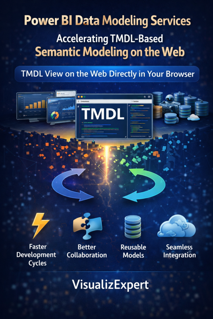
    The Role of Power BI and Tableau in 2026

    Two platforms continue to dominate the space:

    🔹 Power BI

    Businesses are investing in:

    • Power BI Dashboard Development
    • Power BI consulting services
    • custom Power BI reports

    Why?

    Because Power BI enables:

    • Seamless data integration
    • Real-time dashboards
    • Scalable reporting

    🔹 Tableau

    For advanced storytelling, companies rely on:

    • Tableau dashboard services
    • interactive Tableau dashboards
    • custom Tableau reports

    Tableau excels in:

    • Visual storytelling
    • Complex data exploration
    • User-friendly interactivity

    Beyond Tools: The Need for Strategy

    Here’s where most businesses go wrong:

    They invest in tools…
     but ignore strategy.

    Without a clear framework:

    • Dashboards become cluttered
    • Metrics become confusing
    • Insights become unreliable

    This is why business intelligence consulting and analytics strategy services are critical.

    They help define:

    • What to track
    • Why it matters
    • How to act on it

    The Foundation: Data Integration & Automation

    Interactive dashboards are only as good as the data behind them.

    That’s why companies are focusing on:

    • data integration services
    • automated reporting solutions
    • real-time data dashboards

    With proper integration:

    • Data flows seamlessly
    • Reports update automatically
    • Teams always work with accurate insights

    The Rise of Data Storytelling

    Data alone doesn’t drive decisions.

    Stories do.

    Modern businesses are investing in data storytelling services to:

    • Simplify complex insights
    • Align teams
    • Influence stakeholders

    A well-designed dashboard should:

    • Answer key questions instantly
    • Highlight what matters
    • Guide the next step

    Key Elements of High-Impact Dashboards

    A powerful dashboard isn’t just interactive — it’s intentional.

    Here’s what defines the best BI tools for data visualization:

    1️⃣ Clarity over complexity
     2️⃣ Relevant KPIs only
     3️⃣ Real-time data access
     4️⃣ User-friendly navigation
     5️⃣ Actionable insights

    This is the foundation of dashboard design consulting and analytics solutions for startups as well as enterprises.


    The Future: AI + Interactive Analytics

    We’re entering a new phase where dashboards don’t just display data — they interact with users intelligently.

    With AI integration:

    • Insights are automated
    • Patterns are predicted
    • Decisions are accelerated

    This aligns with the rise of:

    • Answer engines
    • AI-driven analytics
    • Predictive dashboards

    Why Businesses Choose VisualizExpert

    At VisualizExpert, the focus is simple:

    👉 Turn complex data into clear, decision-ready insights

    Whether it’s:

    • Building custom analytics solutions
    • Designing interactive KPI dashboards
    • Delivering enterprise-level BI systems

    The goal remains the same:

    Make data usable, actionable, and impactful.


    Final Thoughts

    Interactive data visualization is no longer optional.

    It’s a competitive advantage.

    Businesses that adopt it:

    • Move faster
    • Decide smarter
    • Scale better

    Those that don’t?

    They stay stuck in spreadsheets — guessing instead of knowing.


    🚀 Ready to Transform Your Data?

    If you want to move from scattered reports to clear, decision-ready dashboards, explore tailored solutions at:

    👉 Visualizexpert.com

  • Stitching Clarity: How Data Visualization Becomes a Beacon in Uncertain Times

    Introduction

    In today’s fast-moving business environment, the problem isn’t the lack of data — it’s the lack of clarity.

    Organizations are surrounded by dashboards, reports, and numbers. Yet, decision-making often feels slow, uncertain, and disconnected.

    Interestingly, the solution to this modern challenge can be understood through something deeply traditional:

    Quilts.

    Quilts are not just stitched fabrics. They are stories built from scattered pieces, carefully arranged to create meaning.

    Data works the same way.

    At VisualizExpert, we believe that when data is structured and visualized correctly, it doesn’t just inform — it guides decisions with confidence, especially in uncertain situations.

    The Problem: Data Exists, But It Doesn’t Connect

    Most businesses today operate in silos:

    • Marketing teams track campaign data
    • Sales teams manage pipeline numbers
    • Finance teams analyze revenue separately

    Despite investing in data analytics services, organizations still struggle with:

    • Conflicting reports
    • Delayed insights
    • Lack of alignment

    The issue is not the availability of data.

    It’s the absence of a unified structure.

    Without proper data integration services, data remains fragmented — just like unstitched fabric pieces.

    The Insight: Why Quilts Explain Data Better Than Dashboards

    A single piece of fabric cannot tell a story.

    But when multiple pieces are stitched together with purpose, they create something meaningful.

    Data behaves the same way.

    Individually:

    • Reports look useful
    • Metrics seem relevant

    But together — without structure — they create confusion.

    Through effective data visualization services, these fragments are transformed into a unified narrative.

    That’s where clarity begins.

    The Shift: From Data Chaos to Structured Intelligence

    To make data actionable, businesses need more than tools.

    They need a system.

    This is where business intelligence consulting plays a critical role.

    At VisualizExpert, the approach is simple — treat data like a quilt:

    Carefully collect, align, and stitch it into something meaningful.

    Step 1: Bringing Data Together

    Every organization has multiple data sources.

    Without proper data pipeline automation, these sources remain disconnected.

    The result?

    Incomplete insights and poor decisions.

    Step 2: Cleaning and Structuring Data

    Raw data is messy.

    Through Power BI data modeling, data is structured into a reliable framework that ensures consistency and accuracy.

    This step builds the foundation for everything that follows.

    Step 3: Defining What Matters

    Not all data is useful.

    Through KPI strategy consulting, businesses identify the metrics that actually impact outcomes.

    This removes noise and focuses attention where it matters.

    Step 4: Designing for Clarity

    A dashboard is only useful if it is easy to understand.

    Using an interactive dashboard design, complex datasets are simplified into intuitive visuals.

    This is where data starts becoming actionable.

    Step 5: Creating Unified Dashboards

    With tools like Power BI dashboards and Tableau dashboard services, businesses gain a centralized, real-time view of performance.

    This becomes the single source of truth across teams.

    Step 6: Automating Insights

    Manual reporting slows down decision-making.

    With automated reporting solutions and real-time data dashboards, insights are delivered instantly.

    No delays. No guesswork.

    Why Data Visualization Becomes a Beacon of Hope

    In uncertain business environments, clarity is everything.

    Without it:

    • Decisions get delayed
    • Teams lose direction
    • Opportunities are missed

    With strong enterprise data visualization:

    • Decisions become faster
    • Teams align better
    • Confidence increases

    This is where data transforms from a reporting tool into a decision-making system.

    From Numbers to Meaningful Stories

    Modern businesses are shifting toward data storytelling services.

    Because numbers alone don’t drive action.

    Stories do.

    A well-designed executive analytics dashboard answers:

    • What is happening
    • Why it is happening
    • What should be done next

    This is the difference between data and insight.

    Real Impact on Business

    Faster Decisions

    With real-time data dashboards, leaders act immediately instead of waiting for reports.

    Better Team Alignment

    Using interactive business dashboards, teams work with the same data, reducing confusion.

    Increased Trust in Data

    Consistency builds confidence.

    Decisions become more reliable and less risky.

    Scalable Growth

    With structured systems like Power BI data modeling, businesses can scale their analytics effortlessly.

    Best Practices for Businesses

    To truly benefit from data visualization:

    • Focus on key decision-driving metrics
    • Avoid cluttered dashboards
    • Ensure proper data integration
    • Invest in automation
    • Prioritize simplicity and usability

    The Future: Data That Guides Decisions

    The future is not about collecting more data.

    It’s about understanding it better.

    Businesses that succeed will:

    • Use real-time data dashboards
    • Build systems for data-driven decision-making
    • Focus on clarity over complexity

    Because in the end, data is not valuable unless it drives action.

    Conclusion

    Quilts teach us a simple but powerful lesson:

    Individual pieces don’t create meaning — structure does.

    Data works the same way.

    When stitched together properly, it becomes:

    • Clear
    • Actionable
    • Reliable

    It becomes something teams can trust.

    At VisualizExpert, the focus is not just on building dashboards, but on creating clarity systems that help businesses move forward with confidence.

    Because in a world full of uncertainty, well-structured data isn’t just useful — 

    It becomes a beacon that guides better decisions.

    And that’s exactly what VisualizExpert aims to deliver.

  • Tableau Dashboard Services: Transforming Microsoft 365 into a Real-Time Decision Engine

    Introduction

    In today’s fast-moving digital landscape, businesses no longer struggle with a lack of data — they struggle with how to use it effectively. Disconnected tools, outdated reports, and constant context-switching slow teams down and create decision bottlenecks. This is exactly where Tableau dashboard services step in, transforming how organizations interact with data inside everyday tools like Microsoft Word, PowerPoint, and Teams.

    At VisualizExpert, the goal is simple: bring insights directly into your workflow so your team can make faster, smarter, and more confident decisions — without leaving the platforms they already use.


    The Problem: Data Exists, But Insights Don’t Flow

    Most organizations follow a familiar pattern:

    • Analysts build dashboards in one platform
    • Teams extract screenshots and paste them into reports
    • Stakeholders review static, outdated data
    • Decisions are made on incomplete or stale insights

    This process is not just inefficient — it’s risky.

    Every time data is copied manually, it loses context, accuracy, and timeliness. Meetings get delayed, reports become obsolete, and teams spend more time preparing data than actually using it.


    The Shift: Embedding Analytics Where Work Happens

    The integration of Tableau with Microsoft 365 marks a major shift in how businesses consume data. Instead of switching between tools, users can now:

    • Embed live dashboards into Word documents
    • Present real-time insights directly in PowerPoint
    • Collaborate around data inside Microsoft Teams

    This approach eliminates friction and ensures that insights are always current, contextual, and actionable.

    At VisualizExpert, we help organizations implement this transformation through tailored Tableau implementations that align with their workflows, teams, and business goals.


    Why Tableau + Microsoft 365 Is a Game-Changer

    1. Real-Time Insights in Everyday Documents

    Imagine creating a business report where every chart updates automatically. No more screenshots. No more manual updates.

    With embedded Tableau dashboards:

    • Data refreshes instantly
    • Reports stay relevant
    • Stakeholders trust what they see

    This turns static documents into living, data-driven assets.


    2. Faster Collaboration Across Teams

    Data is most powerful when it’s shared and discussed.

    By integrating Tableau into Microsoft Teams:

    • Teams can access dashboards during meetings
    • Insights can be pinned in channels
    • Decisions happen in real time

    VisualizExpert ensures that these dashboards are designed for clarity, usability, and impact — so every team member can understand and act on data quickly.


    3. A Single Source of Truth

    One of the biggest challenges in organizations is conflicting data.

    Different teams use different reports, leading to:

    • Misalignment
    • Confusion
    • Poor decision-making

    With Tableau:

    • Everyone accesses the same governed data
    • Metrics remain consistent across platforms
    • Trust in data increases significantly

    How VisualizExpert Delivers Value

    Implementing Tableau is not just about tools — it’s about strategy, design, and execution.

    VisualizExpert focuses on delivering complete solutions, not just dashboards.

    Understanding Business Context

    Before building anything, we analyze:

    • Your business goals
    • Key performance indicators
    • Existing data infrastructure

    This ensures that every dashboard serves a clear purpose.


    Designing for Decision-Making

    A dashboard is only useful if it drives action.

    We design dashboards that:

    • Highlight critical insights instantly
    • Reduce cognitive overload
    • Guide users toward decisions

    This approach turns data into a strategic asset, not just a reporting tool.


    Seamless Integration with Microsoft 365

    We ensure that your Tableau dashboards:

    • Work smoothly within Word, PowerPoint, and Teams
    • Maintain performance and speed
    • Stay secure and compliant

    This creates a frictionless experience for end users.


    Benefits of Tableau Dashboard Services

    Increased Productivity

    Teams no longer waste time:

    • Switching between tools
    • Updating reports manually
    • Searching for the latest data

    Everything they need is available in one place.


    Improved Decision Speed

    When insights are readily accessible:

    • Meetings become more productive
    • Decisions happen faster
    • Opportunities are captured in real time

    Enhanced Data Trust

    With governed and consistent data:

    • Stakeholders rely on insights
    • Teams align better
    • Organizations reduce costly errors

    Scalable Analytics Ecosystem

    As your business grows, your data needs evolve.

    Tableau, combined with VisualizExpert’s expertise, ensures:

    • Scalable architecture
    • Flexible dashboard design
    • Future-ready analytics systems

    Real-World Use Cases

    Executive Reporting

    Executives can view real-time performance metrics directly in PowerPoint presentations, eliminating the need for last-minute updates.


    Sales and Marketing Alignment

    Sales teams can track performance in Teams while marketing shares campaign insights — ensuring both teams stay aligned.


    Financial Analysis

    Finance teams can embed dashboards in reports, ensuring that every number reflects the latest data.


    Operational Monitoring

    Operations teams can monitor KPIs in real time, allowing them to respond quickly to changes.


    Best Practices for Implementation

    To get the most out of Tableau within Microsoft 365, organizations should:

    • Focus on key metrics that drive decisions
    • Avoid cluttered dashboards
    • Ensure data governance and security
    • Train teams on how to use dashboards effectively

    VisualizExpert supports organizations at every step — from strategy to execution to ongoing optimization.


    The Future of Data-Driven Workflows

    The future is not about more dashboards — it’s about better integration.

    Organizations that succeed will:

    • Embed insights into daily workflows
    • Reduce dependency on manual reporting
    • Empower teams with real-time data

    This is where Tableau, combined with the right implementation partner, creates a significant competitive advantage.


    Why Choose VisualizExpert

    VisualizExpert is not just a service provider — we act as your analytics partner.

    We bring:

    • Deep expertise in Tableau
    • Strong understanding of business processes
    • A focus on measurable outcomes

    Our approach ensures that your investment in analytics delivers real business value.


    Conclusion

    The way organizations use data is changing rapidly. Static reports and disconnected workflows are no longer sustainable.

    By leveraging Tableau dashboard services, businesses can bring insights directly into Microsoft 365 — turning everyday tools into powerful decision-making platforms.

    With VisualizExpert, this transformation becomes seamless, strategic, and impactful.

    If your goal is to move faster, make better decisions, and truly become data-driven, the time to act is now.


  • Power BI Data Modeling Services: Accelerating TMDL-Based Semantic Modeling on the Web

    Modern organizations are rapidly shifting toward code-first analytics, where flexibility, scalability, and speed define success. With the introduction of TMDL View on the Web, Power BI developers can now manage semantic models directly in the browser — eliminating the need for constant tool switching.

    This evolution is not just a feature update; it’s a transformation in how businesses approach data modeling. Companies leveraging Power BI Data Modeling Services are already seeing how structured, code-driven modeling improves reporting accuracy, reduces manual effort, and enables faster iteration.

    At VisualizExpert, we help organizations adopt these modern practices to build scalable analytics systems that support real business outcomes.


    Why TMDL View on the Web Changes the Game

    TMDL (Tabular Model Definition Language) introduces a human-readable way to define semantic models as code. With its availability on the web, developers can now directly interact with their models without relying on desktop tools.

    This shift enables:

    • Faster development cycles
    • Greater transparency into model structure
    • Improved collaboration across teams

    Organizations investing in business intelligence consulting are increasingly adopting such innovations to stay competitive in a data-driven landscape.

    Instead of relying on fragmented workflows, teams can now manage models centrally, improving both speed and governance.


    How Power BI Data Modeling Services Enhance TMDL Adoption

    While TMDL View on the Web introduces powerful capabilities, its real impact depends on how well your data models are structured.

    This is where Power BI Data Modeling Services play a critical role.

    Building Scalable Data Foundations

    A well-structured model ensures that your TMDL scripts remain clean, reusable, and efficient.

    At VisualizExpert, we design:

    • Optimized data relationships
    • Scalable semantic layers
    • Reusable model components

    These foundations support long-term analytics growth and reduce technical debt.


    Improving Development Efficiency

    TMDL’s code-first approach enables bulk updates, automation, and faster experimentation.

    Combined with custom analytics solutions, businesses can:

    • Automate repetitive modeling tasks
    • Standardize metrics across dashboards
    • Reduce manual errors

    This results in faster deployment of analytics projects and improved consistency across reports.


    Enhancing Performance and Reliability

    Poorly structured models can still cause slow dashboards, even with advanced tools.

    Using techniques like Power BI Star Schema Design, we ensure:

    • Faster query performance
    • Simplified data relationships
    • Better scalability

    Additionally, DAX Formula Optimization helps reduce processing load and improve calculation efficiency across reports.


    Key Capabilities of TMDL View on the Web

    TMDL View on the Web introduces several capabilities that directly improve how teams interact with data models.

    Full Visibility into Semantic Models

    Developers can explore:

    • Tables, columns, and relationships
    • Hidden and advanced properties
    • Model-level configurations

    This level of transparency supports better analytics and reporting, consulting decisions, and ensures that models are built with clarity.


    Code-Based Editing and Control

    The built-in editor allows developers to:

    • Modify model properties
    • Apply bulk updates
    • Preview changes before deployment

    This aligns with modern development practices and supports advanced Power BI consulting services workflows.


    AI-Assisted Development

    With tools like GitHub Copilot, developers can generate and refine TMDL scripts using AI assistance.

    This enhances productivity and supports faster implementation of Power BI automation strategies.


    Reusability and Collaboration

    TMDL scripts can be shared across teams, enabling:

    • Faster model replication
    • Standardized components
    • Collaborative development

    This is particularly valuable for organizations building enterprise-grade BI dashboard solutions.


    Real Business Impact: From Static Models to Dynamic Systems

    Consider a company managing multiple data sources across sales, marketing, and operations.

    Without structured modeling:

    • Reports become inconsistent
    • Metrics vary across teams
    • Development cycles slow down

    With TMDL and optimized modeling:

    • Models become reusable and standardized
    • Teams collaborate more efficiently
    • Dashboards deliver consistent insights

    Using Power BI Dashboard Development, businesses can transform these models into:

    • Executive-ready reports
    • Real-time dashboards
    • Scalable analytics systems

    Integration with Modern Data Ecosystems

    TMDL View on the Web fits perfectly into modern data architectures.

    With Power BI integration services, organizations can connect:

    • Cloud data warehouses
    • CRM systems
    • Marketing platforms

    This creates a unified analytics environment powered by a Unified Reporting Data Model.

    Additionally, optimizing Power BI DirectQuery Performance ensures that even large datasets can be analyzed efficiently in real time.


    Governance, Security, and Control

    As analytics systems grow, governance becomes critical.

    Using Power BI Row Level Security, organizations can:

    • Restrict access based on roles
    • Protect sensitive data
    • Ensure compliance

    This is essential for enterprises deploying enterprise data visualization solutions across departments.


    Migrating from Legacy Systems

    Many organizations still rely on spreadsheets for reporting.

    Transitioning to structured models through Power BI Migration from Excel allows businesses to:

    • Eliminate manual reporting
    • Automate calculations
    • Build scalable dashboards

    This transition supports the creation of advanced interactive business dashboards that provide real-time insights.


    The Role of Visual Dashboards

    Once data models are optimized, visualization becomes more impactful.

    Using data visualization services, businesses can design dashboards that:

    • Simplify complex data
    • Highlight key insights
    • Support decision-making

    For example, executive analytics dashboards enable leadership teams to monitor performance, track KPIs, and identify growth opportunities instantly.


    Why VisualizExpert is the Right Partner

    Adopting TMDL and modern data modeling requires both technical expertise and strategic understanding.

    At VisualizExpert, we specialize in:

    • Power BI Data Modeling Services
    • Power BI Dashboard Development
    • Advanced Power BI consulting service
    • Scalable custom analytics solutions

    Our approach focuses on building analytics systems that are not just technically sound but also aligned with business goals.

    We help organizations:

    • Design scalable data models
    • Optimize dashboard performance
    • Implement automation and integration
    • Deliver decision-ready insights

    Final Thoughts

    TMDL View on the Web represents a major step toward code-first analytics in Power BI.

    It enables developers to work faster, collaborate better, and build more scalable systems directly from the browser.

    However, tools alone are not enough.

    The true value lies in how well your data is structured and modeled.

    With the right Power BI Data Modeling Services, businesses can unlock the full potential of TMDL, build high-performance dashboards, and create analytics systems that scale with growth.

    If you’re planning to modernize your analytics infrastructure or adopt code-first modeling practices, now is the right time to act.

    👉 Explore how VisualizExpert can help you transform your data systems at Visualizexpert.com 

  • 5 Tips to Optimize Looker Studio for Faster Dashboards Now


    Modern businesses rely heavily on dashboards to monitor performance, track KPIs, and make data-driven decisions. But as data grows, many dashboards become slow, cluttered, and difficult to use. This is where Looker Studio optimization becomes essential.

    Without proper optimization, even the most visually appealing reports can suffer from poor performance and unreliable insights. That’s why many companies invest in Looker Studio consulting services to improve dashboard speed, structure, and usability.

    At its core, Looker Studio optimization focuses on improving how data is connected, processed, and visualized so that dashboards remain fast, scalable, and user-friendly.

    Organizations working with professional data analytics services often realize that the real power of dashboards lies not just in visuals — but in how efficiently they are built and optimized.

    In this article, we’ll explore five practical tips to optimize Looker Studio dashboards, improve performance, and deliver better analytics experiences.


    Why Optimization Matters in Looker Studio

    Before focusing on design and visuals, it’s important to ensure that dashboards are technically optimized.

    Without proper optimization, businesses face issues such as:

    • inconsistent metrics
    • slow dashboard performance
    • cluttered report structur
    • inaccurate or delayed insights

    Strong optimization solves these problems by improving dashboard speed, structure, and reliability.

    Organizations using professional analytics and reporting consulting services often optimize dashboards before scaling them across teams.

    This foundation allows teams to build reliable BI dashboard solutions, interactive analytics reports, and scalable business dashboards for leadership teams.


    Core Tips to Optimize Looker Studio Dashboards

    Let’s explore some essential techniques used in modern business intelligence consulting services and analytics projects.


    1. Optimize Data Sources

    The foundation of every Looker Studio dashboard is its data source.

    Using multiple connectors, raw datasets, or heavy queries can significantly slow down performance.

    Best practices include reducing unnecessary fields, filtering data at the source level, avoiding excessive data blending, and using extracted data where possible.

    For example:

    A sales dashboard connected to a clean and filtered dataset becomes faster and more reliable because Looker Studio processes less unnecessary data.


    2. Simplify Report Structure

    Overloading dashboards with too many charts and elements is one of the most common mistakes.

    A cluttered report not only slows performance but also makes insights harder to understand.

    Optimization techniques include limiting the number of charts per page, removing unused components, organizing content into multiple pages, and using clear navigation.

    For instance:

    An executive dashboard should focus only on key KPIs instead of displaying every available metric.


    3. Optimize Calculated Fields

    Calculated fields are powerful but can impact performance when overused or poorly structured.

    Complex or repeated calculations can slow down dashboards significantly.

    Best practices include minimizing redundant calculations, using pre-calculated fields in the data source, simplifying formulas, and avoiding heavy calculations on blended data.

    Example:

    Instead of calculating profit margins in multiple charts, define it once in the data source and reuse it across the dashboard.


    4. Use Efficient Visualizations

    Not all visualizations are equal in terms of performance.

    Heavy charts, large tables, and excessive interactivity can slow down rendering.

    Optimization strategies include using fewer high-impact visuals, avoiding overly detailed tables, limiting interactive elements, and focusing on clarity over complexity.

    For example:

    A simple bar chart showing top-performing products is often more effective than a dense table with hundreds of rows.


    5. Manage Data Refresh and Caching

    Frequent data refresh and real-time connections can put unnecessary load on dashboards.

    In many cases, real-time data is not required.

    Best practices include scheduling data refresh intervals, using caching effectively, avoiding unnecessary real-time connections, and optimizing refresh frequency based on use case.

    For instance:

    A marketing dashboard updated daily is often sufficient instead of refreshing every few minutes.


    How Looker Studio Optimization Improves Analytics

    Companies investing in Looker Studio optimization often experience significant improvements in reporting performance and usability.

    Here’s how structured optimization enhances analytics workflows:

    • Faster dashboard performance with reduced load time
    • Better user experience through clean and structured layouts
    • More efficient calculations with consistent KPI tracking
    • Scalable reporting systems across teams and departments
    • Improved decision-making with faster access to insights

    Real Example: Marketing Performance Dashboard

    Consider a company tracking its marketing performance across multiple channels.

    Without proper optimization, the company may rely on disconnected data sources and slow dashboards.

    With optimized Looker Studio dashboard development, the company can structure its system more efficiently.

    Using this approach, analysts can create dashboards that show:

    • campaign ROI
    • lead generation performance
    • channel-wise conversions

    Executives can then review insights through dashboards that display critical business metrics in a fast and reliable way.


    Transitioning from Basic to Optimized Dashboards

    Many organizations begin their analytics journey with basic dashboards.

    As data grows, performance issues become more visible.

    During optimization, teams refine data sources, reduce manual calculations, improve dashboard structure, and remove unnecessary elements.

    This transition allows companies to move toward faster, scalable, and more reliable analytics systems.


    The Role of Visual Dashboards

    Once dashboards are optimized, visualization becomes more impactful.

    Well-designed dashboards allow decision-makers to understand complex data quickly.

    For example:

    A leadership team reviewing a performance dashboard can instantly identify trends, gaps, and growth opportunities.

    Similarly, marketing teams can evaluate campaign success using clear and interactive visual reports.


    Why Businesses Choose VisualizExpert for Looker Studio Solutions

    Building effective dashboards requires both technical expertise and strategic understanding.

    At VisualizExpert, our team specializes in delivering scalable analytics solutions that help organizations optimize dashboards and improve reporting performance.

    Our services include Looker Studio optimization services, interactive dashboard development, data analytics consulting, performance-focused BI solutions, and scalable reporting systems.

    By combining technical optimization with business insights, VisualizExpert helps companies build dashboards that support smarter decision-making.


    Final Thoughts

    Dashboard performance plays a critical role in business success.

    Optimizing Looker Studio dashboards ensures that reports remain fast, clear, and scalable as data grows.

    Techniques like optimizing data sources, simplifying structure, improving calculations, refining visualizations, and managing refresh settings help transform dashboards into high-performance analytics tools.

    When implemented correctly, these strategies power everything from operational reports to executive dashboards.

    If your organization is planning to improve dashboard performance or scale analytics systems, professional Looker Studio optimization services can make a significant difference.

    At VisualizExpert, we help businesses design high-performance dashboards and build analytics systems that support data-driven decision-making.

    To explore how optimized dashboards can transform your reporting environment, visit visualizexpert.com.

  • How Power BI Data Modeling Works: Techniques, Best Practices, and Real Examples


    Modern organizations collect massive volumes of data every day. But without proper structure, raw data often leads to confusing dashboards and unreliable insights. That’s why many companies rely on Power BI Data Modeling Services to organize data, define relationships, and build meaningful reports that support better decision-making.

    At its core, Power BI data modeling transforms scattered datasets into structured frameworks that allow organizations to create accurate Power BI dashboards, track KPIs, and generate actionable insights.

    Companies working with professional data analytics services and business intelligence consulting providers often discover that the real power of Power BI lies not in visualization alone — but in how the underlying data is modeled.

    In this article, we’ll explain key Power BI data modeling techniques, show real examples, and explore how strong modeling improves reporting, automation, and strategic analytics.


    Why Data Modeling Matters in Power BI

    Before dashboards and visualizations are created, the data must be structured correctly.

    Without proper modeling, businesses face issues such as:

    • inconsistent metrics
    • slow dashboard performance
    • duplicated calculations
    • inaccurate KPIs

    Strong Power BI data modeling solves these problems by creating logical relationships between datasets and ensuring metrics are calculated consistently across reports.

    Organizations using professional analytics and reporting consulting services often implement structured data models before developing reports or dashboards.

    This foundation allows teams to build reliable BI dashboard solutions, interactive analytics reports, and scalable interactive business dashboards for leadership teams.


    Core Techniques Used in Power BI Data Modeling

    Let’s explore some essential techniques used in modern Power BI consulting services and enterprise analytics projects.


    1. Star Schema Design

    One of the most widely used modeling techniques is Power BI Star Schema Design.

    In a star schema structure, data is organized into two types of tables:

    Fact tables
     Contain measurable business data such as revenue, sales, or transactions.

    Dimension tables
     Contain descriptive attributes like product names, customer locations, or dates.

    For example, an executive analytics dashboard tracking monthly revenue becomes faster and more reliable because Power BI can easily calculate metrics across related tables.


    How Power BI Data Modeling Services Improve Analytics

    Companies investing in Power BI Data Modeling Services often experience significant improvements in reporting accuracy and dashboard performance.

    Here’s how structured modeling enhances analytics workflows.

    1. Better KPI Tracking

    A structured data model allows businesses to standardize key metrics such as:

    • revenue growth
    • customer acquisition cost
    • operational efficiency
    • sales performance

    When models are designed correctly, organizations can implement consistent Power BI KPI tracking across multiple dashboards.

    This enables leadership teams to monitor performance using reliable Power BI scorecards rather than disconnected spreadsheets.


    2. Faster Dashboard Performance

    Poorly structured data models often result in slow dashboards and long query times.

    Techniques like optimized relationships and efficient queries help improve Power BI DirectQuery Performance, especially when dealing with large datasets or real-time reporting systems.

    This becomes particularly important for teams monitoring real-time data dashboards or operational analytics.


    3. More Advanced Calculations with DAX

    Another important technique in Power BI modeling is DAX Formula Optimization.

    DAX (Data Analysis Expressions) allows analysts to create advanced calculations such as:

    • year-over-year growth
    • rolling averages
    • customer segmentation
    • revenue forecasting

    For example:

    A finance team may use optimized DAX formulas to calculate profit margins across multiple product categories.

    This capability enables analysts to build sophisticated finance performance dashboards and sales analytics dashboards without relying on external tools.


    4. Secure Data Access

    Enterprises often require strict access controls when sharing reports.

    Using Power BI Row Level Security, organizations can restrict access to specific datasets based on user roles.

    Example:

    A regional sales manager should only see data related to their assigned territory.

    With row-level security, businesses can safely deploy enterprise data visualization solutions across departments while protecting sensitive information.


    5. Integration Across Multiple Systems

    Modern businesses rely on many platforms, including CRMs, marketing tools, and operational databases.

    Power BI models allow these datasets to be unified through Power BI integration services and structured data integration services.

    This enables companies to build unified analytics environments that combine information from:

    • CRM systems
    • sales platforms
    • financial databases
    • marketing tools

    The result is a comprehensive unified reporting data model that supports cross-department insights.


    Real Example: Sales Performance Dashboard

    Consider a company tracking its sales performance across multiple regions.

    Without proper data modeling, the company may rely on disconnected spreadsheets or manual calculations.

    With professional Power BI Dashboard Development, the company can structure its data model using:

    Using this model, analysts can create custom Power BI reports that show:

    • monthly revenue growth
    • regional sales performance
    • product profitability trends

    Executives can then review insights through executive analytics dashboards that display critical business metrics in real time.


    Migrating from Excel to Power BI Models

    Many organizations begin their analytics journey with spreadsheets.

    While spreadsheets are useful for basic analysis, they often become difficult to maintain as data grows.

    That’s why businesses frequently invest in Power BI Migration from Excel projects.

    During this process:

    • Historical data is imported into structured models
    • Manual calculations are replaced with automated metrics
    • Dashboards replace static reports

    This transition allows companies to automate insights using Power BI automation and scalable reporting systems.


    The Role of Visual Dashboards

    Once data models are built, organizations can design visually intuitive reports that help stakeholders understand complex data quickly.

    This is where data visualization services and interactive dashboard design become essential.

    Well-designed dashboards allow decision-makers to monitor business performance without manually analyzing raw datasets.

    For example:

    A leadership team reviewing an operations analytics dashboard can instantly identify operational bottlenecks and efficiency opportunities.

    Similarly, marketing teams analyzing marketing ROI dashboards can quickly understand which campaigns generate the best return on investment.


    Why Businesses Choose VisualizExpert for Power BI Solutions

    Building effective analytics systems requires both technical expertise and business understanding.

    At VisualizExpert, our team specializes in delivering scalable custom analytics solutions that help organizations turn raw data into actionable insights.

    Our services include:

    • Power BI Data Modeling Services
    • Enterprise Power BI Dashboard Development
    • scalable Power BI dashboards for leadership teams
    • advanced Power BI consulting services
    • interactive BI dashboard solutions

    By combining technical modeling expertise with strategic analytics design, VisualizExpert helps companies build data systems that support data visualization for decision-making.


    Final Thoughts

    Data visualization alone does not create valuable insights. The real foundation of powerful analytics lies in how data is structured.

    Strong Power BI data modeling ensures that dashboards remain fast, accurate, and scalable as businesses grow.

    Techniques like star schema design, optimized DAX formulas, data integration, and secure access controls allow organizations to transform raw datasets into reliable analytics systems.

    When implemented correctly, these models power everything from operational reports to strategic executive analytics dashboards.

    If your organization is planning to build advanced analytics systems or improve existing dashboards, professional Power BI Data Modeling Services can make a significant difference.

    At VisualizExpert, we help businesses design scalable data models, build high-performance dashboards, and create analytics systems that support smarter, data-driven decisions.

    To explore how advanced Power BI solutions can transform your reporting environment, visit visualizexpert.com.

  • GA4 Looker Studio Dashboards: How to Fix Data Discrepancies and Build Reliable Analytics Reports


    Data discrepancies between Google Analytics 4 and Looker Studio are one of the most common frustrations faced by marketing analysts, founders, and data teams.

    You open your GA4 interface and see one number.
     Then you check your dashboard and see another.

    Immediately, the question appears:

    “Why don’t these numbers match?”

    This situation is common when building GA4 Looker Studio dashboards, and it can create serious doubts during executive reporting, client presentations, or marketing performance reviews.

    The reality is that these discrepancies are rarely errors. Most of the time, they result from data processing differences, sampling behavior, aggregation methods, and reporting structures.

    Understanding how these systems process data is essential for teams that rely on marketing analytics dashboards for decision-making.

    At VisualizExpert, our data analytics services focus on helping organizations build reliable reporting frameworks so teams can trust their numbers and focus on insights instead of debugging dashboards.


    Why Data Discrepancies Happen in GA4 Looker Studio Dashboards

    When working with GA4 Looker Studio dashboards, it’s important to remember that Looker Studio does not store data. It simply queries and visualizes data through connectors.

    Several technical factors influence what appears in your reports.

    1. Sampling in Large Data Sets

    GA4 uses sampling techniques when analyzing very large datasets. This approach improves system performance but may slightly adjust results when querying data through APIs.

    Looker Studio retrieves information using the GA4 Data API, meaning sampled results may appear when analyzing large date ranges or high-traffic properties.

    For most companies, the difference is minimal. However, organizations operating large marketing campaigns may see small variations in metrics such as:

    • active users
    • sessions
    • engagement rate

    This is why marketing analytics dashboards should always include context and documentation for stakeholders.


    2. Differences Between GA4 Standard Reports and Explorations

    Another source of confusion occurs when teams compare data from standard reports with data from Explorations.

    Standard reports follow predefined aggregation models, while Explorations allow deeper analysis using different calculation logic.

    Because GA4 Looker Studio dashboards connect to standard reports by default, teams comparing data with Explorations may see mismatches.

    This difference is one of the most common questions asked during analytics and reporting consulting sessions.

    Understanding which data source your dashboards rely on is critical for building reliable reports.


    3. Estimation Methods Used by GA4

    GA4 uses estimation algorithms such as HyperLogLog++ to efficiently process user data.

    Instead of storing exact counts for massive traffic datasets, the system estimates values for metrics like:

    • active users
    • sessions
    • unique visitors

    This approach significantly improves performance but can lead to small discrepancies between systems that calculate totals differently.

    For most organizations, these differences remain within acceptable margins. However, executives reviewing executive analytics dashboards often expect exact matches.

    That is why data teams must explain these technical nuances clearly.


    4. Data Blending Challenges

    One of the most powerful features in Looker Studio is Looker Studio Data Blending, which allows analysts to combine multiple data sources.

    However, blending can sometimes produce misleading metrics if the aggregation method is not configured properly.

    For example:

    Combining Google Sheets annotations with GA4 user data might unintentionally duplicate user counts.

    Instead of blending everything into one table, experienced analysts often separate contextual information into independent data sources.

    This improves performance and prevents metric inflation inside digital marketing dashboards.


    Best Practices for Reliable GA4 Looker Studio Dashboards

    Organizations that rely heavily on marketing reporting should follow structured data practices to reduce discrepancies.

    1. Verify Source Data Before Building Dashboards

    Before building dashboards, always verify core metrics directly inside GA4.

    Confirm values for:

    • total users
    • sessions
    • conversions
    • traffic sources

    Once the source data is validated, dashboard development becomes much easier.

    This step is critical when building GA4 analytics dashboards for executive stakeholders.


    2. Keep Date Ranges Consistent

    A common mistake is comparing different date ranges between tools.

    Even including “today” in a report can produce discrepancies because GA4 may still be processing events.

    Always verify that both tools use identical date ranges when validating numbers.

    Consistent comparisons help maintain trust in conversion analytics dashboards.


    3. Avoid Overusing Data Blending

    While Looker Studio data blending is powerful, excessive blending can create complex aggregation problems.

    Many experienced analysts perform transformations externally using:

    • spreadsheets
    • data warehouses
    • ETL tools

    This approach creates cleaner inputs for Looker Studio marketing reports and improves dashboard performance.


    4. Understand Data Processing Delays

    GA4 may update historical data for up to 12 days due to delayed event processing or conversion modeling.

    This means numbers may slightly change when revisiting reports later.

    This behavior is particularly noticeable when tracking:

    • marketing conversions
    • attribution models
    • user engagement trends

    Recognizing this helps avoid unnecessary confusion during campaign analysis.


    Building More Reliable Marketing Analytics Dashboards

    When organizations rely on data to guide strategic decisions, dashboard accuracy becomes extremely important.

    Modern analytics environments often combine multiple systems, including:

    • CRM platforms
    • advertising platforms
    • e-commerce platforms
    • website analytics tools

    Without proper structure, these systems can create inconsistent metrics.

    That is why many companies invest in business intelligence consulting and structured data integration services.

    At VisualizExpert, we help companies build scalable reporting frameworks, including:

    • Looker Studio marketing reports for marketing teams
    • interactive business dashboards for operations and leadership
    • automated campaign analytics reporting pipelines
    • unified customer lifetime value analytics models

    Our goal is to ensure every dashboard supports data visualization for decision-making rather than creating confusion.


    The Role of Data Modeling in Accurate Reporting

    Reliable dashboards begin with strong data architecture.

    Instead of connecting multiple raw data sources directly to dashboards, many organizations implement structured, scalable data models and centralized reporting frameworks.

    These models enable:

    • consistent metric definitions
    • standardized calculations
    • unified attribution logic

    This approach supports accurate multi-channel marketing attribution and enables organizations to analyze metrics like:

    • return on ad spend visualization
    • e-commerce KPI tracking
    • sales conversion rate analytics

    Strong data modeling is essential for building trustworthy marketing analytics dashboards.


    How VisualizExpert Helps Organizations Fix Reporting Challenges

    Many companies discover data discrepancies only after dashboards are already in production.

    At that stage, troubleshooting becomes difficult because dashboards depend on multiple systems and data flows.

    VisualizExpert provides specialized analytics strategy services and dashboard design consulting to help organizations solve these problems systematically.

    Our services include:

    • auditing existing GA4 Looker Studio dashboards
     • improving data pipeline automation and reporting architecture
     • designing scalable interactive dashboard design frameworks
     • creating automated reporting solutions for marketing teams
     • developing unified marketing ROI dashboards

    By combining technical expertise with business context, we help organizations transform fragmented reporting into decision-ready analytics systems.


    Final Thoughts

    Data discrepancies between Google Analytics 4 and Looker Studio can feel frustrating at first, especially when stakeholders expect every number to match perfectly.

    But in reality, most differences come from how modern analytics platforms process data. Sampling methods, estimation algorithms, aggregation logic, and delayed event processing all play a role in shaping the final numbers that appear in your reports.

    When teams understand these mechanisms, they can design more reliable GA4 Looker Studio dashboards and avoid confusion during marketing performance reviews or executive presentations.

    Instead of chasing perfect numerical alignment, the focus should shift toward building structured reporting frameworks, maintaining consistent data methodologies, and documenting how metrics are calculated.

    That’s where expert guidance can make a real difference.

    At VisualizExpert, we help organizations design scalable analytics environments, build reliable marketing analytics dashboards, and create reporting systems that leadership teams can confidently rely on for decision-making.

    By combining structured data models, automated reporting systems, and intuitive visual dashboards, businesses can turn complex analytics into clear insights that drive smarter growth.

    If you’re looking to improve the accuracy and clarity of your reporting, explore the solutions available at visualizexpert.com and discover how better dashboards can transform the way your business understands data.

  • Data Analytics Services: How to Make Self-Service Analytics Actually Work for Modern Businesses

    Introduction: Why Self-Service Analytics Often Fails

    Self-service analytics promised something every organization wanted: faster insights, empowered teams, and fewer bottlenecks with IT. The idea sounded simple — give business users access to data and let them explore insights independently.

    But in reality, many companies experience the opposite.

    Instead of faster decisions, they get conflicting dashboards, inconsistent metrics, and confusion about which numbers to trust. Teams spend more time debating reports than acting on insights.

    This is where professional data analytics services become essential. When self-service analytics is built on a structured data strategy, clear governance, and well-designed dashboards, it becomes a powerful tool that improves how teams collaborate, analyze data, and make decisions.

    Done right, self-service analytics doesn’t just make reporting easier — it transforms how organizations operate.

    What Successful Self-Service Analytics Actually Looks Like

    Many businesses assume that self-service analytics means giving users access to dashboards or BI tools. But true success is about changing how people interact with data across the organization.

    When implemented correctly, self-service analytics creates a culture where teams actively use insights to guide decisions.

    Teams Become Confident Data Users

    One of the biggest benefits of effective self-service analytics is that teams gain confidence in exploring data independently. Instead of waiting days or weeks for reports, business users can quickly answer questions themselves.

    They can explore performance trends, analyze campaign outcomes, or track operational metrics without needing constant technical support. This level of autonomy accelerates problem-solving and allows teams to respond faster to changing business conditions.

    However, this empowerment only works when users have the right tools and clear dashboards built with intuitive structures.

    Data Becomes Consistent Across Teams

    A common challenge in self-service environments is inconsistent reporting. Different teams may create dashboards using different calculations, data sources, or definitions.

    Successful analytics environments solve this problem by establishing a shared data foundation.

    Key metrics such as revenue, churn, customer acquisition cost, and sales conversions are defined centrally so every team works from the same source of truth. This alignment removes confusion and ensures everyone interprets the data the same way.

    When teams trust the numbers they see, they stop debating dashboards and start focusing on strategy.

    Decision-Making Becomes Faster and More Informed

    The ultimate goal of self-service analytics is better decision-making.

    When data is easily accessible and clearly presented, leaders and operational teams can quickly identify patterns, monitor performance, and take action.

    Instead of relying on outdated monthly reports, organizations can track real-time performance metrics and respond immediately when trends change.

    This level of visibility helps companies identify opportunities faster, prevent potential issues earlier, and make smarter strategic decisions.

    Where Self-Service Analytics Typically Breaks Down

    Despite the benefits, many organizations struggle to achieve these outcomes. Self-service analytics often fails because the foundation behind it is incomplete.

    Understanding the most common problems can help businesses avoid them.

    Lack of Structure and Governance

    One of the most common reasons self-service analytics fails is the absence of clear governance.

    Without defined data structures and metric standards, users build dashboards independently using different assumptions. This creates multiple versions of the same metric, making it impossible to determine which report is correct.

    Over time, this leads to confusion, mistrust in analytics, and slower decision-making.

    Effective governance ensures that all dashboards rely on consistent data definitions and trusted data sources.

    Limited Data Literacy Among Business Users

    Access to data does not automatically mean users know how to interpret it.

    Many business teams lack formal training in analytics concepts such as statistical significance, correlation vs. causation, or data sampling. As a result, they may misinterpret trends or draw incorrect conclusions from dashboards.

    Without guidance, users often focus only on surface-level metrics without understanding what drives those numbers.

    This is why successful organizations invest in analytics training and support systems that help teams interpret insights correctly.

    Dashboards Focus on Metrics Instead of Insights

    Another common issue is dashboards that present large volumes of data without explaining what the numbers actually mean.

    Users see dozens of charts, tables, and KPIs but struggle to identify the key takeaway. Instead of guiding decisions, dashboards become overwhelming collections of metrics.

    Effective dashboards prioritize clarity and storytelling. They highlight the most important insights and guide users toward the next action.

    Departments Build Analytics Silos

    When teams independently create reports and dashboards, duplication becomes inevitable.

    Sales, marketing, finance, and operations teams may all track similar metrics but use different data sources or calculations. This creates reporting silos that make cross-department collaboration difficult.

    A well-structured analytics environment encourages shared dashboards and unified reporting frameworks.

    How to Fix Self-Service Analytics and Make It Work

    Solving these challenges requires more than adding new tools. Organizations must build a structured analytics framework that supports users while maintaining data consistency.

    Establish Strong Data Governance

    The first step toward successful self-service analytics is building a clear governance structure.

    Organizations need standardized definitions for critical metrics and clear rules about data access, security, and validation. This ensures that every dashboard reflects accurate and consistent data.

    Governance should not be treated as a one-time setup. As the business evolves, metrics and data structures must evolve as well.

    Invest in Data Literacy and Training

    Empowering teams with data requires education as much as technology.

    Companies should provide ongoing training sessions that teach employees how to interpret dashboards, identify trends, and ask the right analytical questions.

    Short workshops, internal documentation, and interactive learning sessions can significantly improve how teams engage with data.

    Over time, these initiatives create a culture where employees naturally incorporate data into everyday decisions.

    Build Role-Based Dashboards

    Not every user needs access to the same information.

    Executives, managers, and operational teams each require different levels of detail. Designing dashboards around user roles ensures that every team sees the metrics most relevant to their responsibilities.

    Executives may focus on high-level performance indicators, while operational teams need detailed views to monitor day-to-day activities.

    Role-based dashboards improve usability and increase adoption across the organization.

    Monitor Analytics Usage and Continuously Improve

    Even well-designed analytics environments need regular evaluation.

    Organizations should track which dashboards are frequently used, which ones are ignored, and where users struggle to find insights. This feedback helps refine dashboard designs and improve analytics strategies.

    Continuous improvement ensures that the analytics environment evolves alongside business needs.

    How VisualizExpert Helps Organizations Fix Self-Service Analytics

    Building an effective self-service analytics environment requires a combination of technical expertise, strategic planning, and user-focused design.

    VisualizExpert specializes in helping organizations build scalable analytics systems that support business teams while maintaining data consistency and governance.

    Through advanced data analytics services, VisualizExpert helps businesses design analytics frameworks that transform raw data into meaningful insights.

    Their approach focuses on three key areas.

    Structured Data Architecture

    VisualizExpert helps organizations create reliable data models that ensure consistency across all dashboards and reports. By establishing a unified data structure, businesses can eliminate conflicting metrics and improve trust in analytics.

    Intelligent Dashboard Design

    Effective dashboards should simplify decision-making, not complicate it.

    VisualizExpert builds intuitive dashboards that highlight key insights, prioritize clarity, and help users quickly understand performance trends.

    This design-focused approach ensures that dashboards drive action instead of confusion.

    Analytics Strategy and Implementation

    Beyond dashboards, VisualizExpert works with organizations to develop long-term analytics strategies.

    This includes defining KPI frameworks, building scalable reporting systems, and aligning analytics initiatives with business goals.

    The result is a self-service analytics environment that empowers teams while maintaining strong governance and data accuracy.

    The Future of Self-Service Analytics

    As organizations continue adopting modern BI tools and AI-powered analytics platforms, the expectations around self-service analytics will only grow.

    Companies that succeed will focus not just on tools but on building strong analytics foundations — combining structured data models, clear governance, and user-friendly dashboards.

    When done right, self-service analytics creates a powerful advantage.

    Teams move faster, decisions become more informed, and businesses gain the agility needed to compete in data-driven markets.

    Final Thoughts

    Self-service analytics is not simply about giving employees access to data. It’s about creating an environment where people understand the data, trust the numbers, and can confidently use insights to guide decisions.

    Without structure, training, and clear governance, self-service analytics can create confusion rather than clarity.

    But with the right approach — and the right partner — organizations can transform their analytics systems into powerful decision-making engines.

    VisualizExpert helps businesses design scalable analytics environments that support data-driven growth.

    If your dashboards are accessible but your teams still struggle to trust or interpret the numbers, it may be time to rethink how your analytics ecosystem is built.

    Learn more about building effective self-service analytics systems at visualizexpert.com.

  • How to Break Down a Complex Tableau Workbook and Understand Its Logic Faster


    Modern organizations rely heavily on business intelligence dashboards to drive strategic decisions. However, one of the most common challenges analysts face is inheriting a large, complex Tableau workbook filled with dozens — or sometimes hundreds — of calculated fields, data sources, and worksheets.

    When a dashboard grows over time, it can become difficult to understand how everything connects. Calculations reference other calculations, multiple data sources interact, and performance issues begin to appear.

    For teams working with enterprise dashboards, this isn’t just a technical inconvenience. It can slow down decision-making, create confusion among stakeholders, and reduce trust in data insights.

    At VisualizExpert, our Tableau dashboard services and analytics and reporting consulting projects often begin with a similar challenge: helping organizations understand and optimize existing dashboards before scaling them further.

    Understanding how to systematically analyze and restructure a complex Tableau workbook is a crucial skill for modern data teams.


    Why Complex Dashboards Become Difficult to Maintain

    Over time, dashboards naturally evolve. New metrics get added, new teams request additional views, and analysts introduce advanced calculations to answer emerging business questions.

    While this flexibility is powerful, it also creates complexity.

    Some common issues we see include:

    • Calculated fields referencing multiple layers of other calculations
    • Data sources duplicated across worksheets
    • Poor documentation for business metrics
    • Performance issues caused by inefficient queries
    • Confusion around metric definitions across departments

    Without proper governance, dashboards become harder to maintain and scale.

    This is why enterprises invest in enterprise Tableau solutions and structured BI dashboard solutions to ensure dashboards remain sustainable as the organization grows.


    The Importance of Mapping Calculation Dependencies

    When dealing with a complex Tableau workbook, the first step is understanding how calculations depend on one another.

    Many organizations use calculated fields to define KPIs, perform aggregations, or transform raw data into business metrics. But if those calculations reference multiple other fields, tracing their origin becomes challenging.

    Mapping these relationships helps analysts understand:

    • Where a metric originates
    • How multiple calculations interact
    • Which fields impact dashboard results
    • Whether duplicate calculations exist

    This type of structured analysis supports decision-ready data visualization and helps organizations maintain consistency across reporting environments.


    Practical Steps to Analyze a Tableau Workbook

    Breaking down a Tableau workbook doesn’t require guesswork. Instead, analysts should follow a structured approach.

    1. Identify Core Data Sources

    Start by understanding where the data originates.

    Most enterprise dashboards connect to multiple sources, including:

    • Cloud data warehouses
    • SQL databases
    • CRM platforms
    • marketing platforms and ad systems

    Establishing this foundation ensures that analysts know where data transformations occur before they reach the visualization layer.

    Organizations often combine these sources through data integration services and cloud data warehouse integration to maintain a unified reporting structure.


    2. Document Calculated Fields

    Calculated fields are the backbone of advanced Tableau dashboards. However, without proper documentation, they can quickly become confusing.

    Document each calculation with:

    • Field purpose
    • Formula logic
    • Dependent fields
    • Business definition

    This process supports KPI strategy consulting and ensures consistent interpretation of business metrics across teams.


    3. Analyze Data Relationships

    Another key step is understanding how data tables interact.

    Many dashboards rely on complex joins or blends. If these relationships are poorly structured, they can lead to incorrect results or slow dashboard performance.

    Using best practices such as scalable data models and pipeline traceability solutions ensures data flows logically across the reporting environment.

    This step also prevents duplicate transformations across dashboards.


    4. Review Dashboard Performance

    Large dashboards frequently suffer from performance issues.

    Common causes include:

    • Excessive calculations
    • inefficient queries
    • unnecessary filters
    • large extract sizes

    Optimizing these components improves responsiveness and enhances the user experience.

    This process aligns with Tableau server optimization, which helps organizations deliver faster dashboards at enterprise scale.


    Why Visualization Architecture Matters

    Many teams focus heavily on charts and design but overlook the architecture behind dashboards.

    A well-designed visualization environment includes:

    • structured data models
    • standardized metrics
    • centralized data sources
    • scalable infrastructure

    These elements ensure dashboards remain reliable even as organizations scale their data operations.

    Our visual analytics consulting approach focuses on building strong foundations before designing visualizations.

    Without proper architecture, even the most beautiful dashboard becomes unreliable.


    Building Scalable Tableau Environments

    Organizations that successfully scale analytics usually adopt structured governance practices.

    This includes:

    • defining a business-aligned metrics framework
    • implementing consistent data definitions
    • creating standardized dashboard templates
    • enabling controlled self-service analytics

    When combined with interactive Tableau dashboards, this approach empowers teams to explore data while maintaining consistency across departments.


    Improving Dashboard Readability and Usability

    Beyond technical structure, dashboards must communicate insights clearly.

    Complex dashboards often fail because they try to display too much information at once.

    Instead, dashboards should focus on:

    • highlighting key metrics
    • providing clear performance indicators
    • enabling drill-down exploration
    • supporting executive decision-making

    This philosophy supports interactive dashboard design and data storytelling services, which help transform raw data into meaningful narratives.


    Integrating Multiple Analytics Platforms

    Modern organizations rarely rely on a single BI platform.

    A comprehensive analytics strategy often combines tools such as:

    • Tableau for advanced visualization
    • Power BI for operational dashboards
    • Looker Studio for marketing analytics

    This integrated ecosystem allows teams to leverage the strengths of each platform.

    For example, marketing teams may rely on Looker Studio marketing reports while finance teams prefer Power BI reporting solutions for financial analysis.

    The key is ensuring data consistency across tools through unified modeling and governance.


    Avoiding Common Tableau Dashboard Mistakes

    During dashboard reviews, we frequently encounter several recurring issues.

    These include:

    • redundant calculated fields
    • inconsistent metric definitions
    • poor naming conventions
    • excessive worksheet duplication
    • unclear dashboard navigation

    Addressing these issues improves dashboard maintainability and enables smoother collaboration between analysts and business teams.

    Organizations that implement structured dashboard design consulting frameworks often reduce dashboard complexity dramatically.


    The Role of Expert BI Consulting

    Analyzing and optimizing large dashboards requires both technical expertise and business understanding.

    That’s why many organizations work with experienced Tableau consulting experts or business intelligence consultants to restructure their analytics environments.

    Consulting support typically focuses on:

    • auditing existing dashboards
    • redesigning inefficient calculations
    • optimizing data models
    • implementing governance frameworks
    • enabling scalable reporting systems

    This ensures dashboards evolve into reliable decision engines rather than becoming unmanageable reporting tools.


    How VisualizExpert Helps Organizations Simplify Complex Dashboards

    At VisualizExpert, we specialize in helping organizations transform complicated dashboards into streamlined analytics environments.

    Our services include:

    • advanced Tableau dashboard design
    • enterprise data visualization services
    • interactive business dashboards for executive reporting
    • scalable analytics architecture and optimization
    • automated reporting systems across BI platforms

    We combine technical expertise with strategic insight to ensure dashboards deliver real business value.


    Final Thoughts

    Complex Tableau workbooks are not unusual in growing organizations. As data demands increase, dashboards naturally become more sophisticated.

    However, without proper analysis and optimization, complexity can slow down analytics and reduce trust in insights.

    By systematically analyzing calculations, documenting metrics, optimizing data models, and implementing structured governance, organizations can transform even the most complicated dashboards into efficient, scalable reporting systems.

    When dashboards are designed with clarity and performance in mind, they stop being static reports and become powerful decision-making tools.

    At VisualizExpert, our mission is simple: help organizations turn complex data environments into clear, actionable intelligence that drives smarter business decisions.

  • 12 Python Data Visualization Libraries to Explore for Business Analysis


    In today’s data-driven business landscape, making sense of complex datasets quickly and accurately is essential. Python, with its robust ecosystem of data visualization libraries, empowers analysts and executives to turn raw data into decision-ready insights. From plotting simple charts to building interactive business dashboards, Python’s libraries are versatile tools for organizations looking to strengthen their analytics capabilities. At VisualizExpert, we guide teams in leveraging these tools for data visualization services, analytics, and reporting consulting.

    Here’s a look at 12 Python libraries that every business analyst, BI consultant, or data professional should know.


    1. Matplotlib — The Foundation of Python Visualization

    Matplotlib is the cornerstone of Python visualization. Created by John D. Hunter, it’s ideal for generating static, publication-ready charts and exploring datasets.

    • Use Cases: Line charts, bar charts, histograms, scatter plots.
    • Why It Matters for Businesses: Many KPI dashboard services and executive analytics dashboards build upon Matplotlib due to its flexibility and extensive control over charting elements.

    While powerful, Matplotlib has a steep learning curve, especially for teams seeking interactive business dashboards. That’s why wrappers like Seaborn are commonly used.


    2. Seaborn — Beautiful Statistical Visualizations

    Seaborn simplifies the creation of statistically rich visualizations, adding aesthetics and modern color palettes over Matplotlib.

    • Best For: Correlation heatmaps, violin plots, categorical visualizations.
    • Business Value: Ideal for data storytelling services and presenting complex insights in a visually appealing way.

    By integrating Seaborn into Power BI data modeling services or other dashboard tools, analysts can create charts that are both insightful and executive-ready.


    3. Plotnine (ggplot) — Grammar of Graphics in Python

    Plotnine brings the R library ggplot2’s grammar of graphics to Python. Users build plots layer by layer, combining data, geometries, and statistical transformations.

    • Key Feature: Layered approach for building highly customizable plots.
    • Business Relevance: Enables Power BI consulting services teams to integrate advanced visual analytics into interactive business dashboards efficiently.

    4. Bokeh — Interactive, Web-Ready Charts

    Bokeh is designed for interactive, web-friendly visualizations. Unlike Plotnine, it’s native to Python and supports streaming and real-time data.

    • Applications: Web dashboards, live monitoring systems, executive analytics.
    • Business Advantage: Supports Power BI automation and enterprise data visualization, enabling stakeholders to interact with data dynamically.

    5. Pygal — SVG-Based Interactive Visuals

    Pygal’s unique feature is its ability to render SVG charts. While it’s ideal for smaller datasets, its charts are lightweight, responsive, and embeddable in web reports.

    • Use Case: Reports, custom Power BI reports, dashboards requiring clean visuals.
    • Business Impact: Supports interactive KPI dashboards and Power BI scorecards by providing flexible graphics integration.

    6. Plotly — Interactive and Shareable Dashboards

    Plotly is highly popular for building interactive dashboards that can be shared online. It supports complex chart types and works well with Python frameworks like Dash.

    • Applications: Power BI integration services, executive dashboards, ROAS and GA4 dashboards.
    • Business Benefit: Teams can create automated Looker Studio dashboards or interactive Tableau dashboards for stakeholders who demand real-time insights.

    7. Geoplotlib — Geospatial Visualization

    For businesses relying on location-based data, geoplotlib makes it easy to create maps and geographic plots.

    • Best For: Shopify Analytics Dashboard, retail location analysis, and multi-channel marketing attribution reports.
    • Business Insight: Useful in interactive business dashboards for mapping sales performance, campaign reach, or store distribution.

    8. Gleam — Visualizing Graph Data

    Gleam specializes in interactive graph visualizations, allowing users to visualize networks, dependencies, and hierarchies.

    • Applications: Social network analysis, campaign analytics reporting, supply chain data visualization.
    • Business Value: Supports custom analytics solutions for teams looking to uncover hidden patterns in interconnected data.

    9. Missingno — Data Completeness Analysis

    Missingno visualizes missing data patterns in datasets. It is invaluable for ensuring data quality anomaly detection and preparing datasets for dashboards.

    • Business Impact: Helps Power BI Star Schema Design and custom analytics workshops by identifying gaps in large datasets.

    10. Leather — Lightweight Charting

    Leather is a minimalistic library that focuses on simple, reproducible charts without overwhelming configuration.

    • Applications: Quick exploratory data visualization, dashboards for small businesses.
    • Business Use: Ideal for teams who want fast Power BI dashboard development without complex setup.

    11. Altair — Declarative Statistical Visualization

    Altair provides a concise, declarative syntax for creating interactive charts based on the Grammar of Graphics.

    • Key Feature: Easy to read and write code for complex visualizations
    • Business Relevance: Supports decision-ready data visualization, automated reporting solutions, and custom analytics solutions.

    12. Folium — Leaflet Maps in Python

    Folium brings the power of Leaflet.js maps into Python. It’s great for geospatial analysis and executive dashboards showing regional performance.

    • Applications: Looker Studio marketing analytics, location tracking, and e-commerce KPI tracking.
    • Business Advantage: Supports interactive Tableau dashboards and custom Tableau reports, making geospatial insights visually accessible.

    Why Python Libraries Matter for Business Intelligence

    Python’s rich ecosystem empowers organizations to:

    1. Build Power BI dashboards that integrate seamlessly with Python charts.
    2. Automate Looker Studio reports and GA4 dashboards for marketing analytics.
    3. Enhance interactive Tableau storytelling for executives and stakeholders.
    4. Enable real-time data dashboards for finance, operations, and e-commerce.

    At VisualizExpert, we guide teams to choose the right library for the job. Whether it’s a ROAS tracking dashboard, customer lifetime value analytics, or sales conversion rate analytics, Python visualization libraries accelerate data exploration and decision-making.


    Best Practices for Using Python Libraries in Business Analysis

    • Start with a clear objective: Define the dashboard’s purpose before choosing a library.
    • Integrate with BI tools: Use Python visualizations alongside Power BI managed services or Tableau automation services for interactive reporting.
    • Prioritize performance: Libraries like Plotly and Bokeh handle large datasets better than Pygal.
    • Ensure accessibility: Follow accessibility-driven BI design principles for executive dashboards and stakeholder reports.
    • Automate and scale: Combine Python visualization with automated Looker Studio dashboards and data pipeline automation to reduce manual workload.

    Conclusion

    Python’s 12 key visualization libraries — Matplotlib, Seaborn, Plotnine, Bokeh, Pygal, Plotly, Geoplotlib, Gleam, Missingno, Leather, Altair, and Folium — provide unparalleled flexibility and power for business analysis.

    At VisualizExpert, we leverage these tools for custom analytics solutions, BI dashboard solutions, Power BI scorecards, interactive Tableau dashboards, and automated Looker Studio reporting. By combining the right Python libraries with enterprise BI tools, businesses can transform raw data into actionable insights, enabling smarter, faster decisions across marketing, finance, operations, and executive management.

    If your team is looking to elevate its analytics and reporting consulting, interactive business dashboards, or enterprise data visualization, adopting Python visualization libraries is a critical step toward achieving decision-ready insights.