Blog

  • How Biggest Movers Charts Make Power BI Dashboards Decision-Ready

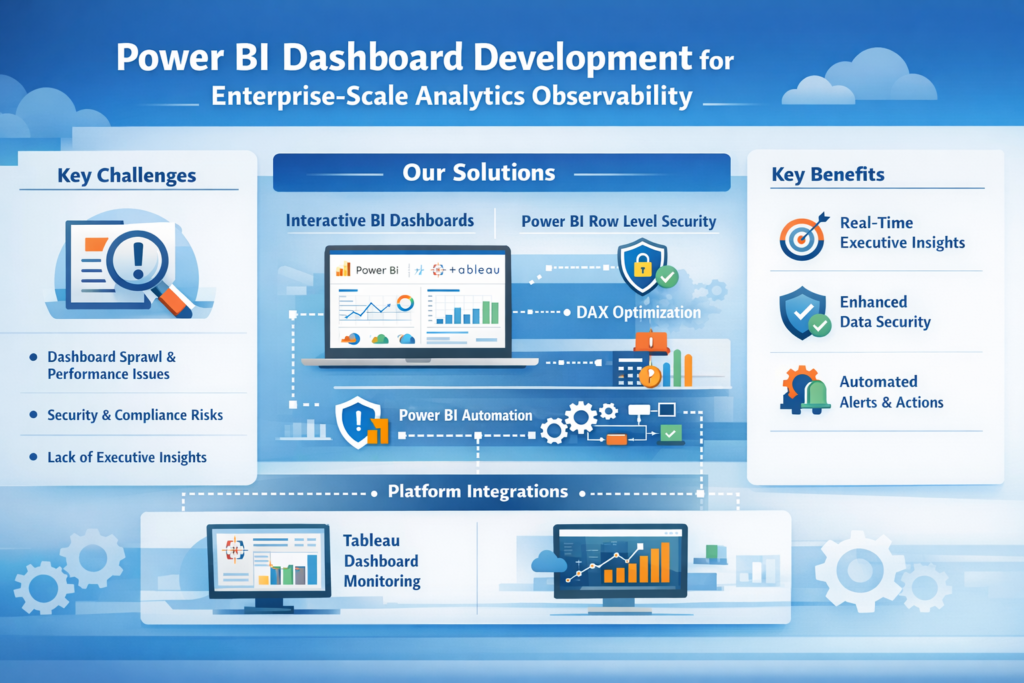
    Introduction: Why Static Metrics No Longer Work

    Power BI dashboards are no longer just reporting tools—they are decision systems. Yet many dashboards still fail at the most critical job: helping leaders instantly understand what changed, why it changed, and where to act next.

    Most reports focus on totals, averages, or rankings. While useful, these metrics hide the real story—movement. A product can still be a top seller while rapidly declining. A region can look average while quietly becoming the fastest-growing market.

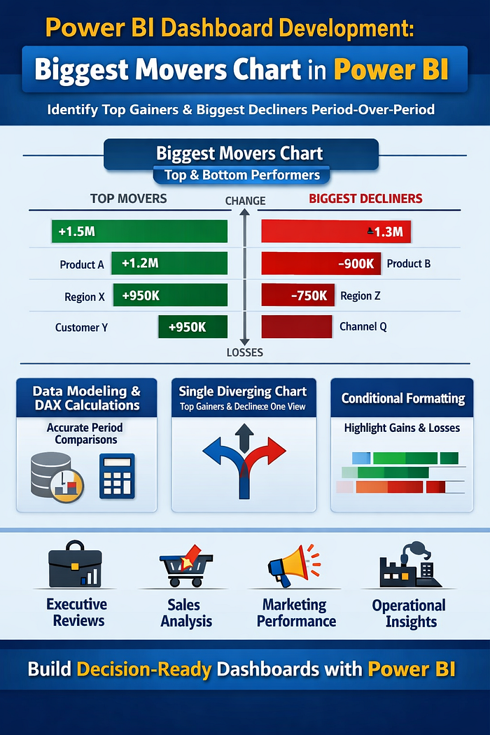
    This is where Biggest Movers charts change everything. Instead of asking users to compare periods manually, these visuals surface the largest positive and negative changes automatically—turning dashboards into early-warning systems and opportunity detectors.

    In this article, we explain how Biggest Movers charts elevate Power BI dashboards, how they work conceptually, and why they are essential for modern analytics teams.


    What Is a Biggest Movers Chart?

    A Biggest Movers chart highlights dimension members (products, regions, customers, campaigns) with the largest absolute change between two time periods.

    Unlike traditional “Top N” visuals, it answers different questions:

    • What improved the most?
    • What declined the fastest?
    • Where should we investigate immediately?

    By showing both gains and losses in one visual, Biggest Movers charts reduce cognitive load and eliminate the need for multiple charts.


    Why Most Power BI Dashboards Miss Performance Shifts

    Many dashboards rely on static comparisons:

    • Current month vs previous month tables
    • Rank-based bar charts
    • KPI cards with arrows

    The problem? These formats require mental math. Users must scan, compare, and interpret before acting.

    In high-pressure environments—sales reviews, operations calls, executive meetings—this friction kills insight velocity. Leaders don’t need more numbers; they need direction.

    Biggest Movers charts remove ambiguity by surfacing movement first, context second.


    How Biggest Movers Strengthen Power BI Dashboards

    1. Immediate Pattern Recognition

    Movement is easier to process than raw values. When users see bars extending left (decline) and right (growth), the story is instantly clear—no legend or explanation required.

    This makes Power BI dashboards usable even for non-technical stakeholders.

    2. Balanced View of Performance

    Traditional dashboards often over-celebrate growth while hiding decline. Biggest Movers force balance by displaying both extremes in a single view.

    This prevents false confidence and promotes healthier performance discussions.

    3. Faster Root-Cause Analysis

    By identifying where change occurred, analysts can drill down faster into why it happened—saving hours of investigation time.


    Designing Biggest Movers Charts That Actually Work

    Choose the Right Metric

    Biggest Movers charts are most effective for metrics that indicate momentum, such as:

    • Revenue change
    • Volume growth
    • Conversion rate shift
    • Cost increase or decrease

    Avoid vanity metrics that don’t drive decisions.

    Use Absolute Change, Not Percent Alone

    Percent change can exaggerate small numbers. Absolute change provides clarity, especially in executive-level Power BI dashboards.

    Percent change can still be layered in tooltips for context.

    Limit the Number of Movers

    Showing too many items defeats the purpose. Focus on:

    • Top 5 increases
    • Top 5 decreases

    This keeps attention on what matters most right now.


    Conditional Formatting: Turning Insight into Action

    Color is not decoration—it’s guidance.

    Effective Biggest Movers charts use:

    • Neutral colors for baseline
    • Strong contrast for growth vs decline
    • Consistent color logic across the dashboard

    This ensures users don’t have to relearn meaning every time they open the report.

    In high-stakes Power BI dashboards, consistency equals trust.


    Biggest Movers for Different Business Teams

    Sales Teams

    • Identify accounts at risk before churn
    • Spot fast-growing products or regions
    • Prioritize pipeline follow-ups

    Marketing Teams

    • Track campaign performance swings
    • Identify channels gaining or losing efficiency
    • Adjust spend in near real time

    Operations Teams

    • Monitor cost spikes
    • Detect supply chain disruptions early
    • Track productivity changes across units

    This flexibility makes Biggest Movers charts one of the most reusable visuals in Power BI.


    Common Mistakes to Avoid

    Even well-intended dashboards fail when:

    • Too many dimensions are shown at once
    • Time periods are unclear
    • Users can’t filter context easily
    • Visuals lack explanations or annotations

    The goal of Power BI dashboards is not to impress—it’s to enable confident decisions.


    Making Biggest Movers Executive-Friendly

    Executives don’t want to explore—they want answers.

    To make Biggest Movers work at leadership level:

    • Add short insight labels (e.g., “Driven by pricing change”)
    • Use clean, uncluttered layouts
    • Pair with one supporting KPI card for context

    This transforms dashboards from reporting tools into decision briefings.


    Why VisualizExpert Builds Dashboards Around Movement

    At VisualizExpert, we design Power BI dashboards around behavior, not just data.

    That means:

    • Prioritizing change over static totals
    • Designing visuals for speed, not density
    • Ensuring every chart answers a business question

    Biggest Movers charts align perfectly with this philosophy because they reduce noise and highlight action.


    Final Thoughts: Movement Is the Story

    In modern analytics, change is more valuable than status. The fastest-moving businesses win not because they have more data, but because they see shifts earlier and respond faster.

    By integrating Biggest Movers charts into Power BI dashboards, organizations move from passive reporting to proactive decision-making.

    If your dashboards still require explanation, they’re not working hard enough.

    Stop reporting numbers. Start revealing movement.
    Let our experts at VisualizExpert redesign your Power BI dashboards to surface what actually changes—and why it matters.

    👉 Talk to a Power BI Dashboard Expert
    🔗 https://visualizexpert.com/

  • Why Most Reporting Fails Without Real-Time Data Dashboards (And How Looker Studio Fixes It)

    Dashboards are meant to simplify decision-making—but for many organizations, reporting still feels slow, fragmented, and frustrating. Static reports, delayed updates, and disconnected tools often prevent teams from acting when it matters most. This is where real-time data dashboards change everything.

    Without real-time visibility, even accurate data loses value. Leaders make decisions based on yesterday’s numbers, teams wait on manual updates, and insights arrive too late to influence outcomes. At VisualizExpert, we see this pattern repeatedly: businesses don’t suffer from a lack of data—they suffer from a lack of timely, usable insight.

    In this article, we explore why traditional reporting fails, how user experience plays a critical role, and how Looker Studio enables real-time dashboards that actually support decisions instead of slowing them down.


    The Hidden Problem With Traditional Reporting

    Most reporting systems were not designed for speed or usability. They evolved from spreadsheets, exports, and slide decks—formats built for review, not action.

    Here’s what typically goes wrong:

    • Reports are updated weekly or monthly, not continuously
    • Data lives across multiple tools with no unified view
    • Users rely on analysts for every new question
    • Dashboards show too many metrics without context
    • Stakeholders don’t trust or understand the numbers

    The result is predictable: dashboards get ignored. Teams fall back on instinct, assumptions, or outdated summaries. Reporting becomes a task instead of a strategic asset.


    Why Timing Matters More Than Volume

    Organizations often believe they need more data to make better decisions. In reality, they need faster access to the right data.

    Delayed insights cause:

    • Missed optimization opportunities
    • Slow responses to performance drops
    • Reactive instead of proactive decisions
    • Endless back-and-forth between teams

    A report that arrives late—even if it’s accurate—fails its purpose. Decision-making happens in the present, not in hindsight.

    This is exactly why real-time data dashboards have become essential for modern teams.


    How Real-Time Data Dashboards Change Decision-Making

    Real-time dashboards shift reporting from a passive activity to an active decision system.

    Instead of asking:

    “What happened last month?”

    Teams can ask:

    “What’s happening right now—and what should we do next?”

    What Real-Time Dashboards Enable

    • Immediate visibility into performance changes
    • Faster validation of strategy and experiments
    • Continuous monitoring instead of periodic reviews
    • Shared context across teams and stakeholders

    When dashboards update automatically, decisions become grounded in reality—not assumptions.


    The UX Problem Most Dashboards Ignore

    Speed alone isn’t enough. A dashboard can be real-time and still fail if users don’t understand it.

    This is where dashboard UX becomes critical.

    Poor UX leads to:

    • Cognitive overload
    • Misinterpretation of metrics
    • Confusion instead of clarity
    • Loss of trust in the data

    Well-designed dashboards prioritize:

    • Clear hierarchy
    • Focused KPIs
    • Logical layout
    • Minimal but meaningful visuals

    At VisualizExpert, we design dashboards with one core principle:
    If a user can’t understand it in seconds, it won’t be used.


    Designing Dashboards Around Users, Not Tools

    Dashboards are not built for databases—they’re built for people.

    Effective dashboard UX starts by asking:

    • Who is this for?
    • What decisions will they make?
    • What actions should this dashboard support?

    Executives need clarity and direction.
    Marketing teams need performance signals.
    Operations teams need early warnings.

    A single dashboard trying to serve everyone usually serves no one.

    User-centered design ensures:

    • Each audience sees only what matters
    • Metrics are aligned with real decisions
    • Complexity is hidden behind simplicity

    Why Looker Studio Solves the Real Reporting Problem

    Looker Studio is not just a visualization tool—it’s a decision-enablement platform when implemented correctly.

    What makes Looker Studio effective:

    • Live connections to multiple data sources
    • Automatic refresh without manual intervention
    • Interactive filters for self-serve analysis
    • Cloud-based sharing with access control
    • Flexible design for different user roles

    When combined with thoughtful UX and data modeling, Looker Studio transforms reporting from static snapshots into living systems.


    Where Most Looker Studio Dashboards Still Go Wrong

    Despite its capabilities, many Looker Studio dashboards fail because they replicate old reporting habits.

    Common mistakes include:

    • Recreating Excel reports instead of rethinking insights
    • Showing every metric “just in case”
    • Ignoring performance and load times
    • Designing for aesthetics over usability
    • Failing to define a single source of truth

    Technology doesn’t fix reporting problems—design and strategy do.


    What High-Impact Dashboards Do Differently

    High-performing dashboards share a few critical traits:

    • They answer specific business questions
    • They highlight trends, not raw numbers
    • They guide attention, not distract it
    • They are trusted and consistently used

    Most importantly, they are decision-first, not data-first.

    At VisualizExpert, our approach focuses on aligning data, UX, and business intent—so dashboards support real decisions, not just reporting requirements.


    Building Trust Through Consistency and Clarity

    Trust is the foundation of dashboard adoption.

    Users trust dashboards when:

    • Numbers match across teams
    • Definitions are consistent
    • Data refreshes reliably
    • Visuals are easy to interpret

    Once trust is lost, dashboards become decoration.

    Real-time dashboards reinforce trust by:

    • Eliminating manual errors
    • Reducing lag between action and insight
    • Providing a shared, current view of reality

    From Reporting to Decision Systems

    The future of analytics is not more reports—it’s decision-ready dashboards.

    Organizations that succeed with analytics:

    • Reduce reporting effort
    • Increase insight accessibility
    • Empower non-technical users
    • Act faster with confidence

    This shift requires more than tools. It requires the right design mindset, governance, and implementation strategy.


    Final Thoughts

    Most reporting fails not because data is wrong—but because it arrives too late, feels overwhelming, or lacks clarity.

    Real-time data dashboards solve this by delivering timely, accessible, and trustworthy insights that support real decisions.

    When designed with users in mind and implemented thoughtfully using Looker Studio, dashboards stop being passive reports—and start becoming strategic assets.

    At VisualizExpert, we believe dashboards should do one thing exceptionally well:
    help people make better decisions, faster.

  • Strategic BI Roadmap Development: How VisualizExpert Turns Data Strategy into Organization-Wide Adoption

    Strategic BI Roadmap Development is the difference between having a data strategy on paper and seeing it actively used across your organization. In the first 90 days of most analytics initiatives, leaders face the same challenge: dashboards are built, tools are purchased, yet decision-making remains unchanged. At VisualizExpert, we help organizations close this gap by translating strategy into an execution-ready roadmap that aligns business priorities, analytics delivery, and measurable ROI.

    A well-designed roadmap does more than list projects. It clarifies what will be delivered, when it will be delivered, and why it matters to revenue, efficiency, and risk reduction. Most importantly, it creates trust — among executives who fund initiatives and departments that depend on analytics to run their operations.

    This article explains how VisualizExpert approaches Strategic BI Roadmap Development to drive adoption, accountability, and sustained business impact.


    What Is a Strategic BI Roadmap — and Why Most Fail Without One

    A BI roadmap is a sequenced operating plan that connects business goals to analytics execution. Without it, organizations often experience:

    • Disconnected Power BI dashboards
    • Conflicting KPIs across departments
    • Low adoption of reporting solutions
    • Analytics teams overwhelmed by ad-hoc requests

    Strategic BI Roadmap Development solves these issues by aligning KPI strategy consultingbusiness intelligence consulting, and decision-ready data visualization into a single, shared plan.

    At VisualizExpert, we design roadmaps that answer four executive-level questions clearly:

    1. What business outcomes will analytics drive?
    2. Which dashboards, reports, and models deliver those outcomes?
    3. When will value be realized?
    4. What resources and skills are required to execute?

    Strategic BI Roadmap Development as an Executive Decision Framework

    Executives don’t fund dashboards — they fund outcomes. This is why Strategic BI Roadmap Development must function as a decision framework, not a technical document.

    VisualizExpert structures roadmaps to support funding and prioritization by:

    • Tying initiatives to board-level KPIs
    • Quantifying ROI through efficiency gains and revenue impact
    • Sequencing initiatives based on feasibility and readiness
    • Showing trade-offs when new requests arise

    Instead of debating isolated requests for Power BI reporting solutions, leaders evaluate initiatives in context — understanding what moves forward, what moves out, and why.

    This approach ensures analytics investments stay aligned with business priorities, even as strategies evolve.


    Building Department-Level Adoption Through Clear Deliverables

    Analytics adoption happens in the middle of the organization. Department leaders need clarity, not architecture diagrams.

    VisualizExpert designs BI roadmaps that act as shared timelines across teams by clearly defining:

    • Executive analytics dashboards for leadership visibility
    • Interactive business dashboards for operations and sales
    • Power BI KPI tracking aligned to departmental goals

    Each deliverable includes timing, ownership, and business purpose — ensuring stakeholders know exactly what they will receive and when.

    By grounding analytics delivery in real operational needs, departments stop viewing BI as an IT project and start treating it as a performance tool.


    Designing Analytics That Are Actually Used

    Adoption depends on usability. Even the most accurate data fails if decision-makers don’t trust or understand it.

    VisualizExpert prioritizes interactive dashboard design and data storytelling services to ensure insights are intuitive, credible, and actionable. This includes:

    • Clear metric definitions and context
    • Consistent KPI logic across reports
    • Visual design optimized for executive consumption
    • Shareable stakeholder reports that reduce manual presentations

    When analytics answers real business questions quickly, usage becomes habitual — not mandated.


    Aligning Power BI Architecture With Roadmap Execution

    A roadmap only works if the underlying data model supports scale. VisualizExpert integrates Power BI Data Modeling Services and Power BI Star Schema Design directly into roadmap planning.

    This ensures that:

    • KPIs remain consistent as reporting expands
    • Performance scales with adoption
    • New dashboards don’t introduce conflicting metrics

    We also address performance early using Power BI DirectQuery Performance optimization where real-time access is required, avoiding costly rework later.

    The result is a scalable analytics foundation that grows with the business — not against it.


    Factoring People and Skills Into the BI Roadmap

    One of the most common reasons BI initiatives stall is unrealistic capacity planning. Strategic BI Roadmap Development must treat people as core investments, not afterthoughts.

    VisualizExpert explicitly maps:

    • Required roles and skill sets
    • Internal vs external delivery responsibilities
    • Ongoing maintenance and support needs

    Our clients often pair roadmap execution with Power BI Managed Services to ensure continuity, reduce burnout, and maintain momentum after initial delivery.

    By making resourcing visible, leadership can make informed decisions — rather than discovering gaps mid-project.


    Quarterly Roadmap Reviews That Prove Impact

    A BI roadmap is not a one-time artifact. It must evolve with the business.

    VisualizExpert embeds quarterly reviews into every roadmap, focusing on:

    • Business impact achieved (not just dashboards delivered)
    • Adoption and usage metrics
    • Re-prioritization based on new initiatives
    • Data readiness and operational gaps

    These reviews reinforce accountability and keep analytics aligned with changing objectives — a critical factor in long-term BI adoption services.


    Why Organizations Choose VisualizExpert for BI Roadmap Execution

    VisualizExpert operates as a data analytics agency focused on outcomes, not tool implementation alone. Our roadmap engagements combine:

    • Analytics strategy services
    • Power BI dashboard development
    • Executive summary dashboards
    • ROI-driven reporting solutions

    Clients choose VisualizExpert because we bridge the gap between strategy, design, and execution — ensuring analytics becomes embedded in how decisions are made.


    Key Takeaways

    • Strategic BI Roadmap Development turns analytics vision into an executable operating plan.
    • Adoption increases when roadmaps clearly define deliverables, timing, and business value.
    • Executives need ROI-focused decision frameworks, not technical documentation.
    • Departments adopt BI when dashboards align with real performance goals.
    • Staffing, data modeling, and design must be planned together — not separately.
    • Quarterly reviews keep BI aligned, credible, and impactful.

    Turn Your Data Strategy Into Measurable Results
    Talk to a VisualizExpert consultant and build a BI roadmap your teams actually adopt—aligned to ROI, KPIs, and executive decision-making.
    👉 Schedule a Free Strategy Call

  • How Visual Intelligence Is Powering Confident Decisions in the Agentic Era

     For more than a decade, every major technology shift in analytics has sparked the same claim: dashboards are dead. Machine learning was supposed to replace them. Automation was supposed to run decisions end to end. Now generative AI and autonomous agents are said to make visual analytics obsolete.

    Yet inside organizations that carry real accountability—revenue targets, operational risk, compliance, and people decisions—the opposite is happening. As systems become faster and more automated, leaders are asking for more clarity, not less. What’s changing is not the relevance of dashboards, but their purpose. Static reporting is fading. Data visualization for decision making is becoming the human governance layer of the AI-driven enterprise.

    Dashboards are no longer destinations you visit after the fact. They are decision systems that sit between data, AI, and action.


    From Reports to the Decision Layer

    Traditional BI was built for hindsight. Reports explained what happened last quarter, last month, or yesterday. In the agentic era, that model breaks down. AI systems generate predictions and recommendations in seconds, but accountability still sits with humans. No executive approves a strategic shift, a budget reallocation, or an autonomous action without understanding why.

    This is where the role of a modern Business Intelligence Consultant has fundamentally changed. The job is no longer to produce dashboards. It is to design a decision environment where AI outputs, business logic, and human judgment converge. Analytics now acts as the connective tissue that translates machine reasoning into something leaders can verify and trust.

    Without this layer, organizations don’t innovate—they automate confusion.


    Why Trust Is the Real Bottleneck

    Most enterprises don’t lack data or tools. They lack alignment. Metrics live across dashboards, spreadsheets, notebooks, copilots, and embedded systems. Definitions vary by department. Numbers don’t match. When trust erodes, decision-making slows.

    This is why executive analytics dashboards remain central to leadership behavior. Executives don’t use dashboards because they like charts. They use them because dashboards provide a shared reality—a single place to confirm data, logic, risk, and action before committing to outcomes.

    Visual intelligence solves the last-mile trust problem by making insight verifiable, explainable, and shared. In an AI-powered environment, that trust layer becomes more important, not less.


    Letting Bad Dashboards Die

    Not all dashboards deserve to survive. The ones that should disappear are the static, handcrafted reports disconnected from a governed source of truth. These dashboards are slow, manual, and dangerous in a world where decisions happen in real time.

    Modern BI dashboard solutions are dynamic and decision-driven. They are designed around the actions leaders need to take, not the data analysts want to show. If a dashboard doesn’t reduce cognitive effort or lead to a clear next step, it adds friction rather than value.

    The question is no longer, “Is the dashboard accurate?”
    It’s, “Does this dashboard change what we do next?”


    The Semantic Foundation AI Depends On

    AI can only be as good as the business logic it understands. When metrics mean different things to different teams, AI outputs drift quickly from reality. This is why KPI alignment is no longer a reporting exercise—it’s a strategic one.

    Effective KPI strategy consulting ensures that metrics are defined consistently, understood universally, and aligned to business outcomes. This semantic foundation is what allows AI and humans to reason from the same facts. Without it, predictions may look impressive but lead to the wrong decisions.


    Visualization as the Audit Trail for AI

    AI systems are powerful, but they are still black boxes to most leaders. Visual analytics turns those black boxes into transparent systems. Modern interactive business dashboards show not just outcomes, but inputs, thresholds, trends, and logic.

    This visual verification layer acts as an instant audit trail. Leaders can see how a recommendation was generated, assess risk, and decide whether to act. In regulated and high-stakes environments, this explainability is non-negotiable.

    Visualization is no longer about presentation. It’s about accountability.


    The Evolution of Power BI and Tableau

    The future of analytics is not a tool war. Power BI and Tableau are evolving toward the same destination: decision intelligence. Through Power BI dashboard development, organizations integrate real-time data, AI insights, and governed metrics into a unified environment. Tableau adds strength in deep exploration and explanation, especially where understanding drivers matters most.

    Together, these platforms support analytics that move at the speed of AI while remaining grounded in human judgment.


    Insights Where Work Happens

    One of the biggest shifts in analytics is location. Leaders don’t want another portal to check. They want insights inside the tools where decisions happen—CRM systems, collaboration platforms, and operational workflows. Power BI embedded analytics enables this shift by bringing verified insight directly into context.

    Dashboards are no longer places you go. They are systems that come to you.


    Performance Is a Trust Issue

    In the agentic era, slow dashboards don’t just frustrate users—they undermine confidence. Poor Power BI DirectQuery performance signals instability and causes leaders to question the data itself. Real-time expectations demand scalable models, predictable performance, and responsive interaction.

    If analytics can’t keep up, users fall back to spreadsheets, and the BI investment loses credibility.


    Governance Still Matters

    Autonomy without control is risk. As organizations scale analytics access, Power BI row level security and strong governance frameworks ensure that the right people see the right data at the right time. Trust isn’t just about accuracy—it’s about controlled visibility.

    This governance layer allows organizations to move fast without losing compliance or oversight.


    Designing for Leaders, Not Analysts

    Analysts explore data. Leaders make decisions. Executive leadership dashboards are built for speed, clarity, and alignment. They prioritize signals over noise, trends over tables, and outcomes over metrics volume.

    When dashboards are designed for how leaders actually think, adoption follows naturally.


    Visual Analytics as Strategic Capability

    Tableau visual analytics plays a critical role in helping leaders understand why outcomes change. In AI-driven environments, explanation becomes as valuable as prediction. Visualization bridges that gap by translating complexity into clarity.


    The Power of Narrative

    Insight alone doesn’t drive action. Alignment does. Data storytelling services turn analytics into narratives that teams can rally around. In the agentic era, storytelling is operational—it ensures that humans and machines move in the same direction.


    Designing Dashboards That Get Used

    Adoption is the ultimate success metric. Effective dashboard design consulting focuses on reducing cognitive load, aligning visuals to decisions, and embedding dashboards into real workflows. If users don’t return, the dashboard has failed—regardless of how accurate the data is.


    Strategy Before Tools

    Technology doesn’t deliver ROI on its own. Analytics strategy services align BI initiatives with business priorities, maturity, and change readiness. This strategic layer ensures analytics investments translate into measurable outcomes.


    Making BI Habitual

    Even the best dashboards fail without adoption. BI adoption services address training, enablement, and cultural change, ensuring analytics becomes part of daily decision-making rather than an optional resource.


    Measuring What Matters

    Successful dashboards focus on outcomes, not activity. KPI dashboard services help organizations track the metrics that directly influence performance, risk, and growth.


    Why VisualizExpert Exists

    At VisualizExpert, our VisualizExpert dashboards reviews evaluate analytics through one lens: decision impact. We assess clarity, alignment, performance, and adoption to ensure dashboards earn their place in leadership workflows.


    BI and AI Are Stronger Together

    The future isn’t BI versus AI. It’s BI with AI. Analytics transformation consulting brings prediction, semantics, visualization, and governance together into a single decision stack.

    Dashboards aren’t obsolete. The relationship to them is evolving. They are becoming the real-time interface between human judgment and autonomous systems—the layer where decisions are understood, validated, and aligned.

    In the agentic era, that makes dashboards more important than ever.

    If your dashboards aren’t driving decisions, it’s time to rethink how they’re designed. Explore how VisualizExpert helps organizations build decision-ready analytics.

  • Power BI Dashboard Development for Enterprise-Scale Analytics Observability


    Modern analytics platforms are no longer just reporting tools — they are mission-critical systems that power daily business decisions. As organizations scale their analytics footprint, Power BI Dashboard Development becomes central to ensuring leaders have visibility into performance, governance, and risk. The challenge is not only building dashboards, but continuously monitoring usage, security, data freshness, and operational health across thousands of users and assets.

    At VisualizExpert, we work with enterprises that have outgrown ad-hoc reporting and manual administration. They need observability, automation, and decision-ready insights — without adding operational complexity.


    The Observability Gap in Growing Analytics Environments

    Self-service BI adoption is a success story — until it isn’t. As dashboards multiply, so do problems: duplicated metrics, unused reports, slow queries, and unclear ownership. Built-in admin tools often fail to answer enterprise-level questions such as:

    • Which dashboards are critical to executives but at risk of failure?
    • Where are performance bottlenecks emerging?
    • Are users accessing only the data they are authorized to see?

    This is where business intelligence consulting shifts from visualization to platform strategy. Enterprises need a structured analytics operating model that connects usage data, performance telemetry, and governance signals into one coherent view.


    Why Platform Observability Is Now a BI Requirement

    Observability is no longer exclusive to IT infrastructure. Analytics platforms themselves must be observable — measurable, auditable, and optimizable. Leading organizations integrate platform event data with analytics and reporting consulting frameworks to proactively manage risk instead of reacting to incidents.

    At VisualizExpert, we help organizations transform raw platform logs into executive-level intelligence that answers “what’s happening, why it matters, and what to do next.”


    Power BI Dashboard Development as an Observability Layer

    How Power BI Becomes the Control Plane

    When designed correctly, Power BI dashboards can act as a real-time control plane for analytics operations. Using Power BI Data Modeling Services, platform activity data can be shaped into star schemas that support fast, scalable analysis of usage trends, refresh reliability, and adoption patterns.

    This is not traditional reporting. It is operational intelligence for analytics leaders.


    Governance Without Friction Using Power BI Row Level Security

    Security failures in analytics are rarely malicious — they are usually accidental. Misconfigured permissions, inherited access, and forgotten users create silent risk. By applying Power BI Row Level Security, organizations can ensure that operational dashboards show the right insights to the right stakeholders without exposing sensitive metadata.

    This approach aligns compliance with usability, a key requirement for regulated industries.


    Executive Visibility Through KPI-Driven Monitoring

    Leadership teams do not want logs — they want answers. VisualizExpert designs executive analytics dashboards that translate platform health into KPIs such as adoption velocity, report reliability, and business impact coverage. These dashboards enable faster intervention and more confident decision-making.


    Tableau Cloud, Platform APIs, and Cross-Tool Strategy

    Many enterprises operate hybrid BI ecosystems. Tableau remains critical for visual exploration and storytelling, while Power BI often becomes the enterprise monitoring layer. Our Tableau Dashboard Design expertise ensures that Tableau environments remain performant and trusted, even as usage scales globally.

    Tableau Observability with Platform Event Data

    By combining Tableau event streams with Tableau Server Optimization techniques, organizations can identify extract failures, slow dashboards, and unused assets before they impact users.


    H2: Power BI Dashboard Development for Platform Observability at Scale

    True observability requires more than visuals — it requires architecture. VisualizExpert designs interactive business dashboards that connect platform APIs, warehouse telemetry, and governance metadata into a unified monitoring experience. These dashboards answer not only “what happened,” but “what should we fix next?”

    This is where analytics maturity becomes a competitive advantage.


    Automation: From Monitoring to Action

    Observability without action is just awareness. By applying Power BI automation, we help enterprises trigger alerts, workflows, and remediation steps when thresholds are breached — whether that’s a failed refresh, a sudden spike in query load, or a permissions change.

    Automation reduces operational overhead while increasing platform reliability.


    Data Integrity and Modeling Excellence

    Platform data is only valuable if it is trustworthy. Using DAX Formula Optimization, we ensure that operational metrics remain accurate at scale, even as event volumes grow into millions of records per day. This protects confidence in analytics leadership dashboards.


    Embedded Analytics for Platform Teams

    Analytics teams themselves need analytics. Through Power BI Embedded Analytics, platform health insights can be delivered directly inside admin portals, IT dashboards, or internal tools — reducing context switching and accelerating response time.


    Tableau Expertise for Advanced Use Cases

    Complex organizations often require advanced Tableau capabilities. Our Tableau LOD Calculation Expert services enable precise measurement of usage, adoption, and performance across multiple dimensions — without sacrificing visual clarity.

    Meanwhile, Tableau visual analytics ensures that insights remain accessible to both technical and non-technical stakeholders.


    Enterprise-Grade Performance and Scalability

    As usage grows, performance becomes a strategic issue. We design enterprise data visualization solutions that scale across regions, user groups, and data volumes — without degrading experience. This includes proactive performance modeling and capacity planning.


    The VisualizExpert Difference

    VisualizExpert is not just a dashboard vendor — we are a strategic analytics partner. Our work spans BI dashboard solutions, platform governance, and long-term analytics enablement. We help enterprises move from reactive administration to proactive intelligence.

    Our approach is grounded in real-world experience, not templates. Every engagement is aligned to business outcomes, not vanity metrics.


    Preparing for the Future of Analytics Operations

    As analytics platforms evolve, observability will become non-negotiable. APIs, event data, and automation will define how organizations maintain trust in their insights. VisualizExpert helps enterprises prepare for that future today — by building systems that are transparent, resilient, and decision-ready.


    Final Thoughts

    Enterprise analytics success is no longer defined by how many dashboards you have — but by how well you understand, govern, and evolve your analytics ecosystem. With the right observability strategy and expert execution, analytics becomes a source of confidence rather than complexity.

    If your organization is scaling analytics and needs clarity at every level, VisualizExpert is ready to help.

  • BI and Analytics Tool Selection Framework: A Practical Guide for Confident Decisions


    Introduction: Why BI Tool Selection Fails More Often Than It Should

    Selecting a BI and analytics platform is no longer a purely technical decision — it is a strategic one that directly influences how leaders interpret data and act on it. Organizations often invest months evaluating tools, yet still struggle with adoption, performance, or trust in insights. This is where Power BI consulting services play a critical role, helping businesses move beyond surface-level comparisons and toward platforms that truly align with their data maturity, operating model, and long-term goals.

    At VisualizExpert, we’ve seen a consistent pattern: BI tools fail not because they lack features, but because they are selected without a structured evaluation framework. A successful BI selection process balances architecture, usability, scalability, governance, and future readiness. This article outlines a practical BI and analytics tool selection framework — one that prioritizes real-world decision impact over vendor hype.


    Why a Framework Matters More Than a Feature Checklist

    Modern BI platforms all promise speed, self-service, AI-assisted insights, and beautiful dashboards. Yet organizations still face dashboard sprawl, inconsistent metrics, and slow decision cycles. The problem lies in how tools are selected.

    A framework forces clarity around:

    • Who will use the tool and how
    • Where data transformation should live
    • How governance and scalability will be enforced
    • What success looks like after implementation

    Without this structure, even best-in-class tools become underutilized reporting layers instead of decision engines.


    Core Component 1: Determining True Tool Fit

    Tool fit goes beyond compatibility with data sources. It evaluates how well a BI platform integrates into your organization’s operating reality — today and three years from now.

    Key considerations include:

    • Alignment with your current and future data architecture
    • Learning curve for both analysts and business users
    • Licensing model sustainability as adoption grows
    • Performance under real data volumes and concurrency

    The most successful BI environments are not those with the most dashboards, but those where analytics naturally integrates into everyday decision-making. Fit should be validated through hands-on proof-of-concepts that mirror real workflows, not sanitized demos.


    Core Component 2: Data Platform Alignment

    BI tools do not exist in isolation. They sit at the top of your data stack and depend heavily on what exists beneath them.

    Organizations generally fall into one of three platform scenarios:

    Modular Data Platforms

    These environments combine best-of-breed tools for ingestion, transformation, storage, and analytics. The BI tool must work efficiently with cloud warehouses, semantic models, and transformation layers without duplicating logic.

    Vendor-Centric Cloud Platforms

    Unified ecosystems provide deep integration benefits but often nudge organizations toward native BI tools. While this can accelerate deployment, it may also introduce long-term vendor dependency that must be evaluated carefully.

    No Centralized Data Platform

    In less mature environments, the BI tool often absorbs responsibilities it was not designed for — data preparation, transformation, and even storage. This can work short-term but introduces technical debt unless paired with a roadmap toward centralization.

    Understanding your platform direction is essential before locking in a BI tool.


    Core Component 3: Where Data Transformation Should Live

    One of the most overlooked decisions in BI selection is where transformation logic resides. While many BI tools allow data shaping, relying on them as the primary transformation layer limits scalability and complicates future migrations.

    Best-practice principles include:

    • Centralizing complex transformations in the data platform
    • Keeping BI-level calculations lightweight and presentation-focused
    • Designing semantic models that remain portable across tools

    This separation ensures performance, governance, and long-term flexibility — especially as data volumes and user counts increase.


    How Power BI Consulting Services Improve BI Tool Selection Outcomes

    Organizations that engage experienced Power BI consulting services during the selection phase consistently achieve higher adoption and faster time-to-value. This is not because consultants push a specific tool, but because they bring a decision-first mindset.

    Consulting-led selection helps organizations:

    • Translate business decisions into analytics requirements
    • Identify hidden architectural constraints early
    • Stress-test tools under realistic workloads
    • Design governance and security models before rollout

    Rather than asking “What can this tool do?”, the conversation shifts to “What decisions must this tool support reliably?”

    This approach reduces rework, minimizes shelfware, and ensures the BI platform evolves with the organization — not against it.


    Core Component 4: Weighing the Intangibles

    Technical capability alone does not determine success. Intangible factors often make or break BI adoption.

    Licensing Trajectory

    Costs rarely stay flat. Organizations must model how licensing scales with usage, viewer counts, and premium features — not just initial pricing.

    Real Use Cases Over Feature Depth

    Advanced functionality has little value if it does not support actual decision scenarios. Prioritize the workflows that matter most to leadership, operations, and frontline teams.

    Vendor Momentum and Ecosystem

    An active product roadmap, strong community, and skilled talent pool signal long-term viability. A stagnant ecosystem increases future risk.

    These factors are difficult to quantify — but ignoring them is costly.


    Core Component 5: Migration as a Strategic Opportunity

    Migration should never be treated as a lift-and-shift exercise. It is a rare opportunity to clean, rationalize, and improve your analytics environment.

    Successful migration planning addresses:

    • Which reports truly deliver value
    • Whether required data is accessible and trustworthy
    • How change management will minimize disruption

    Phased cutovers, parallel runs, and strong communication ensure users trust the new platform from day one. When executed well, migration accelerates adoption rather than slowing it.


    Key Takeaways for BI Leaders

    • BI tool selection is a strategic decision, not a procurement task
    • Architecture, governance, and usability matter more than feature volume
    • Data transformation should be centralized, not buried in dashboards
    • Intangibles like licensing and ecosystem health shape long-term success
    • Migration is a chance to reset — not replicate — analytics debt

    Most importantly, the right BI tool is the one that consistently supports better decisions at scale.


    Why VisualizExpert Approaches BI Differently

    At VisualizExpert, we believe analytics should reduce cognitive load — not add to it. Our approach focuses on decision clarity, scalable design, and long-term adaptability. Tool selection is never about trends; it’s about fit, trust, and measurable impact.

    If your organization is evaluating BI platforms or reassessing its current analytics stack, a structured framework — and the right expertise — can mean the difference between dashboards that impress and analytics that actually perform.

  • Decision-Ready Data Visualization: How to Spot Misleading Charts by Reviewing the Message

    Introduction

    In an era where charts influence everything from executive decisions to public opinion, decision-ready data visualization has never been more important. Charts simplify complexity, highlight patterns, and help us act quickly—but they can also mislead if the message behind them is misunderstood or intentionally distorted.

    At VisualizExpert, a data analytics agency delivering advanced data analytics services, we help organizations move beyond surface-level visuals toward trustworthy insights. Spotting misleading charts is not about distrusting data—it’s about understanding the author’s interpretation, assumptions, and framing.

    This article focuses on one of the most critical yet overlooked skills in analytics: reviewing the message behind a chart so leaders can make confident, informed decisions.


    Why Charts Can Mislead Even When the Data Is Correct

    Many people assume misleading charts are the result of bad data. In reality, even accurate data can be misinterpreted through selective comparisons, missing context, or emotionally loaded language.

    Charts are flexible communication tools, much like written language. Just as words can persuade or manipulate, visuals can emphasize certain narratives while downplaying others. This is why strong business intelligence consulting emphasizes not just technical accuracy, but interpretive integrity.

    Without this skill, even sophisticated BI dashboard solutions risk becoming vehicles for misinformation instead of insight.


    Decision-Ready Data Visualization Requires Critical Interpretation

    Decision-Ready Data Visualization Starts With Asking “Compared to What?”

    One of the most common causes of misleading messages is incomplete comparison. Charts rarely speak in absolutes—they rely on context.

    A chart may show an increase, decrease, or difference, but compared to what baseline? A single time period, product category, or region can completely alter the takeaway. Without understanding the comparison being made, viewers may draw conclusions that the data does not support.

    This is why analytics and reporting consulting frameworks emphasize comparative clarity. Decision-ready visuals ensure that comparisons answer the right business question, not just a convenient one.


    Context Is the Difference Between Insight and Misinformation

    Charts that isolate a narrow slice of data often imply trends that disappear when broader context is added. A short-term spike may look alarming, while a long-term view shows stability or improvement.

    At VisualizExpert, we frequently encounter dashboards that unintentionally mislead because they lack historical or categorical context. This is especially common in executive analytics dashboards, where limited space can lead to oversimplification.

    Good context doesn’t clutter a visual—it strengthens trust.


    Correlation Is Not Causation: A Classic Misinterpretation

    Even when charts are well-designed, interpretations can go wrong when correlation is mistaken for causation.

    Two metrics moving together does not mean one causes the other. External factors often influence both. Without careful interpretation, leaders may invest resources in solving the wrong problem.

    This is why strong data visualization services focus on explanation, not just presentation. Visuals should invite thoughtful interpretation rather than encourage quick, unsupported conclusions.


    Why Uncertainty Must Be Part of the Message

    Data is never perfect. Surveys, forecasts, and samples all contain uncertainty. Ignoring this uncertainty creates false confidence.

    Margins of error, confidence intervals, and sample size context are not signs of weak data—they are signs of honest analysis. When uncertainty is hidden, viewers may believe differences are meaningful when they are not.

    In enterprise data visualization, acknowledging uncertainty is essential for ethical decision-making. Leaders should understand not only what the data suggests, but how confident they can be in that suggestion.


    Language Shapes How Charts Are Understood

    Words matter as much as visuals.

    Titles, subtitles, labels, and annotations frame how viewers interpret a chart. Emotionally charged language can exaggerate urgency or downplay risk. Poorly chosen terminology can also reinforce bias or dehumanize the subjects represented in the data.

    At VisualizExpert, our data storytelling services emphasize inclusive, neutral, and precise language. The goal is clarity—not persuasion.

    A chart should describe what the data shows, not what the author wants the audience to believe.


    Bias Can Exist Even Without Bad Intent

    Not all misleading charts are intentionally deceptive. Many are created by well-meaning analysts who lack training in data literacy or equity-aware design.

    Bias can appear through:

    • Metric selection
    • Data exclusions
    • Framing of results
    • Cultural assumptions

    This is why visual analytics consulting plays a critical role in modern organizations. A second set of expert eyes often reveals blind spots that creators themselves cannot see.


    From Charts to Dashboards: Scaling Trust Across the Organization

    Misinterpretation doesn’t stop at individual charts—it compounds across dashboards.

    A single misleading visual replicated across interactive business dashboards can shape strategy, budgets, and performance reviews. Over time, this erodes trust in analytics altogether.

    Organizations investing in Power BI dashboards or modern BI platforms must pair tooling with education. Governance, review processes, and shared standards are essential for consistent interpretation.


    How VisualizExpert Helps Build Decision-Ready Visualization

    As a specialized data analytics agency, VisualizExpert helps organizations design analytics that leaders can trust.

    Our approach combines:

    • Custom analytics solutions aligned with real decisions
    • KPI dashboard services grounded in business outcomes
    • Executive summary dashboards that prioritize clarity over complexity
    • Decision-ready data visualization principles applied across reports and dashboards

    We don’t just ask whether a chart is accurate—we ask whether it leads to the right decision.


    Keep Asking Questions When You Read Charts

    Strong data literacy is a habit, not a checklist.

    When viewing any chart, ask:

    • What is being compared?
    • What context is missing?
    • How much uncertainty exists?
    • How does language influence interpretation?
    • Who benefits from this framing?

    These questions turn passive viewers into active decision-makers.


    Practice Builds Confidence

    Interpreting charts is a skill that improves with practice. The more charts you evaluate critically, the easier it becomes to spot misleading messages.

    Organizations that invest in data driven decision making empower employees at every level—not just analysts—to challenge assumptions and improve outcomes.


    Shared Interpretation Strengthens Organizations

    Analytics should never exist in isolation. Discussing charts with peers often reveals alternative interpretations and hidden assumptions.

    This collaborative review process strengthens organizational decision-making and reduces the spread of misinformation. It also builds a shared data culture where questions are encouraged—not avoided.


    Final Thoughts

    Charts are powerful tools—but power requires responsibility.

    Decision-ready data visualization is not about making charts more impressive. It’s about making decisions more informed, fair, and defensible.

    When leaders learn to review the message behind charts, they move from reacting to visuals to reasoning with evidence.

    At VisualizExpert, that shift—from data to decisions—is where real value begins.

  • Power BI Reports vs Dashboards: A Practical Guide for Teams Migrating from Tableau


    Introduction

    If you’ve recently transitioned from Tableau to Power BI, you’ve likely asked the same question many teams do: “Where are the dashboards?” The confusion is understandable. While Power BI dashboards and Tableau dashboards sound similar, they are designed for very different purposes.

    At VisualizExpert, a data analytics agency delivering end-to-end data analytics services, we frequently support organizations navigating this transition as part of broader business intelligence consulting engagements. Understanding the difference between reports and dashboards in Power BI is essential for building analytics that executives trust and teams actually use.

    This guide explains how Power BI reports vs dashboards differ, why the distinction matters, and how organizations can design scalable analytics when migrating from Tableau.


    What Is a Power BI Report?

    A Power BI report is created in Power BI Desktop and acts as the core analytical workspace. Reports are interactive, flexible, and designed for exploration.

    Reports can include multiple pages, each with different visualizations, slicers, and filters. All visuals within a report must connect to a single semantic model, which makes Power BI data modeling a critical success factor. When modeling is done correctly — often through dedicated Power BI Data Modeling Services — reports become fast, reliable, and easy to understand.

    Reports are where teams answer questions like why did this happen or what changed. They are essential for analysts, finance teams, operations managers, and anyone responsible for detailed analysis.


    Power BI Reports vs Dashboards: Understanding the Core Difference

    Power BI Reports vs Dashboards in Practice

    The most important distinction is where these assets live and how they are used.

    Reports are built in Power BI Desktop and can be published to the Power BI service. Dashboards, however, exist only in the Power BI service. A dashboard is a single-page canvas created by pinning visuals from one or multiple reports.

    This difference changes how users interact with data. Reports are designed for deep exploration. Dashboards are designed for monitoring and decision-making.

    At VisualizExpert, we design dashboards as decision interfaces, not visual collections. This approach aligns with our KPI dashboard services, where every visual exists to support a specific business outcome.


    Why Power BI Dashboards Are Built for Executives

    Executives rarely need full interactivity. What they need is clarity.

    A well-designed executive analytics dashboard answers high-level questions quickly:

    • Are we on track?
    • Where do we need to intervene?
    • Which metric signals risk or opportunity?

    Dashboards work best when paired with Power BI scorecards and consistent Power BI KPI tracking, allowing leadership to monitor progress without digging through report pages.

    To maintain trust, dashboards must rely on optimized calculations. This is where DAX Formula Optimization and standardized metrics play a crucial role.


    Designing Effective Power BI Dashboards

    Creating effective dashboards requires more than pinning charts.

    Strong dashboards follow a few essential principles:

    • KPIs are aligned with business goals through structured KPI strategy consulting
    • Metrics are standardized across reports and departments
    • Performance is optimized, especially when using live connections and Power BI DirectQuery Performance
    • Access is controlled using Power BI Row Level Security, ensuring the right users see the right data

    These practices ensure dashboards remain fast, accurate, and trusted as organizations scale.


    From Tableau to Power BI: What Changes for Users

    Teams coming from Tableau often expect dashboards in Power BI to behave the same way. This is one of the biggest sources of frustration during migration.

    In Tableau, dashboards are highly interactive and often serve both analytical and executive purposes. In Power BI, that responsibility is split. Reports handle analysis, while dashboards focus on monitoring and alignment.

    Organizations with strong experience in Tableau Dashboard Design typically adapt quickly once they understand this separation. The key is redesigning — not recreating — existing analytics.

    This is where experienced Power BI consulting services add value by translating Tableau logic into Power BI’s architecture.


    Common Mistakes During Migration

    Across many Power BI migration projects, a few mistakes appear consistently.

    Teams often try to rebuild Tableau dashboards directly as Power BI dashboards instead of reports. Others skip proper Power BI Star Schema Design, leading to slow visuals and inconsistent KPIs. Some overload dashboards with operational detail, making them unusable for leadership.

    Successful migrations focus on clarity, governance, and long-term usability — not visual parity.


    Reports for Teams, Dashboards for Decisions

    A useful way to think about Power BI assets is this:

    Reports help teams understand why something happened. Dashboards help leaders decide what to do next.

    This separation allows organizations to scale analytics across departments while keeping leadership focused on outcomes. It also enables advanced scenarios like Power BI Embedded Analytics, where dashboards are surfaced inside internal tools or customer-facing applications.


    How VisualizExpert Supports Power BI Success

    As a specialized data analytics agency, VisualizExpert helps organizations design analytics that drive real decisions.

    Our services include:

    • Custom Power BI reports for operational and analytical teams
    • BI dashboard solutions tailored for executives
    • Analytics and reporting consulting to align metrics with strategy
    • Power BI Managed Services to maintain performance, security, and adoption

    We combine data visualization services with a deep understanding of business context to build interactive business dashboards that leadership actually trusts.


    When to Use Dashboards vs Reports

    Reports are best when users need exploration, comparisons, and detailed analysis. Dashboards are best when leaders need fast insight, trend monitoring, and alignment.

    Organizations that succeed with Power BI design both intentionally and never try to make one do the job of the other.


    Final Thoughts

    Understanding the difference between Power BI reports vs dashboards is not just a technical lesson. It’s a strategic shift.

    When reports and dashboards are designed around real decisions, adoption improves, trust increases, and analytics deliver measurable ROI.

    If your organization is migrating from Tableau or rethinking its BI foundation, aligning analytics with decision-making is the most impactful place to start.

    At VisualizExpert, that’s exactly what we help organizations achieve.

  • Strategic BI Roadmap Development: How to Build a Data Strategy That Gets Adopted

    Introduction

    Many organizations invest heavily in analytics tools, platforms, and data teams — yet still struggle to turn data strategy into consistent execution. The missing link is rarely technology. It’s adoption. This is exactly where Strategic BI Roadmap Development becomes critical.

    A well-designed BI roadmap translates ambition into action. It connects business priorities to sequenced initiatives, sets realistic expectations, and aligns teams around shared outcomes. Most importantly, it becomes a living operating plan that leaders rely on and departments actually follow.

    At VisualizExpert, we’ve seen firsthand that roadmaps don’t fail because they’re incomplete — they fail because they aren’t designed for how organizations make decisions. This article breaks down how to build a BI roadmap that earns trust, survives change, and gets adopted across the enterprise.

    What Is a BI Roadmap — and Why Adoption Matters

    A BI roadmap is not a project plan or a list of technologies. It is a structured, time-bound view of what data capabilities will be delivered, when they will arrive, and why they matter to the business.

    When done correctly, a roadmap clarifies:

    • What insights the business will gain
    • How success will be measured
    • Which initiatives are foundational versus additive
    • Where trade-offs must be made

    Without this clarity, analytics efforts drift. Teams chase urgent requests, executives fund disconnected initiatives, and data leaders are left defending priorities instead of executing them.

    Adoption is the difference between a roadmap that lives in a slide deck and one that shapes daily decisions.

    When Organizations Should Build a BI Roadmap

    A BI roadmap should be created after strategy discovery and use-case prioritization — not before. It is the final step that turns intent into execution.

    Common triggers include:

    • Rapid growth creating reporting inconsistency
    • Leadership demanding clearer ROI from data investments
    • Expanding analytics or AI initiatives without governance
    • Platform migrations or modernization efforts
    • Increasing friction between central data teams and department

    In each case, the roadmap becomes the shared source of truth that prevents analytics from becoming reactive and fragmented.

    How Strategic BI Roadmap Development Drives Organization-Wide Adoption

    Adoption doesn’t happen through mandate — it happens through relevance, clarity, and trust. Strategic BI Roadmap Development focuses on these three levers.

    1. Make the Roadmap a Decision Tool for Executives

    Executives don’t approve dashboards or data platforms — they approve outcomes.

    For leadership, the roadmap must:

    • Tie initiatives directly to business KPIs and OKRs
    • Make sequencing and trade-offs explicit
    • Show when value will materialize, not just when work starts

    Rather than debating every new request in isolation, leaders use the roadmap to guide funding decisions. This shifts conversations from “why do you need this?” to “what moves if we prioritize this now?”

    The result is alignment — not micromanagement.

    2. Use the Roadmap as a Shared Timeline for Departments

    Departments don’t adopt strategies they can’t see themselves in.

    For managers and operational leaders, the roadmap answers:

    • What will my team receive?
    • When will it be usable?
    • What input is required from us?

    Clear deliverables — such as executive dashboards, operational reports, or analytics models — build confidence that requests aren’t disappearing into a backlog. Transparent sequencing explains why certain teams are served first and how shared foundations benefit everyone.

    This visibility transforms departments from passive recipients into active participants in the data strategy.

    3. Make People and Capacity Explicit

    One of the most common causes of roadmap failure is ignoring execution capacity.

    A credible BI roadmap must surface:

    • Required roles and skills
    • Capacity constraints and dependencies
    • Where hiring, reskilling, or external support is necessary

    Analytics initiatives don’t fail because ideas are bad — they fail because teams are stretched thin. By making staffing and ownership visible, the roadmap prevents burnout and sets realistic expectations.

    This also strengthens trust: leaders can see what it actually takes to deliver value.

    4. Treat the Roadmap as a Living Operating Plan

    A roadmap that doesn’t evolve quickly becomes irrelevant.

    Quarterly reviews ensure the roadmap remains aligned with:

    • Shifting business priorities
    • New regulatory or market pressures
    • Emerging opportunities such as AI or automation
    • Organizational capacity and maturity

    These reviews should focus on impact, not activity. Reporting value delivered, adoption levels, and upcoming risks reinforces confidence that the roadmap is working.

    Change isn’t a failure of planning — it’s a reality of business. The roadmap’s job is to absorb change without losing direction.

    What an Effective BI Roadmap Review Looks Like

    To maintain momentum, roadmap reviews should answer five questions:

    1. What value has been delivered so far?
      Quantify impact in terms of revenue, cost reduction, time saved, or decisions accelerated.
    2. Who is actually using what we built?
      Adoption metrics validate relevance and surface where enablement is needed.
    3. What priorities need to shift — and why?
      Transparent re-prioritization builds credibility and prevents political escalation.
    4. Where are we constrained?
      Identifying skills or capacity gaps early avoids stalled initiatives.
    5. How does this still align with business objectives?
      Re-anchoring to outcomes ensures foundational work is understood, not dismissed.

    This structure turns reviews into strategic conversations — not status updates.

    Why Most BI Roadmaps Fail (and How to Avoid It)

    Roadmaps typically fail for three reasons:

    • They are built as technology plans instead of business plans
    • They lack ownership and executive sponsorship
    • They are treated as static documents

    Avoiding these pitfalls requires discipline. Roadmaps must be outcome-driven, championed at the executive level, and continuously reinforced through communication and delivery.

    At VisualizExpert, roadmaps are designed to survive real-world complexity — not ideal conditions.

    The VisualizExpert Approach

    VisualizExpert approaches BI roadmaps as adoption frameworks, not documentation exercises.

    Every roadmap is built to:

    • Align analytics initiatives with business strategy
    • Make trade-offs visible and defensible
    • Support decision-making at every level
    • Evolve as the organization grows

    This approach reflects deep experience across industries and analytics maturity levels — ensuring roadmaps are both ambitious and executable.

    Key Takeaways

    • A BI roadmap turns strategy into action by clarifying what gets delivered, when, and why it matters.
    • Adoption depends on relevance to executives, departments, and delivery teams.
    • People and capacity are as critical as platforms and tools.
    • Regular reviews keep the roadmap credible, aligned, and trusted.
    • Strategic BI Roadmap Development is not a one-time exercise — it’s an ongoing operating discipline.

    Build a Data Strategy Roadmap That Actually Gets Used
    Talk with a VisualizExpert data analytics expert to review your current roadmap, identify adoption gaps, and align your data initiatives with measurable business outcomes.

  • Power BI Dashboard Development: Building Biggest Movers Charts for Decision-Ready Analytics

    Introduction

    In modern analytics environments, knowing what changed matters just as much as knowing what happened. This is where Power BI Dashboard Development becomes essential. Instead of overwhelming stakeholders with static reports or disconnected KPIs, well-designed dashboards surface meaningful movement in data — especially period-over-period changes that demand attention.

    One of the most effective ways to achieve this is through a Biggest Movers Chart. This visualization highlights the dimension members — products, regions, customers, or channels — that experienced the largest positive or negative change over time. Rather than scanning multiple visuals to find gains and losses, decision-makers can instantly understand impact in a single view.

    At VisualizExpert, dashboards are not built to impress — they are built to answer questions. In this article, we’ll explore how biggest movers charts fit into practical Power BI dashboards, why they outperform traditional visuals, and how expert dashboard development transforms raw change data into actionable insight.

    Why Biggest Movers Charts Matter in Business Intelligence

    Most dashboards focus on totals, averages, or rankings. While useful, these metrics often hide volatility. A product might still be a top seller, yet declining rapidly. A region may show modest revenue but improving faster than any other.

    Biggest movers charts solve this problem by focusing on change, not just size.

    Key benefits include:

    • Immediate visibility into rising and declining performers
    • Faster identification of risks and opportunities
    • Reduced cognitive load compared to multiple top/bottom visuals
    • Clear prioritization for leadership discussions

    Instead of asking, “What are our top products?”, teams can ask, “What changed the most — and why?”

    How Power BI Dashboard Development Enables Biggest Movers Analysis

    Effective biggest movers visuals don’t happen by accident. They require thoughtful modeling, precise calculations, and strong visual design — core pillars of Power BI Dashboard Development.

    1. Data Modeling That Supports Time Comparisons

    Before any chart is created, the underlying data model must support accurate period-over-period analysis. This means:

    • A clean date table
    • Consistent granularity across fact tables
    • Clearly defined relationships

    Without this foundation, movement calculations become unreliable. At VisualizExpert, dashboard projects always begin with data structure validation to ensure every visual reflects reality.

    2. Calculating Absolute Change Correctly

    Biggest movers charts typically rank dimension members by absolute change, not percentage alone. This ensures that both large gains and large losses are surfaced — even if they move in opposite directions.

    For example:

    • Product A: +₹1.2M increase
    • Product B: −₹900K decrease

    A well-designed biggest movers chart displays both together, allowing immediate comparison.

    This analytical clarity is what separates dashboards built for reporting from dashboards built for decisions.

    3. Designing a Single Visual for Positive and Negative Movement

    Traditionally, analysts create two visuals: top movers and bottom movers. This fragments insight.

    A single biggest movers chart:

    • Uses a diverging axis
    • Clearly separates positive and negative change
    • Maintains consistent sorting logic

    This design choice reduces noise and speeds up comprehension — especially in executive dashboards where time is limited.

    Conditional Formatting: Turning Insight into Intuition

    Numbers alone don’t drive action — clarity does. Conditional formatting enhances biggest movers charts by visually encoding meaning.

    Common approaches include:

    • Color gradients for positive vs. negative change
    • Emphasis on extreme outliers
    • Muted tones for low-impact movement

    When implemented correctly, stakeholders can understand performance direction without reading a single label.

    At VisualizExpert, formatting choices are guided by business context, not aesthetics alone. The goal is always to reduce interpretation effort.

    Use Cases Where Biggest Movers Charts Deliver the Most Value

    Biggest movers charts are not generic visuals — they shine in specific business scenarios:

    Executive Performance Reviews

    Leaders don’t need every KPI — they need to know what shifted. Biggest movers visuals surface the drivers behind results, enabling sharper strategic conversations.

    Sales and Revenue Monitoring

    Sales teams can instantly see which products, regions, or accounts are accelerating or declining, without digging through tables.

    Marketing Campaign Analysis

    Instead of focusing only on top channels, teams can identify which campaigns changed performance the most between periods.

    Operations and Supply Chain

    Movement-based visuals help detect sudden drops in efficiency, fulfillment delays, or cost spikes before they become systemic issues.

    Common Mistakes to Avoid

    Even experienced Power BI users can dilute the value of biggest movers charts. The most common pitfalls include:

    • Ranking by percentage change without context
    • Mixing different time comparisons in the same visual
    • Overloading the chart with too many dimension members
    • Ignoring negative movement

    Strong Power BI Dashboard Development avoids these issues by aligning visuals with decision intent — not technical convenience.

    How VisualizExpert Approaches Dashboard Design

    VisualizExpert doesn’t treat dashboards as templates. Every project begins with three core questions:

    1. What decision should this dashboard support?
    2. What movement in data signals risk or opportunity?
    3. How fast should that signal be understood?

    Biggest movers charts are used strategically — only where change matters more than totals. Combined with thoughtful layout, narrative flow, and performance optimization, these visuals become powerful tools for leadership alignment.

    This approach reflects EEAT principles:

    • Experience: Built from real-world dashboard implementations
    • Expertise: Grounded in advanced Power BI practices
    • Authority: Designed for executive and operational decision-makers
    • Trust: Transparent calculations and consistent logic

    Answering the Question Decision-Makers Actually Ask

    Many executives don’t ask, “What does the data say?”
    They ask, “What changed — and what should we do?”

    Biggest movers charts answer that question directly.

    When embedded into a thoughtfully designed Power BI dashboard, they eliminate guesswork, shorten meetings, and align teams around facts that matter.

    Final Thoughts

    Data visibility alone doesn’t create impact. Insight comes from understanding movement, direction, and magnitude — quickly and clearly.

    That is the real value of Power BI Dashboard Development done right.

    At VisualizExpert, dashboards are built to surface change, not hide it. Biggest movers charts are just one example of how analytics can move beyond reporting and become a decision engine for modern businesses.

    If your dashboards still tell you what happened but not what changed, it may be time to rethink how your analytics are designed.