Introduction
In an era where charts influence everything from executive decisions to public opinion, decision-ready data visualization has never been more important. Charts simplify complexity, highlight patterns, and help us act quickly—but they can also mislead if the message behind them is misunderstood or intentionally distorted.
At VisualizExpert, a data analytics agency delivering advanced data analytics services, we help organizations move beyond surface-level visuals toward trustworthy insights. Spotting misleading charts is not about distrusting data—it’s about understanding the author’s interpretation, assumptions, and framing.
This article focuses on one of the most critical yet overlooked skills in analytics: reviewing the message behind a chart so leaders can make confident, informed decisions.
Why Charts Can Mislead Even When the Data Is Correct
Many people assume misleading charts are the result of bad data. In reality, even accurate data can be misinterpreted through selective comparisons, missing context, or emotionally loaded language.
Charts are flexible communication tools, much like written language. Just as words can persuade or manipulate, visuals can emphasize certain narratives while downplaying others. This is why strong business intelligence consulting emphasizes not just technical accuracy, but interpretive integrity.
Without this skill, even sophisticated BI dashboard solutions risk becoming vehicles for misinformation instead of insight.
Decision-Ready Data Visualization Requires Critical Interpretation
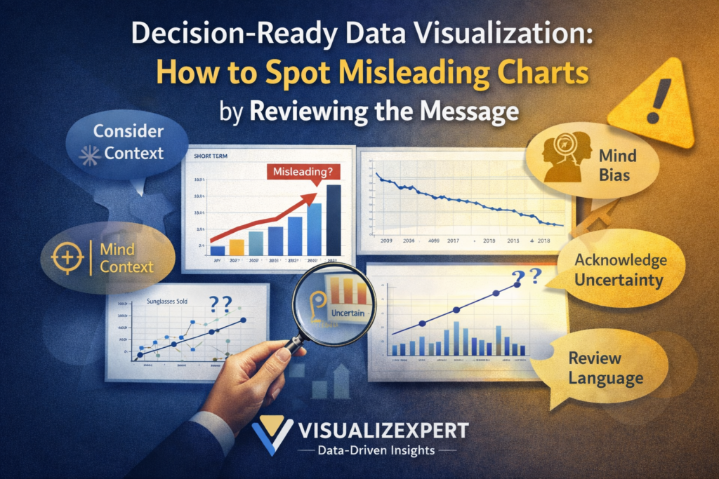
Decision-Ready Data Visualization Starts With Asking “Compared to What?”
One of the most common causes of misleading messages is incomplete comparison. Charts rarely speak in absolutes—they rely on context.
A chart may show an increase, decrease, or difference, but compared to what baseline? A single time period, product category, or region can completely alter the takeaway. Without understanding the comparison being made, viewers may draw conclusions that the data does not support.
This is why analytics and reporting consulting frameworks emphasize comparative clarity. Decision-ready visuals ensure that comparisons answer the right business question, not just a convenient one.
Context Is the Difference Between Insight and Misinformation
Charts that isolate a narrow slice of data often imply trends that disappear when broader context is added. A short-term spike may look alarming, while a long-term view shows stability or improvement.
At VisualizExpert, we frequently encounter dashboards that unintentionally mislead because they lack historical or categorical context. This is especially common in executive analytics dashboards, where limited space can lead to oversimplification.
Good context doesn’t clutter a visual—it strengthens trust.
Correlation Is Not Causation: A Classic Misinterpretation
Even when charts are well-designed, interpretations can go wrong when correlation is mistaken for causation.
Two metrics moving together does not mean one causes the other. External factors often influence both. Without careful interpretation, leaders may invest resources in solving the wrong problem.
This is why strong data visualization services focus on explanation, not just presentation. Visuals should invite thoughtful interpretation rather than encourage quick, unsupported conclusions.
Why Uncertainty Must Be Part of the Message
Data is never perfect. Surveys, forecasts, and samples all contain uncertainty. Ignoring this uncertainty creates false confidence.
Margins of error, confidence intervals, and sample size context are not signs of weak data—they are signs of honest analysis. When uncertainty is hidden, viewers may believe differences are meaningful when they are not.
In enterprise data visualization, acknowledging uncertainty is essential for ethical decision-making. Leaders should understand not only what the data suggests, but how confident they can be in that suggestion.
Language Shapes How Charts Are Understood
Words matter as much as visuals.
Titles, subtitles, labels, and annotations frame how viewers interpret a chart. Emotionally charged language can exaggerate urgency or downplay risk. Poorly chosen terminology can also reinforce bias or dehumanize the subjects represented in the data.
At VisualizExpert, our data storytelling services emphasize inclusive, neutral, and precise language. The goal is clarity—not persuasion.
A chart should describe what the data shows, not what the author wants the audience to believe.
Bias Can Exist Even Without Bad Intent
Not all misleading charts are intentionally deceptive. Many are created by well-meaning analysts who lack training in data literacy or equity-aware design.
Bias can appear through:
- Metric selection
- Data exclusions
- Framing of results
- Cultural assumptions
This is why visual analytics consulting plays a critical role in modern organizations. A second set of expert eyes often reveals blind spots that creators themselves cannot see.
From Charts to Dashboards: Scaling Trust Across the Organization
Misinterpretation doesn’t stop at individual charts—it compounds across dashboards.
A single misleading visual replicated across interactive business dashboards can shape strategy, budgets, and performance reviews. Over time, this erodes trust in analytics altogether.
Organizations investing in Power BI dashboards or modern BI platforms must pair tooling with education. Governance, review processes, and shared standards are essential for consistent interpretation.
How VisualizExpert Helps Build Decision-Ready Visualization
As a specialized data analytics agency, VisualizExpert helps organizations design analytics that leaders can trust.
Our approach combines:
- Custom analytics solutions aligned with real decisions
- KPI dashboard services grounded in business outcomes
- Executive summary dashboards that prioritize clarity over complexity
- Decision-ready data visualization principles applied across reports and dashboards
We don’t just ask whether a chart is accurate—we ask whether it leads to the right decision.
Keep Asking Questions When You Read Charts
Strong data literacy is a habit, not a checklist.
When viewing any chart, ask:
- What is being compared?
- What context is missing?
- How much uncertainty exists?
- How does language influence interpretation?
- Who benefits from this framing?
These questions turn passive viewers into active decision-makers.
Practice Builds Confidence
Interpreting charts is a skill that improves with practice. The more charts you evaluate critically, the easier it becomes to spot misleading messages.
Organizations that invest in data driven decision making empower employees at every level—not just analysts—to challenge assumptions and improve outcomes.
Shared Interpretation Strengthens Organizations
Analytics should never exist in isolation. Discussing charts with peers often reveals alternative interpretations and hidden assumptions.
This collaborative review process strengthens organizational decision-making and reduces the spread of misinformation. It also builds a shared data culture where questions are encouraged—not avoided.
Final Thoughts
Charts are powerful tools—but power requires responsibility.
Decision-ready data visualization is not about making charts more impressive. It’s about making decisions more informed, fair, and defensible.
When leaders learn to review the message behind charts, they move from reacting to visuals to reasoning with evidence.
At VisualizExpert, that shift—from data to decisions—is where real value begins.
Leave a Reply