Category: Uncategorized

  • 11 Data Visualization Techniques for Every Use Case (With Real Business Examples)


    Why Data Visualization Is No Longer Optional

    Modern businesses are drowning in dashboards but starving for clarity.

    Every department has data.
     Every tool promises insights.
     Yet leaders still ask, “What should we do next?”

    This gap exists because data visualization for decision making isn’t about charts — it’s about cognitive clarity. At VisualizExpert, we see this daily: organizations don’t fail due to a lack of data; they fail because visuals don’t support decisions.

    Effective visualization compresses complexity into patterns the human brain can instantly recognize. When done right, it shortens meetings, aligns teams, and accelerates action.


    From Analysis to Action: Where Visualization Fits

    Before diving into techniques, it’s important to understand why visualization matters.

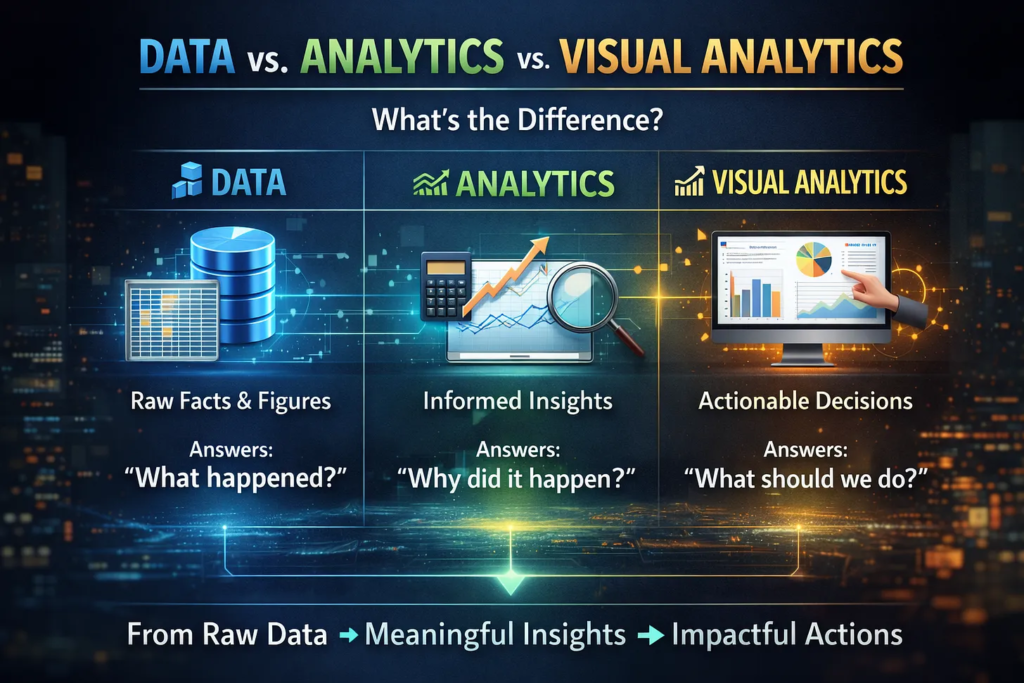
    • Data captures what happened
    • Analytics explains why it happened
    • Visualization enables decisions on what to do next

    This is the foundation of data-driven decision making — and the reason visual analytics has moved from “nice-to-have” to mission-critical.


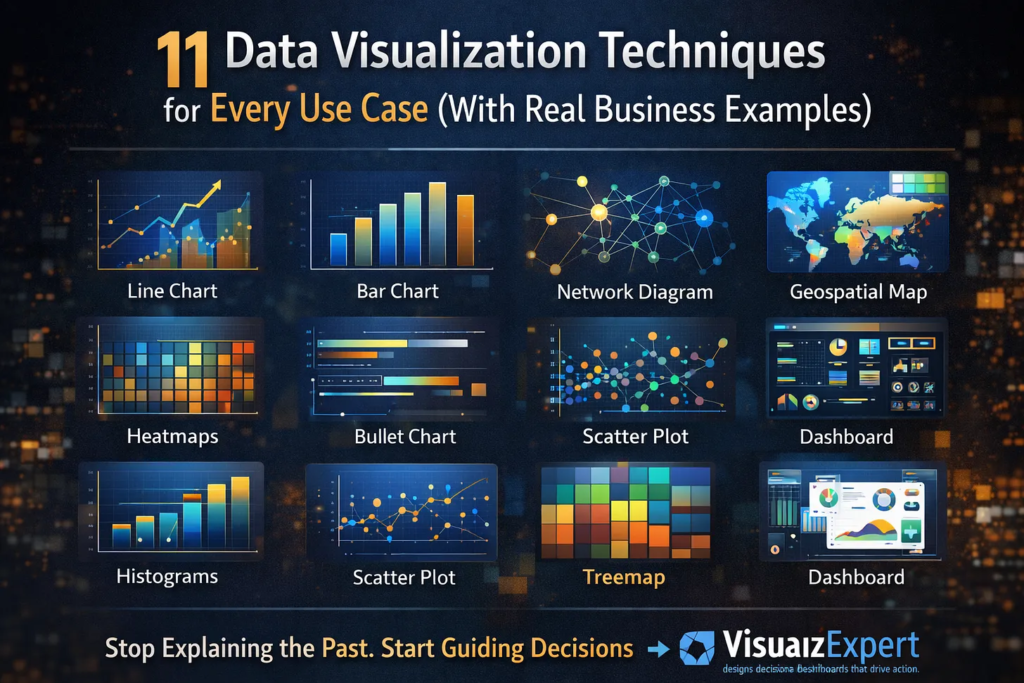
    11 Data Visualization Techniques That Actually Work

    Below are 11 visualization techniques, mapped to real business use cases — not theory.


    1. Line Charts — Tracking Change Over Time

    Best for: Trends, growth, seasonality

    Line charts are ideal when leadership needs to understand momentum. Revenue growth, traffic trends, or cost movement over time become immediately visible.

    Used heavily in executive analytics dashboards, line charts answer one question fast: Are we improving or declining?


    2. Bar Charts — Comparing Categories

    Best for: Rankings, comparisons

    Bar charts excel at showing differences between categories — regions, products, channels, or teams. When paired with KPI dashboard services, they help leaders spot underperformance instantly.


    3. Histograms — Understanding Distribution

    Best for: Frequency, spread, anomalies

    Histograms reveal whether results are consistent or volatile. They’re commonly used in analytics and reporting consulting to identify skewed performance or outliers that averages hide.


    4. Box Plots — Spotting Risk and Variability

    Best for: Outliers, variability

    Box plots are powerful in finance, operations, and HR analytics where understanding risk dispersion matters more than averages.


    5. Scatter Plots — Revealing Relationships

    Best for: Correlation, hypothesis testing

    Scatter plots expose relationships between variables — such as spend vs. return or speed vs. quality. They are often used in custom analytics solutions to validate assumptions before scaling decisions.


    6. Heatmaps — Pattern Recognition at Scale

    Best for: Density, intensity, behavior patterns

    Heatmaps allow instant recognition of peaks and gaps. From user behavior to performance tracking, they’re widely used in interactive business dashboards where speed of interpretation matters.


    7. Treemaps — Part-to-Whole Analysis

    Best for: Portfolio breakdowns

    Treemaps are ideal when showing how components contribute to a whole — budget allocation, product mix, or revenue contribution. They often replace pie charts in enterprise data visualization due to better readability.


    8. Geospatial Maps — Location-Based Insight

    Best for: Regional performance

    Maps make geography actionable. Sales coverage, logistics efficiency, and market penetration come alive when layered onto spatial visuals — especially in BI dashboard solutions.


    9. Network Diagrams — Relationship Mapping

    Best for: Connections, dependencies

    Network diagrams are powerful for fraud detection, supply chains, or organizational analysis. They reveal structures that tables cannot, often forming part of business intelligence consulting engagements.


    10. Bullet Charts — Performance vs Target

    Best for: KPI tracking

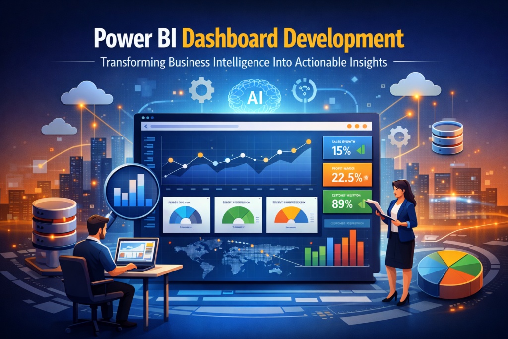
    Bullet charts replace cluttered gauges and are excellent for compact dashboards. They’re frequently used in Power BI Dashboard Development to show actuals versus targets without visual noise.


    11. Dashboards — Decision Systems, Not Reports

    Best for: Ongoing monitoring

    Dashboards aren’t a visualization type — they’re a system. Effective dashboards combine multiple techniques into a narrative aligned with business goals. The best ones focus on decision-ready data visualization, not reporting volume.


    Choosing the Right Visualization (H2 with keyword)

    Decision-Ready Data Visualization: How to Choose What Actually Works

    (Keyword used: Decision-Ready Data Visualization)

    Choosing the wrong chart can destroy even the best analysis.

    Ask these questions before selecting a visualization:

    1. What decision should this support?
    2. Who is the audience?
    3. How fast must the insight be understood?
    4. What action should follow?

    This approach is central to dashboard design consulting, where clarity always beats complexity.


    Tools Matter — but Strategy Matters More

    Tools like Power BI, Tableau, and Looker Studio have democratized visualization. But tools alone don’t guarantee impact.

    Successful organizations invest in:

    • Power BI consulting services to align visuals with strategy
    • Tableau Dashboard Design for storytelling and exploration
    • data visualization services that focus on adoption, not aesthetics

    Without a strategy, dashboards become unused artifacts.


    Best Practices That Separate Good from Great

    Based on real-world delivery experience, here’s what works:

    • One insight per visual
    • Consistent color logic
    • Minimal cognitive load
    • Clear visual hierarchy
    • Metrics tied to accountability

    These principles underpin interactive dashboard design and ensure visuals guide action — not confusion.


    Scaling Visualization Across the Organization

    As organizations mature, visualization must scale:

    • Across departments
    • Across roles
    • Across decision levels

    This is where KPI strategy consulting and analytics strategy services help standardize metrics while allowing flexibility for different users.

    The goal isn’t more dashboards — it’s fewer, trusted ones.


    Why Visualization Is a Leadership Skill Now

    Visualization is no longer just for analysts.

    Executives rely on executive summary dashboards to:

    • Reduce meeting time
    • Align priorities
    • Act with confidence

    That’s why visualization has become a core pillar of analytics transformation consulting — it directly affects decision velocity.


    Final Thought: Where Better Decisions Actually Begin

    Data visualization isn’t about prettier charts.
     It’s about confidence, speed, and alignment.

    When leaders can see what matters, decisions stop being debated and start being executed. That’s how organizations move faster — without guessing.

    If your dashboards still explain the past instead of guiding the next move, it’s time to rethink how you visualize.

    👉 VisualizExpert helps teams design decision-ready dashboards that don’t just display data — they drive action.
     From strategy to execution, the focus stays the same: clarity that scales with growth.

    Because the real value of data isn’t knowing more.
     It’s about making better decisions — every single day.

  • Data vs. Analytics vs. Visual Analytics: Turning Information into Decisions That Scale


    Introduction: Why Data Alone Is No Longer Enough

    Most organizations today are drowning in data — but still starving for clarity. Spreadsheets, dashboards, and reports are everywhere, yet leadership teams continue to ask the same question: “So what should we do?”

    This gap exists because data, analytics, and visual analytics are often treated as interchangeable terms when, in reality, they play very different roles in decision-making. At VisualizExpert, our data analytics services are built on the belief that insights only matter when they lead to confident action.

    Understanding the difference between these three layers is the foundation for building business intelligence systems that don’t just inform — but guide.


    Data: The Raw Material (Not the Deliverable)

    Data is the foundation of everything — but on its own, it has no direction. Tables, logs, metrics, and event streams are simply raw inputs. They answer what happened, but not why or what to do next.

    Many organizations make a critical mistake here: they treat access to data as success. But data without structure, context, and intent increases cognitive load and slows decisions. This is why modern business intelligence consulting focuses less on collecting data and more on shaping it for outcomes.

    At VisualizExpert, we often remind clients: a data source is not a solution. Until data is modeled, validated, and aligned to business goals, it cannot support real decisions.


    Analytics: Making Sense of the Noise

    Analytics is where data begins to create value. Through calculations, aggregations, comparisons, and statistical methods, analytics transforms raw data into insights.

    This is where trends emerge, anomalies are detected, and performance is measured. Solutions like Power BI Dashboard Development and custom analytics solutions allow organizations to move beyond static tables into meaningful analysis.

    However, analytics still has a limitation:
     It explains what is happening — but often stops short of influencing what should happen next.

    Many analytics initiatives fail not because the analysis is wrong, but because the insights are not communicated in a way that decision-makers can quickly understand and trust.


    Visual Analytics: Where Insight Becomes Action

    Visual analytics is the convergence of strategy, data, design, and engineering. It doesn’t just show insights — it shapes how humans perceive, interpret, and act on them.

    This is where data visualization services and interactive business dashboards become critical. Visual analytics reduces time to insight, increases accuracy, and dramatically improves adoption across teams.

    At VisualizExpert, visual analytics means:

    • Designing dashboards around decisions, not metrics
    • Using visual hierarchy to guide attention
    • Embedding business logic directly into reports
    • Enabling users to ask “the next question” without friction

    This is the difference between looking at data and using data.


    Why BI Projects Fail Without Visual Analytics

    Many BI initiatives technically succeed — but practically fail. Why? Because they stop at analytics.

    A dashboard packed with charts but lacking narrative, prioritization, or context creates confusion instead of clarity. This is why BI dashboard solutions must be designed for how executives actually think and decide.

    Without visual analytics:

    • Insights are ignored
    • Dashboards become shelfware
    • Adoption drops
    • ROI disappears

    This is where executive analytics dashboards and decision-ready data visualization change the game — by aligning insights with real-world decisions.


    How VisualizExpert Bridges the Gap

    VisualizExpert operates at the intersection of analytics and decision intelligence. Our approach combines technical depth with business strategy to deliver Power BI consulting services that scale across teams and industries.

    What Makes Our Approach Different

    • Strategy-first design: Every dashboard starts with a decision framework
    • Strong data foundations: Including Power BI data modeling services and optimized schemas
    • Performance-focused engineering: Ensuring speed, reliability, and scalability
    • Human-centered visualization: Dashboards designed for clarity, not decoration

    This is why clients trust us for analytics and reporting consulting that delivers measurable outcomes — not just reports.


    From Static Reports to Living Systems

    Traditional reports answer yesterday’s questions. Visual analytics systems evolve with the business.

    Using tools like Power BI Embedded Analytics and interactive KPI dashboards, we help organizations:

    • Monitor performance in real time
    • Identify risks before they escalate
    • Align teams around shared metrics
    • Build trust in data across leadership

    The result is not just better reporting — but better decision-making at every level.


    The Role of Engineering in Visual Analytics

    Behind every great dashboard is invisible engineering. Poor performance, broken filters, and inconsistent metrics destroy trust instantly.

    That’s why VisualizExpert invests heavily in:

    • Power BI DirectQuery Performance Optimization
    • Secure access using Power BI Row Level Security
    • Scalable architectures through Power BI Managed Services

    Visual analytics only works when the underlying systems are reliable, fast, and governed.


    Beyond BI: Building a Decision Culture

    The future of analytics isn’t more AI or more dashboards — it’s better decisions. Organizations that win are those that treat analytics as a capability, not a project.

    Through Visual Analytics Consulting, VisualizExpert helps teams:

    • Define decision ownership
    • Align metrics with strategy
    • Reduce analysis paralysis
    • Build confidence in insights

    This cultural shift is what turns analytics investments into long-term competitive advantage.

    Power BI Dashboard Development That Drives Decisions

    (Keyword used: Power BI Dashboard Development)

    A well-built Power BI dashboard should not ask users to interpret data — it should guide them. At VisualizExpert, our Power BI dashboards are structured around business questions, not visuals.

    We focus on:

    • Clear KPI hierarchies
    • Scenario-based views
    • Contextual benchmarks
    • Executive-level summaries

    This ensures dashboards are used daily — not reviewed once a month.


    Why Visual Analytics Is the Real Competitive Advantage

    Data is everywhere. Analytics is expected. Visual analytics is rare — and that’s why it matters.

    Organizations that master visual analytics:

    • Decide faster
    • Align teams better
    • Adapt more quickly to change
    • Trust their data

    This is the real ROI of modern BI.


    Final Thoughts: Data Is Potential. Visual Analytics Is Power.

    Data without analytics is noise.
     Analytics without visualization is friction.
     Visual analytics without a strategy is decoration.

    At VisualizExpert, we bring all three together to help organizations move from information to impact — confidently, consistently, and at scale.

    If your dashboards explain the past but don’t guide the future, it’s time to rethink how you use data.

  • Power BI Dashboard Development: Transforming Business Intelligence Into Actionable Insights

    In today’s data-driven world, businesses cannot afford to make decisions based on gut instinct alone. Organizations collect massive amounts of information every day — from sales transactions to customer interactions — but without the right tools, this data remains underutilized. This is where Power BI Dashboard Development comes in. By designing interactive, dynamic, and visually appealing dashboards, companies can convert complex datasets into actionable insights that drive smarter decision-making.

    Effective dashboards do more than just display data; they provide clarity, context, and understanding. With the right Power BI Dashboard Development approach, organizations can monitor key performance indicators (KPIs), track operational efficiency, and identify emerging trends before competitors do. For businesses looking to maximize ROI from their data, investing in structured dashboard development is no longer optional — it’s essential.


    Why Power BI Dashboard Development Matters

    Power BI Dashboard Development bridges the gap between raw data and business intelligence. Modern businesses operate in fast-paced environments where timely insights can make or break a strategy. A well-developed Power BI dashboard allows decision-makers to:

    1. Visualize Data in Real Time: See updated metrics instantly and respond to changes proactively.
    2. Monitor KPIs Across Departments: From finance to marketing, dashboards provide unified insights.
    3. Streamline Reporting Processes: Automated reports reduce manual work and eliminate errors.
    4. Enable Self-Service Analytics: Business users can explore data without needing IT support.

    For example, a logistics company using Power BI dashboards can monitor delivery times, fuel costs, and driver performance simultaneously. By correlating these metrics, managers can make operational improvements, reduce costs, and improve service quality. This is the tangible value that Power BI Dashboard Development delivers.


    Best Practices for Power BI Dashboard Development

    Creating an effective dashboard goes beyond simply dragging charts onto a canvas. Successful Power BI Dashboard Development requires a strategic approach:

    1. Define Business Objectives

    Before building dashboards, it’s critical to understand the key business questions. Are you tracking sales growth? Monitoring operational efficiency? Or measuring marketing campaign performance? Clear objectives guide the dashboard design, ensuring that every visual tells a meaningful story.

    2. Design for the User

    Dashboards must be intuitive and user-friendly. Use clean layouts, consistent color schemes, and logical groupings. Avoid clutter — every chart, table, and KPI should serve a purpose. Remember, a dashboard is not just a display; it’s a decision-making tool.

    3. Optimize Data Models

    A robust data model ensures fast performance and accurate reporting. Implement Power BI Star Schema Design and clean relationships between tables. Proper modeling reduces errors, improves query performance, and enables scalable dashboard solutions.

    4. Leverage DAX for Advanced Analytics

    Complex calculations can be automated using DAX formulas. From dynamic measures to custom KPIs, DAX ensures your dashboards go beyond visualization and provide actionable insights. Optimization of DAX queries also improves performance for large datasets.

    5. Use Interactivity Wisely

    Interactive filters, slicers, and drill-through capabilities allow users to explore data deeply. Interactive business dashboards foster engagement and enable teams to uncover insights themselves, reducing reliance on static reports.


    Common Use Cases of Power BI Dashboard Development

    Organizations across industries leverage Power BI Dashboard Development to solve diverse challenges:

    Sales & Marketing Dashboards

    Track revenue by region, monitor customer acquisition costs, and evaluate campaign effectiveness. Integration with Google Analytics 4 visualizations and other marketing data sources enhances insights.

    Finance & Operations Dashboards

    Visualize budget performance, cash flow trends, and operational KPIs. Real-time dashboards enable finance leaders to make informed decisions and anticipate potential bottlenecks.

    Healthcare Dashboards

    Hospitals and clinics use dashboards to monitor patient outcomes, resource utilization, and operational efficiency. HIPAA-compliant dashboards ensure sensitive patient data is secure while enabling actionable insights.

    Supply Chain & Logistics Dashboards

    Track shipments, inventory levels, and supplier performance. Real-time monitoring improves responsiveness and reduces delays, enhancing overall supply chain resilience.


    How VisualizExpert Excels in Power BI Dashboard Development

    At VisualizExpert, we specialize in end-to-end Power BI Dashboard Development tailored to your business needs. Our team combines technical expertise with domain knowledge to deliver dashboards that are:

    • Insightful: Every metric and chart is purpose-driven.
    • Interactive: Users can drill down into data and explore scenarios.
    • Scalable: Dashboards grow with your business and data complexity.
    • Integrated: Connect seamlessly with your ERP, CRM, Google Analytics, or other data sources.

    Our approach emphasizes analytics strategy services, ensuring that dashboards align with business goals, enable decision-making, and foster a culture of data-driven insights.


    Future Trends in Power BI Dashboard Development

    As BI evolves, Power BI Dashboard Development is embracing new technologies and design philosophies:

    1. AI-Powered Insights: Integration with AI enables predictive analytics, anomaly detection, and automated recommendations.
    2. Mobile-First Dashboards: Users can access insights on-the-go, ensuring timely decisions from anywhere.
    3. Data Storytelling: Dashboards go beyond numbers, incorporating narratives and interactive visualizations that communicate insights clearly.
    4. Real-Time Data Integration: Streaming data from IoT devices, social media, and operational systems allows instant monitoring and response.
    5. Automation & Workflow Integration: Dashboards trigger alerts, workflows, and actions, making BI operational rather than passive.

    By staying ahead of these trends, businesses can turn Power BI dashboards into strategic assets rather than static reports.


    Conclusion

    Effective Power BI Dashboard Development transforms business intelligence into a competitive advantage. By combining robust data models, optimized DAX calculations, and intuitive design, companies can turn raw data into actionable insights that drive growth and efficiency.

    At VisualizExpert, we partner with organizations to deliver custom dashboards that empower decision-makers, streamline reporting, and foster a culture of data-driven success. Whether it’s enterprise-level reporting, interactive KPI dashboards, or automated analytics solutions, our expertise ensures your data works for you — fast, precise, and insightful.

    Investing in Power BI Dashboard Development isn’t just about visualization — it’s about building a foundation for smarter, faster, and more confident business decisions. With the right dashboards, businesses don’t just react to the market — they shape it.

  • Power BI Migration from Excel: What the 2026 Deprecation Means for Your Business Analytics


    The recent announcement from Microsoft about changes to Excel and CSV imports in Power BI Service is more than a routine product update — it’s a clear signal that organizations must rethink how they build and maintain analytics. With legacy Excel and CSV imports being deprecated in 2026, businesses that still rely on old file-based workflows face stale data, broken refresh cycles, and growing reporting risk.

    This is exactly where a well-planned Power BI Migration from Excel becomes essential — not just as a technical fix, but as a strategic analytics upgrade.

    At VisualizExpert, this shift is seen as an opportunity: a chance for organizations to move from fragile spreadsheets to governed, scalable, and insight-driven BI systems that actually support growth.


    Understanding the Power BI Excel Import Deprecation

    Microsoft has confirmed that reports created using the old Excel and CSV import experience in Power BI Service will no longer refresh after July 31, 2026. Even earlier, by May 31, 2026, users will no longer be able to create new semantic models using that legacy option.

    What does this mean in practical terms?

    • Reports will continue to open, but the data will become outdated
    • Scheduled refresh options will disappear
    • Models can’t be edited or downloaded
    • Business users may continue making decisions based on stale numbers — without realizing it

    This isn’t just an IT inconvenience. It’s a business risk.


    Why Excel-Based Reporting Was Always a Bottleneck

    Excel has long been the starting point for analytics — and that made sense. It’s flexible, familiar, and fast for early-stage reporting. But as organizations scale, Excel introduces serious limitations:

    • Manual data updates and version conflicts
    • No centralized governance or security
    • Poor performance with growing data volumes
    • Limited ability to support real-time or near–real-time insights

    The deprecation simply exposes a truth that’s been there all along: Excel is not a sustainable backbone for enterprise analytics.


    Why Power BI Migration from Excel Is Now Non-Negotiable

    A forced change — or a strategic upgrade?

    Many teams see the 2026 deadline as a forced migration. The smarter approach is to treat it as a chance to modernize analytics architecture.

    A proper Power BI Migration from Excel goes beyond “rebuilding the same report.” It involves:

    • Replacing static files with reliable data sources
    • Designing reusable, scalable semantic models
    • Improving data accuracy, refresh reliability, and performance
    • Aligning reports with real business questions — not spreadsheet layouts

    This is where most DIY migrations fail. Teams recreate Excel logic inside Power BI without redesigning the underlying model — leading to the same problems in a new tool.


    What a Strategic Migration Actually Looks Like

    A structured migration approach focuses on long-term value rather than quick fixes.

    1. Analytics Discovery (Not Just File Conversion)

    Teams must first understand:

    • Which Excel reports are business-critical
    • Who uses them and why
    • What decisions depend on them

    This prevents migrating unused or redundant reports and ensures focus on high-impact analytics.

    2. Data Model Redesign

    Excel files often mix raw data, calculations, and presentation. In Power BI, these layers must be separated:

    • Source systems (databases, APIs, cloud tools)
    • Clean, governed semantic models
    • Optimized measures for performance and clarity

    This step alone typically improves refresh speed and report usability.

    3. Business Logic Validation

    Excel formulas rarely scale well. During migration, business rules are reviewed, validated, and standardized — so finance, sales, and operations all see the same truth.

    4. Performance and Refresh Optimization

    Unlike legacy imports, modern Power BI connectors support:

    • Scheduled refresh
    • Incremental data updates
    • Secure access and governance

    This eliminates manual intervention and reduces reporting delays.


    Business Impact: Beyond Technical Compliance

    Migrating before the deadline isn’t just about avoiding broken dashboards. The real value lies in what businesses gain after migration:

    Better Decision Confidence

    Executives no longer question whether numbers are up to date or “which Excel is correct.”

    Faster Reporting Cycles

    What once took days of manual updates becomes automated and reliable.

    Scalable Analytics

    New departments, new data sources, and new KPIs can be added without rebuilding everything from scratch.

    Stronger Data Governance

    Security, access control, and auditability are built into the platform — not enforced through process discipline alone.


    Common Migration Mistakes to Avoid

    As organizations rush to meet the 2026 deadline, several predictable mistakes appear:

    • Recreating Excel layouts instead of redesigning models
    • Migrating everything instead of prioritizing high-value reports
    • Ignoring performance until users complain
    • Treating migration as an IT task rather than a business initiative

    These shortcuts often result in Power BI dashboards that look modern but behave just like spreadsheets — fragile and hard to trust.


    The Role of Expert Guidance in Migration

    A successful migration sits at the intersection of technology, business context, and analytics strategy. That’s why specialized support matters.

    VisualizExpert supports organizations by:

    • Identifying which legacy reports are at risk
    • Designing future-proof Power BI data models
    • Aligning dashboards with executive decision-making
    • Ensuring adoption across teams — not just deployment

    The goal isn’t simply to replace Excel files, but to create analytics systems that scale with the business.


    Preparing for 2026 — Starting Now

    The worst time to address the deprecation is mid-2026, when reports stop refreshing, and leadership starts asking uncomfortable questions.

    The best time is now — when there’s room to:

    • Audit existing Excel-based reports
    • Define a clear analytics roadmap
    • Migrate in phases without disruption

    Organizations that act early don’t just avoid risk — they gain a competitive analytics advantage.

    Final Thoughts

    Microsoft’s decision to retire the old Excel and CSV import experience is a clear message: modern analytics requires modern foundations. Businesses that continue relying on legacy workflows will face increasing friction, while those that invest in structured BI will move faster and decide smarter.

    A thoughtful Power BI Migration from Excel isn’t just a technical necessity — it’s a strategic upgrade to how your organization understands and uses data.

    If your dashboards still depend on spreadsheets behind the scenes, 2026 isn’t the problem. It’s the deadline.

    For organizations looking to move early and migrate with confidence, VisualizExpert helps turn this transition into a long-term analytics advantage — ensuring reports stay refreshable, scalable, and aligned with real business decisions.

    And deadlines are best met with a plan.

  • Power BI Dashboard Development Enters a New Era with Modern Visual Tooltips


    Power BI Dashboard Development has quietly crossed an important milestone. With the general availability of modern visual tooltips, Power BI reports are no longer just static representations of data — they have become more interactive, intuitive, and decision-oriented. This update, now live across Power BI Desktop, web, mobile, Microsoft Teams, and embedded experiences, fundamentally changes how users explore insights inside dashboards.

    For organizations investing in enterprise analytics, this is more than a UI enhancement. It’s a shift in how dashboards guide behavior, reduce friction, and accelerate understanding. At VisualizExpert, we see modern tooltips as a critical building block for next-generation dashboard experiences — especially when reports must scale across business units, leadership layers, and operational teams.


    Why Modern Visual Tooltips Matter in Power BI

    Traditional tooltips in Power BI served a narrow purpose: showing the value behind a data point. While functional, they often required users to leave the flow of analysis to take action — right-clicking, navigating menus, or moving to other pages to explore further.

    Modern visual tooltips change that interaction model.

    They bring context, action, and continuity directly into the moment of exploration. When users hover over a bar, line, or data point, they are no longer just observing data — they are invited to interact with it.

    This matters because dashboards are not consumed passively. They are used under time pressure, during meetings, and in decision-making moments where every extra click creates friction.


    Power BI Dashboard Development and Interactive Data Exploration

    One of the most impactful additions in modern tooltips is the Actions footer, which allows users to drill down, drill up, or drill through directly from the tooltip.

    What this changes for dashboard users:

    • Exploration becomes intuitive, not instructional
    • Insights unfold naturally without breaking focus
    • Users no longer need training just to navigate reports

    From a Power BI Dashboard Development perspective, this enables a new design philosophy: dashboards that guide users forward, instead of forcing them to search for the next step.

    At VisualizExpert, we design dashboards where tooltips act as micro-navigation layers — helping users move from summary to detail without overwhelming the main canvas.


    Consistent Design Through Theme-Based Tooltip Styling

    Another critical improvement is that modern visual tooltips now inherit styling from the report theme. Fonts, colors, and transparency are automatically aligned, creating a seamless and professional look across all visuals.

    This is especially important for enterprise dashboards where:

    • Brand consistency matters
    • Reports are shared with executives and external stakeholders
    • Multiple authors contribute to the same report ecosystem

    Theme-based styling ensures that tooltips do not become visual outliers. Instead, they reinforce trust by maintaining consistency across the entire dashboard experience.

    VisualizExpert leverages this capability to help organizations standardize dashboard design at scale — reducing manual formatting effort while improving visual quality.


    No Disruption to Existing Reports

    One of the most enterprise-friendly aspects of this update is that existing reports remain unchanged unless authors choose to adopt the new experience.

    • New reports use modern tooltips by default
    • Existing reports can be upgraded selectively using “Reset to default”

    This gives BI teams full control over rollout timing, testing, and governance — without introducing unexpected changes to business-critical dashboards.

    For organizations managing hundreds or thousands of reports, this controlled adoption is essential.


    Designing Tooltips for Decision-Making, Not Decoration

    Modern tooltips should not be treated as decorative add-ons. When used intentionally, they become one of the most powerful interaction layers in a Power BI dashboard.

    At VisualizExpert, our Power BI Dashboard Development approach treats tooltips as:

    • Decision accelerators — showing just enough context to move forward
    • Navigation bridges — connecting summary views to deeper analysis
    • Trust builders — reinforcing clarity and consistency

    We design tooltip content to answer the next logical question a user might have — without cluttering the main visual.


    Enterprise Use Cases Where Modern Tooltips Shine

    Modern visual tooltips unlock value across multiple business scenarios:

    Executive Dashboards

    Executives can drill into performance drivers without leaving high-level views, keeping conversations focused and efficient.

    Operational Reporting

    Teams can move from anomaly detection to root-cause analysis in seconds, directly from the point of interest.

    Embedded Analytics

    When Power BI reports are embedded in applications, tooltips reduce the need for custom navigation logic — simplifying development while improving usability.

    These are the environments where thoughtful Power BI Dashboard Development delivers measurable ROI.


    VisualizExpert’s Approach to Modern Power BI Experiences

    Modern tooltips are most effective when they are part of a broader dashboard strategy. VisualizExpert helps organizations align Power BI features with business outcomes by focusing on:

    • Interaction-first dashboard design
    • Scalable theming and layout standards
    • Clear analytical pathways from overview to action

    We don’t just enable features — we design experiences that make those features meaningful.

    By combining platform knowledge with strong visual analytics principles, we help teams turn Power BI dashboards into tools people actually want to use.


    Analytics Maturity Depends on User Experience

    As BI platforms mature, the differentiator is no longer access to data — it’s how easily people can work with it.

    Modern visual tooltips support:

    • Faster insight discovery
    • Reduced cognitive load
    • More confident decision-making

    These are not cosmetic gains. They directly impact adoption, trust, and the perceived value of analytics investments.


    Final Thoughts: Small Interaction, Big Impact

    Modern visual tooltips may seem like a small enhancement, but they reflect a larger shift in Power BI’s evolution — from reporting to guided analytics.

    For organizations serious about Power BI Dashboard Development, this update is an opportunity to rethink how users interact with data at every touchpoint.

    At VisualizExpert, we believe the best dashboards don’t just show information — they anticipate questions, reduce friction, and support action.

    And sometimes, the most powerful changes happen right where users hover.

  • Enterprise Data Observability at Scale with Tableau Dashboard Design by VisualizExpert


    Introduction: Why Observability Is the New BI Standard

    As organizations scale their analytics platforms, dashboards alone are no longer enough. Enterprises running Tableau Cloud across departments, geographies, and thousands of users now face a deeper challenge: observability. Knowing what dashboards exist is easy. Understanding how they are used, who changed what, why performance degrades, and where governance breaks down is where modern analytics leadership begins.

    At VisualizExpert, we help enterprises move beyond static reporting through Tableau Dashboard Design that is supported by enterprise-grade monitoring, governance, and platform intelligence. With the introduction of Tableau Cloud’s Platform Data API, organizations now have unprecedented visibility into their analytics environment — and the opportunity to turn that visibility into action.


    Tableau Dashboard Design Built for Enterprise Governance

    Great dashboards do more than display metrics. They guide decisions, enforce consistency, and build trust. VisualizExpert approaches Tableau Dashboard Design with governance and observability in mind, ensuring dashboards remain valuable as adoption grows.

    Using event-level telemetry from Tableau Cloud, we help organizations understand:

    • Which dashboards are actively used by leadership
    • Which assets create performance bottlenecks
    • Where permissions and access controls change over time

    This transforms dashboards from visual artifacts into governed business assets.


    API Integration Services That Power Platform Observability

    Observability data is only valuable when it is accessible and actionable. The Platform Data API provides rich event logs, but real impact comes from how that data is integrated. VisualizExpert’s API Integration Services enable enterprises to pull Tableau Cloud activity data into data warehouses, monitoring systems, and analytics platforms of their choice.

    With this approach, teams can monitor:

    • User logins and administrative actions
    • Extract refresh failures, including Bridge execution
    • Content changes across sites and projects

    APIs don’t just move data. They create accountability and transparency at scale.


    Creating a Unified Reporting Data Model for Analytics Operations

    Raw event logs create noise without structure. We at VisualizExpert build a Unified Reporting Data Model that connects Tableau platform data with business systems such as CRM, finance, and marketing platforms.

    This allows leaders to answer high-impact questions like:

    • Which dashboards support revenue-critical decisions?
    • Where is BI adoption slowing down?
    • Which users or groups introduce governance risk?

    By unifying observability data with business context, analytics operations become measurable and optimizable.


    Enterprise Tableau Solutions Designed to Scale

    As Tableau Cloud deployments grow into the thousands of users, traditional admin workflows break down. VisualizExpert delivers enterprise Tableau solutions that embed observability into the analytics lifecycle itself.

    Using Platform Data API insights, we help enterprises:

    • Proactively identify unused or redundant assets
    • Detect abnormal access patterns
    • Maintain compliance across regions and teams

    The result is a Tableau environment that scales without losing control.


    Tableau Data Integration Without Performance Blind Spots

    Modern analytics platforms depend on complex data pipelines. VisualizExpert specializes in Tableau data integration architectures that are observable, auditable, and resilient.

    By tracking refresh activity, query behavior, and data latency, organizations gain confidence that:

    • Data freshness meets business expectations
    • Performance issues are diagnosed early
    • Operational failures are visible, not hidden

    Observability ensures data trust doesn’t degrade as complexity increases.


    Visual Analytics Consulting for Platform-Level Decisions

    Most organizations focus analytics on business performance, but few analyze their analytics platforms themselves. VisualizExpert’s Visual Analytics Consulting practice applies analytics thinking to BI operations.

    By visualizing platform usage, content sprawl, and admin activity, leaders can:

    • Optimize licensing and infrastructure costs
    • Improve self-service adoption
    • Align analytics investments with business value

    This is analytics about analytics — and it changes how platforms are managed.


    Interactive Tableau Dashboards for Admin and Leadership Teams

    Observability data becomes powerful when it is easy to explore. VisualizExpert builds interactive Tableau dashboards specifically for administrators, COEs, and executive stakeholders.

    These dashboards surface:

    • Usage trends across departments
    • High-risk permission changes
    • Performance anomalies over time

    Instead of reacting to incidents, teams gain continuous situational awareness.


    Tableau KPI Dashboards That Measure Analytics Maturity

    Analytics maturity is measurable. Using Platform Data API insights, VisualizExpert designs Tableau KPI dashboards that track platform health indicators such as adoption, performance reliability, and governance coverage.

    These dashboards help organizations:

    • Benchmark analytics maturity over time
    • Identify gaps in governance or training
    • Tie platform improvements to business outcomes

    BI success becomes quantifiable, not subjective.


    Tableau Automation Services for Scalable Administration

    Manual administration does not scale. VisualizExpert provides Tableau automation services that leverage observability data to trigger workflows automatically.

    Examples include:

    • Alerting on failed refreshes or access violations
    • Automated cleanup of unused content
    • Scheduled reporting for audit and compliance teams

    Automation turns observability into operational efficiency.


    Enterprise BI Managed Services with Built-In Observability

    For organizations seeking long-term support, VisualizExpert offers Enterprise BI Managed Services that incorporate monitoring, governance, and optimization as ongoing capabilities.

    By continuously analyzing platform data, we ensure:

    • Performance remains consistent as usage grows
    • Governance adapts to organizational change
    • Analytics platforms deliver sustained business value

    Observability is not a one-time setup — it’s an operating model.


    Why VisualizExpert for Tableau Cloud Observability

    The Tableau Cloud Platform Data API marks a turning point for enterprise analytics management. But APIs alone don’t create insight. Strategy, modeling, integration, and visualization do.

    At VisualizExpert, we combine deep Tableau expertise with modern data engineering and governance practices to help organizations:

    • Understand their analytics platforms at scale
    • Reduce risk and operational friction
    • Enable confident, data-driven decision-making

    Observability is the foundation of trust. And trust is the foundation of analytics that actually works.

  • API Integration Services for Power BI: A Practical Guide to Visualizing Real-Time Data


    Introduction: Why APIs Matter for Modern Power BI Analytics

    Modern organizations no longer rely on static spreadsheets or delayed reports to make decisions. Today’s analytics environments demand real-time access, scalability, and flexibility, especially when building enterprise-grade dashboards. This is where API integration services play a critical role.

    At VisualizExpert, we help businesses unlock the full potential of Power BI dashboards by integrating APIs that connect cloud platforms, CRMs, marketing tools, ERPs, and custom applications directly into a unified analytics layer. APIs allow Power BI to consume structured data dynamically, ensuring dashboards reflect the most accurate and up-to-date business performance.

    This guide explains how APIs support Power BI visualization, how to architect them correctly, and how VisualizExpert applies best-in-class business intelligence consulting practices to ensure performance, security, and decision-ready insights.


    What Is an API and How Does It Power BI?

    An API (Application Programming Interface) acts as a standardized bridge between systems. In Power BI environments, APIs enable automated data exchange without manual uploads or fragile file-based workflows.

    For example:

    • A CRM exposes customer data via an API
    • Power BI securely requests that data
    • Dashboards refresh automatically based on defined intervals

    This architecture supports real-time data dashboards, eliminates duplication, and improves reporting accuracy across teams.


    Choosing the Right API Strategy for Power BI

    Not all APIs are designed equally for analytics workloads. Choosing the right approach impacts dashboard responsiveness, scalability, and user trust.

    Common API Types Used in BI

    • REST APIs for operational and transactional data
    • GraphQL APIs for flexible, selective data retrieval
    • Secure OAuth-based APIs for enterprise authentication

    VisualizExpert evaluates API readiness as part of our analytics and reporting consulting process, ensuring the source systems can support Power BI refresh schedules and concurrency demands.


    Designing APIs for Power BI Data Modeling

    Poor API design leads to slow dashboards, broken refreshes, and inconsistent KPIs. That’s why API structure must align with Power BI modeling principles.

    Power BI Star Schema Design (H2)

    A well-designed API should support Power BI Star Schema Design, separating fact data (metrics) from dimension data (attributes). This enables:

    • Faster query performance
    • Cleaner DAX calculations
    • Scalable Power BI data modeling services

    VisualizExpert ensures APIs expose analytics-ready entities, minimizing transformations during report development.


    Structuring API Data for Performance and Accuracy

    When APIs are built for analytics use cases, they must deliver consistent data types, predictable pagination, and stable field naming.

    Key considerations include:

    • Date formatting compatible with Power BI time intelligence
    • Numeric precision for financial and KPI reporting
    • Logical aggregation levels for executive dashboards

    This foundation enables interactive business dashboards that remain performant even as data volumes grow.


    Securing APIs for Enterprise Power BI Deployments

    Security is non-negotiable when APIs power analytics environments. Power BI dashboards often surface sensitive operational and financial data.

    VisualizExpert implements:

    • Token-based authentication
    • Role-based access controls
    • Power BI Row Level Security aligned with API permissions

    This ensures that users only see data relevant to their role, whether they are executives, analysts, or operational managers.


    Connecting APIs to Power BI

    Power BI supports API ingestion through:

    • Native Web connectors
    • Custom Power Query logic
    • Secure gateway configurations

    When implemented correctly, APIs enable:

    • Power BI DirectQuery performance for near real-time insights
    • Automated refresh pipelines
    • Reduced dependency on manual ETL processes

    Our Power BI integration services ensure reliable refresh cycles without throttling or data loss.


    Optimizing Power BI Dashboards with API Data

    Once API data is ingested, optimization becomes the next priority.

    DAX Formula Optimization (H2)

    API-driven models often involve high-volume datasets. DAX Formula Optimization ensures calculations remain efficient, responsive, and reusable.

    VisualizExpert applies:

    • Measure-first modeling
    • Optimized filter context handling
    • KPI-ready semantic layers

    This results in fast, reliable KPI dashboard services tailored for leadership decision-making.


    Real-World Use Cases: API-Driven Power BI Dashboards

    API integrations unlock advanced analytics across industries:

    • Executive analytics dashboards pulling live financial and operational KPIs
    • Marketing dashboards combining ad platforms, GA4, and CRM data
    • Sales performance dashboards with pipeline and conversion metrics
    • Operations dashboards monitoring real-time system health

    These solutions align directly with VisualizExpert’s data visualization services, designed for clarity, accuracy, and business impact.


    Managing and Scaling API-Powered BI Solutions

    As organizations scale, API governance becomes critical.

    VisualizExpert provides Power BI managed services that include:

    • API performance monitoring
    • Refresh failure diagnostics
    • Version control and schema change management

    This ensures long-term stability and consistent reporting across departments.


    Why VisualizExpert for API-Driven Power BI Analytics?

    VisualizExpert combines technical depth with business alignment. Our approach goes beyond dashboards — we build analytics systems that leadership trusts.

    Our expertise includes:

    • Power BI dashboard development
    • Custom Power BI consulting
    • Enterprise data visualization
    • Data analytics services for scalable growth

    We design APIs and dashboards together, ensuring insights flow seamlessly from source systems to executive decision-makers.


    Conclusion: Turning APIs Into Decision-Ready Insights

    APIs are no longer optional in modern analytics — they are foundational. When designed and integrated correctly, APIs enable Power BI to deliver real-time, scalable, and secure insights across the organization.

    With VisualizExpert’s BI dashboard solutions, businesses move beyond static reporting toward decision-ready data visualization that drives measurable outcomes.

    If your organization is ready to modernize reporting, automate data flows, and scale analytics confidently, API-powered Power BI dashboards are the next step — and VisualizExpert is the partner to make it happen.

  • The Role of API Integration Services in Modern Data Visualization


    Introduction: Why Data Visualization Depends on APIs More Than Ever

    Modern organizations don’t struggle with a lack of data.
     They struggle with connecting it, controlling it, and visualizing it in a meaningful way.

    As businesses adopt multiple platforms — CRMs, marketing tools, ERP systems, cloud databases — the need for API integration services becomes critical. APIs act as the connective layer that allows data to flow seamlessly into dashboards, analytics platforms, and executive reports.

    At Visualizexpert, we see API integration as the foundation of effective data visualization services. Without it, dashboards are delayed, incomplete, or misleading. With it, leaders get timely, accurate, and actionable insights — exactly when they need them.


    What Is an API and Why It Matters for Data Visualization

    An API (Application Programming Interface) defines how one system communicates with another. In analytics and BI, APIs enable tools like Power BI, Tableau, and Looker Studio to pull data from multiple sources in a controlled and scalable way.

    Instead of manually exporting files or relying on static reports, APIs allow:

    • Automated data refresh
    • Real-time or near–real-time updates
    • Consistent data definitions across dashboards

    This is especially important when building interactive business dashboards that decision-makers rely on daily.


    Why Businesses Use API Integration for Data Visualization

    Organizations working with Visualizexpert typically turn to API-driven analytics for four core reasons:

    1. Unified Access to Disparate Data Sources

    APIs make it possible to bring together data from:

    • CRM systems
    • Marketing platforms
    • Financial databases
    • Cloud data warehouses

    This unified access enables enterprise data visualization without forcing teams to manage fragmented datasets manually.

    2. Greater Control Over What Gets Visualized

    With APIs, data teams can filter, aggregate, and transform data before it reaches the dashboard.
     This ensures:

    • Cleaner metrics
    • Faster dashboards
    • Fewer inconsistencies across reports

    This level of control is essential for executive analytics dashboards and KPI reporting.

    3. Improved Accuracy and Trust in Reports

    When dashboards pull directly from source systems via APIs, the risk of outdated or mismatched data drops significantly.
     This builds confidence in data-driven decision making, especially for leadership teams.

    4. Performance and Scalability

    Large datasets can overwhelm BI tools if not handled correctly. APIs allow businesses to:

    • Optimize queries
    • Limit unnecessary data pulls
    • Improve dashboard performance

    This is critical for real-time data dashboards and operational reporting.


    How API Integration Services Improve BI Performance

    API Integration Services for Scalable Analytics (H2)

    At Visualizexpert, our API integration services are designed to support growth — not just reporting.

    We focus on:

    • Secure API connections
    • Optimized data pipelines
    • Scalable data models

    This ensures BI platforms like Power BI and Tableau can handle increasing data volumes without performance degradation.

    Our approach supports:

    • Power BI integration services
    • Tableau data integration
    • Cloud data warehouse integration

    The result is analytics infrastructure that grows with your business.


    API Integration in Power BI, Tableau, and Looker Studio

    Different BI tools leverage APIs in different ways:

    Power BI

    APIs enable:

    • Automated refresh schedules
    • DirectQuery optimization
    • Embedded analytics for applications

    This supports advanced use cases like Power BI dashboards, Power BI data modeling, and Power BI KPI tracking.

    Tableau

    API integration enhances:

    • Live data connections
    • Multi-source blending
    • Interactive storytelling

    This is key for Tableau dashboard services and high-impact visual narratives.

    Looker Studio

    APIs unlock:

    • Marketing and SEO dashboards
    • Real-time campaign tracking
    • Shareable stakeholder reports

    This makes Looker Studio ideal for agile, client-facing analytics.


    Two Ways to Use APIs for Data Visualization

    1. BI Tools with Built-in API Support

    Most modern BI platforms allow API connections without heavy development work. This approach is ideal when:

    • Speed matters
    • Use cases are well-defined
    • Data sources are standardized

    It’s commonly used for BI dashboard solutions and marketing analytics.

    2. Custom API and Data Pipeline Engineering

    For complex environments, custom APIs and pipelines offer full control. This approach enables:

    • Custom business logic
    • Advanced transformations
    • Enterprise-grade scalability

    Visualizexpert often applies this model for automated data pipeline engineering and large-scale analytics ecosystems.


    Best Practices for API-Driven Data Visualization

    Based on real-world projects, here are three best practices we follow:

    Use Multiple Data Sources Strategically

    APIs make it easy to combine datasets — but more isn’t always better. Focus on data that directly supports business outcomes.

    Apply Filtering and Aggregation Early

    Pre-processing data via APIs improves performance and clarity. Dashboards should answer questions, not overwhelm users.

    Balance Historical and Real-Time Data

    Not every metric needs to be real-time. APIs allow you to design dashboards that combine trend analysis with live monitoring.


    Why Visualizexpert Focuses on API-First Analytics

    At Visualizexpert, we believe dashboards are only as good as the data architecture behind them.

    Our services combine:

    • Business intelligence consulting
    • Custom analytics solutions
    • Interactive dashboard design
    • Data storytelling services

    By anchoring everything in API-driven integration, we help organizations move from static reports to decision-ready data visualization.

    We don’t just connect data — we design systems that leaders can trust.


    Conclusion: API Integration Is the Backbone of Modern BI

    Data visualization isn’t about charts.
     It’s about clarity, speed, and confidence in decisions.

    API integration services make this possible by ensuring data is accurate, timely, and scalable across BI platforms. Whether you’re building executive dashboards or operational analytics, APIs are no longer optional — they’re foundational.

    If you’re investing in analytics, investing in the right integration strategy is what separates dashboards that look good from dashboards that actually drive outcomes.

    If your dashboards need cleaner data, faster performance, and better integration, see how Visualizexpert delivers API-first data visualization solutions at https://visualizexpert.com/

  • How to Manage Charts and Pages in Looker Studio for Scalable, Role-Based Dashboards

    As analytics teams build more advanced Looker Studio reports, the challenge is no longer data availability — it’s relevance. Founders, executives, marketers, and analysts often view the same dashboard, but they don’t need the same level of detail. Without control, dashboards become cluttered, confusing, or duplicated across teams.

    This is where managing charts and pages effectively becomes critical. With recent updates, Looker Studio now supports granular visibility controls, smarter page management, and flexible report design patterns that reduce duplication and improve clarity.

    At VisualizExpert, we see this shift as a natural evolution in data analytics services — moving from static dashboards to adaptive, audience-aware reporting systems. This guide explains how to manage charts and pages in Looker Studio and why these features matter for scalable business intelligence.

    What’s Changed in Looker Studio Chart and Page Management

    Historically, teams handled different audiences by cloning reports. One version for leadership, one for clients, one for internal teams. Over time, this approach created maintenance overhead and version confusion.

    With recent updates, Looker Studio enables:

    • Chart-level control visibility
    • Page duplication and hiding
    • Role-aware dashboards using variables
    • Cleaner navigation for complex reports

    These improvements align with modern business intelligence consulting principles: one trusted dataset, one report, multiple perspectives.

    Why Visibility Control Matters More Than Design

    Dashboards fail when they try to show everything to everyone. Founders want outcomes. Teams need diagnostics. Clients expect clarity.

    Visibility controls allow teams to:

    • Hide internal calculations
    • Reduce cognitive overload
    • Keep advanced analysis accessible without overwhelming viewers

    This shift supports better data visualization services, where clarity drives decisions instead of decoration.

    How to Control Visibility for Charts and Components

    Looker Studio allows charts, text blocks, tables, and images to be conditionally displayed based on variables.

    Basic setup:

    1. Open the report in Edit mode
    2. Select a chart or component
    3. Click the three-dot menu
    4. Choose Control visibility

    You can define whether a component:

    • Is always visible
    • Is always hidden
    • Appears only when a condition is met

    This enables interactive business dashboards that adapt to the viewer without duplicating reports.

    Using Group Membership Variables (Pro Feature)

    For teams using Looker Studio Pro, group membership variables unlock identity-aware reporting.

    These variables evaluate:

    • Viewer email addresses
    • Google Group membership

    When the condition matches, the chart or page is shown.

    This is especially valuable for:

    • Agencies managing multiple clients
    • Enterprises with role-based reporting
    • Teams delivering enterprise data visualization at scale

    Instead of managing access through manual filters, visibility adapts automatically.

    Managing Pages: Duplicate, Hide, Rename, Reorder

    Chart control is only part of the experience. Page-level management shapes how users move through a report.

    Looker Studio allows you to:

    • Duplicate pages to reuse layouts
    • Rename pages for clarity
    • Reorder pages to guide narrative flow
    • Hide pages from viewers while retaining edit access

    These features support cleaner BI dashboard solutions, especially for long or multi-functional reports.

    Managing Visibility in Automated Looker Studio Dashboards

    When teams build Automated Looker Studio Dashboards, visibility management becomes essential.

    Automation removes manual updates — but without visibility rules, automation can amplify noise.

    Effective visibility management ensures:

    • Executives see KPIs, not raw tables
    • Teams access diagnostics when needed
    • Stakeholders receive clean, focused views

    This is how automation supports decision-making instead of overwhelming it.

    Practical Use Cases for Control Visibility

    1. Executive Reporting

    Executives need trends, not tables. Visibility controls allow teams to surface executive analytics dashboards without exposing underlying complexity.

    2. Multi-Team or Multi-Client Reporting

    One report can serve multiple audiences by showing only relevant sections — a core principle in scalable analytics and reporting consulting.

    3. Cleaner Marketing and Performance Reports

    Marketers can focus on outcomes while analysts retain access to deeper views, such as Looker Studio marketing analytics and performance diagnostics.

    Limitations and Governance Considerations

    Visibility controls improve UX — but they are not a replacement for security.

    Key limitations:

    • Group variables require Pro access
    • Editors can remove visibility logic if permissions allow
    • Sensitive data should still rely on proper data access controls

    This is why visibility must complement — not replace — strong KPI dashboard services and governance practices.

    Why Visibility Control Is a Strategy Decision, Not a Feature

    Visibility management reflects analytics maturity. Teams that control what users see:

    • Reduce confusion
    • Improve trust
    • Accelerate decisions

    At VisualizExpert, we view this as part of custom analytics solutions — designing dashboards that respect how decisions are actually made.

    How VisualizExpert Helps Teams Scale Looker Studio Reporting

    As a specialized Data Analytics Agency, VisualizExpert helps organizations:

    •  role-based Looker Studio reports
    • Implement visibility logic aligned with business goals
    • Build scalable reporting frameworks that reduce duplication
    • Deliver dashboards leaders actually use

    We don’t just design charts. We design systems that support data-driven decision-making.

    Final Thoughts

    Managing charts and pages in Looker Studio is no longer just a design task — it’s a strategic capability. Visibility controls, page management, and automation allow teams to move from static reporting to adaptive analytics.

    When dashboards show the right information to the right people at the right time, reporting becomes an asset instead of a burden.

    If your Looker Studio reports are growing in complexity, mastering visibility controls isn’t optional — it’s foundational.

    At VisualizExpert, we help teams build dashboards that scale with the business, not against it.

  • Why Founders Should Stop Asking for Reports and Start Asking Better Questions

    Modern founders don’t lack dashboards. They lack clarity.

    Every week, reports land in inboxes. Revenue summaries. CAC breakdowns. Funnel snapshots. Yet the most common question remains unanswered:

    “So… what should we do next?”

    This is where many data initiatives quietly fail. Not because of bad tools or missing metrics — but because founders are trained to ask for reports instead of asking better questions.

    At VisualizExpert, we see this pattern across companies investing heavily in data analytics services. Dashboards exist. Data pipelines run. But decisions still lag. The real gap isn’t visibility — it’s intent.

    This article explains why reports are no longer enough, how better questions unlock better outcomes, and how modern analytics — done right — supports founders at the moment decisions are made.

    The Hidden Problem With “Can I Get a Report?”

    A report is an output. A question is a direction.

    When founders ask for reports, they unknowingly push teams into reactive mode. Data teams scramble to pull numbers. Analysts interpret results. By the time insights surface, the context has already shifted.

    This is why many Power BI dashboards and analytics tools feel underwhelming. They weren’t designed to answer questions — they were designed to summarize activity.

    The result?

    • Lagging indicators instead of leading signals
    • Retrospective insights instead of real-time guidance
    • More explanation, less action

    The issue isn’t reporting quality. It’s the mental model behind reporting.

    Data Analytics Services Should Support Questions, Not Just Charts

    The most effective data analytics services start by reframing the conversation.

    Instead of:

    • “Can I see last month’s performance?”
    • “Can you send the CAC report?”
    • “Why don’t these numbers match?”

    High-performing founders ask:

    • “Which customer segments are scaling profitably?”
    • “Where are we overspending relative to retention?”
    • “What changed this week that could impact next quarter?”

    This shift changes everything.

    Dashboards stop being static summaries and become decision tools. Metrics align around intent. Teams move faster because they’re solving the right problems, not just delivering outputs.

    Why Reports Create Distance Between Founders and Decisions

    Traditional reporting creates a translation layer:

    Business question → analyst interpretation → data model → visualization → explanation → decision

    Each step introduces delay and ambiguity.

    Even the best business intelligence consulting can’t fully compensate if dashboards are built around reports instead of questions. Founders end up consuming information instead of engaging with insight.

    This is why many executives feel disconnected from their own data — despite having access to dozens of dashboards.

    How Executive Analytics Dashboards Change the Dynamic

    Well-designed executive analytics dashboards reverse this flow.

    Instead of asking teams for reports, founders interact directly with outcomes:

    • Growth vs profitability tradeoffs
    • Channel performance in context
    • Customer behavior over time

    These dashboards are intentionally minimal. They surface only what matters most, aligned to leadership decisions — not operational noise.

    At VisualizExpert, this is where custom Power BI consulting becomes critical. Executive dashboards require a different design philosophy than operational reports. They prioritize clarity, trust, and speed over completeness.

    Asking Better Questions Starts With the Right Data Model

    Behind every great dashboard is a solid foundation.

    Strong Power BI data modeling services ensure metrics behave consistently across views. Revenue means the same thing everywhere. CAC isn’t recalculated five different ways. Cohorts remain stable.

    This structure allows founders to explore data without fear of misinterpretation — turning dashboards into safe environments for strategic thinking.

    Without this foundation, even the most polished visuals fail to support confident decisions.

    Interactive Business Dashboards Replace Static Reporting

    Static reports answer one question once.

    Interactive business dashboards allow founders to explore why something happened — and what to do next. Filters, drill-downs, and comparisons enable curiosity without friction.

    This is where analytics shifts from consumption to collaboration.

    Founders don’t wait for explanations. They discover insights themselves.

    KPI Dashboard Services That Align With Strategy

    Most KPI dashboards track activity. Few track progress.

    Effective KPI dashboard services align metrics to strategic goals:

    • Are we growing efficiently?
    • Are customers staying longer?
    • Is revenue quality improving?

    When KPIs reflect strategy, founders naturally ask better questions — because the dashboard mirrors how they think about the business.

    Decision-Ready Data Visualization Matters More Than Volume

    More data doesn’t create better decisions. Decision-ready data visualization does.

    Clean layouts. Clear hierarchies. Contextual benchmarks.

    This is the difference between “interesting data” and actionable insight. It’s where data visualization services meet leadership psychology.

    Good dashboards reduce cognitive load. Great dashboards reduce hesitation.

    Why Power BI Managed Services Support Long-Term Clarity

    As businesses evolve, questions change.

    New markets. New pricing models. New growth levers.

    Without ongoing support, dashboards slowly drift out of alignment. Metrics lose relevance. Trust erodes.

    This is why Power BI Managed Services matter — not just for maintenance, but for continuity. Dashboards must evolve alongside strategy to remain useful.

    When Founders Stop Asking for Reports, Teams Move Faster

    When founders ask better questions:

    • Data teams focus on insight, not extraction
    • Analysts spend less time reconciling numbers
    • Leadership conversations shift from explanation to action

    This is the true ROI of analytics — not prettier dashboards, but organizational velocity.

    How VisualizExpert Approaches Founder-Level Analytics

    At VisualizExpert, we design analytics around how leaders think, not how tools work.

    As a specialized Data Analytics Agency, our approach blends:

    • Business intelligence consulting
    • Custom Power BI reports aligned to decisions
    • Scalable data models and governance
    • Executive-ready dashboards built for clarity

    We don’t start with visuals. We start with questions.

    Final Thoughts: Reports Don’t Build Companies — Decisions Do

    Founders don’t win by knowing more.

    They win by knowing what matters now.

    If your analytics still revolve around reports, the limitation isn’t your data — it’s the questions being asked.

    When dashboards are designed to answer better questions, insight becomes immediate, decisions become confident, and growth becomes intentional.

    That’s where analytics stops being a function — and starts becoming a leadership advantage.

    👉 Learn how VisualizExpert helps founders move from reporting to real decision-making