Author: Supriya karmakar

  • Strategic BI Roadmap Development: Charting a Smarter Data Strategy for 2026

    Strategic BI Roadmap Development is becoming one of the most critical capabilities for organizations heading into 2026. As data volumes grow and analytics tools multiply, many businesses find themselves surrounded by dashboards but still unsure how to move forward with confidence. Reports exist, metrics exist—but clarity does not.

    At VisualizExpert, we see this challenge across industries and growth stages. The problem isn’t a lack of data or technology. It’s the absence of a shared strategy that connects analytics efforts to real business decisions. A roadmap brings structure, alignment, and intent to an otherwise fragmented analytics landscape.


    Why Modern Data Initiatives Lose Momentum

    Most organizations don’t start their analytics journey incorrectly. They invest in tools, hire analysts, and build dashboards with good intentions. The breakdown happens later—when growth introduces complexity.

    Common signs include:

    • Multiple teams answering the same question differently
    • Analytics teams stuck responding to ad-hoc requests
    • Leadership unsure which numbers to trust
    • Reporting that explains the past but doesn’t guide action

    Without a clear strategy, analytics becomes reactive. Teams work hard, but progress feels scattered. A roadmap is what turns effort into direction.


    What a BI Roadmap Actually Solves

    A BI roadmap is not a project plan or a tool checklist. It is a strategic framework that connects business goals, data capabilities, and execution priorities.

    When done well, a roadmap helps organizations:

    • Clarify what decisions matter most
    • Identify gaps across people, process, and technology
    • Sequence initiatives realistically
    • Balance short-term wins with long-term scalability

    Instead of asking, “What should we build next?”, teams start asking, “What decision are we trying to improve?”


    Strategic BI Roadmap Development as a Structured Engagement

    Strategic BI Roadmap Development

    At VisualizExpert, roadmap engagements are designed to be collaborative, practical, and outcome-driven. Rather than prescribing generic solutions, we work closely with stakeholders to define a path that fits the organization’s current maturity and future ambitions.

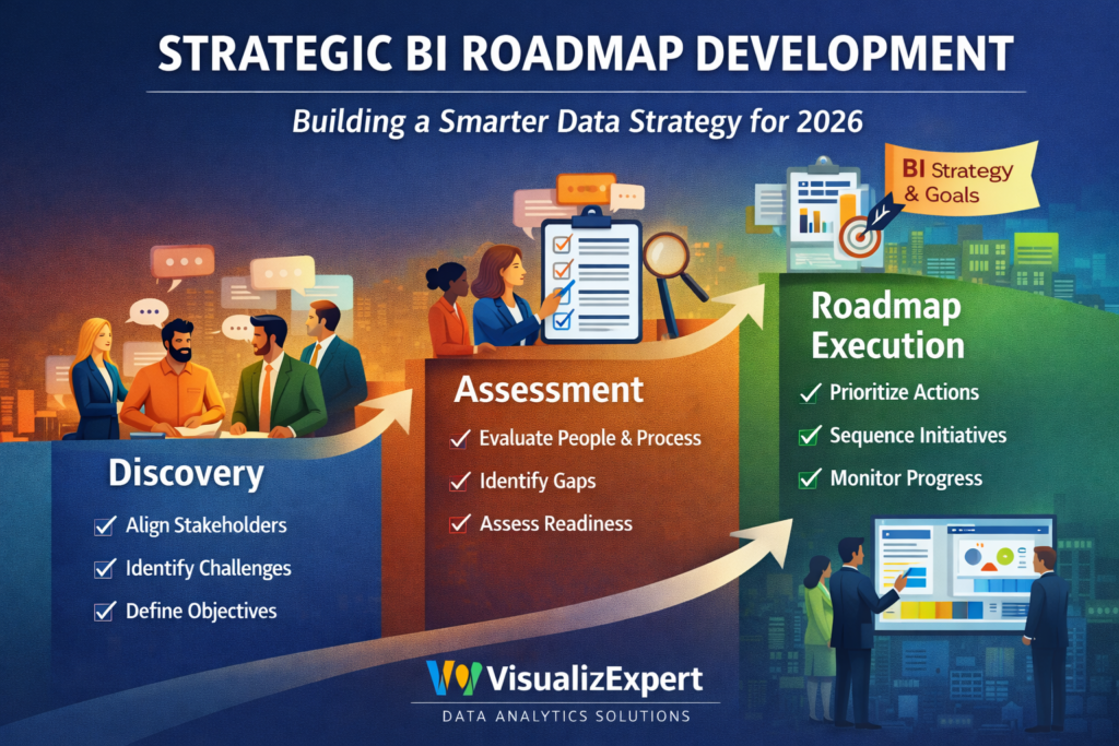
    The engagement typically unfolds across three connected phases.


    Phase 1: Discovery and Alignment

    The first step is creating shared understanding.

    This phase focuses on conversations—not dashboards. We bring together leaders, analysts, and operational teams to uncover:

    • Key decisions that drive outcomes
    • Current pain points and inefficiencies
    • Where ownership is unclear
    • What success actually looks like

    This alignment phase often surfaces a critical insight: teams are solving real problems, but in isolation. A roadmap aligns those efforts into a single direction.


    Phase 2: Capability and Maturity Assessment

    Once goals are clear, the next step is understanding readiness.

    This phase examines:

    • How data flows today
    • How insights are created and consumed
    • Where friction, rework, or delays occur
    • Whether current practices support future goals

    Rather than focusing only on tools, this assessment looks at how analytics operates as a system. The outcome is a clear picture of what’s enabling progress—and what’s silently slowing it down.


    Phase 3: A Prioritized Execution Roadmap

    The final output is a clear, phased roadmap that connects today’s reality to tomorrow’s goals.

    This roadmap:

    • Defines what to do first, and what can wait
    • Highlights dependencies and sequencing
    • Sets realistic expectations around effort and impact
    • Creates accountability without rigidity

    Importantly, the roadmap is actionable whether teams execute independently or with continued support. It becomes a decision-making reference, not a static document.


    Why Leadership Engagement Improves with a Roadmap

    One of the most consistent outcomes of roadmap engagements is stronger leadership alignment.

    Executives gain:

    • Visibility into current-state challenges
    • Context for prioritizing analytics investments
    • Confidence that initiatives are connected—not random
    • A shared language for discussing data strategy

    Instead of approving isolated requests, leadership evaluates analytics as a coordinated portfolio of initiatives aligned to business value.


    Supporting Modernization Without Creating Chaos

    Many organizations pursue roadmaps while preparing for major transitions—cloud adoption, platform changes, or advanced analytics initiatives. Without structure, these efforts can create disruption instead of progress.

    A roadmap helps organizations modernize with intent:

    • Foundations are strengthened before complexity increases
    • Experiments are guided, not scattered
    • Risks are identified early, not after failure

    This approach allows organizations to evolve their data capabilities without overwhelming teams or losing trust.


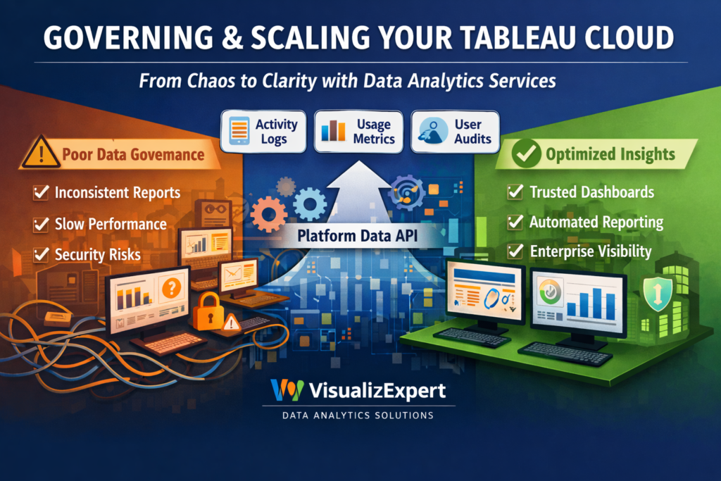
    Governance That Enables, Not Restricts

    Governance often gets delayed because it’s perceived as restrictive. In reality, governance becomes far easier when embedded within a strategy.

    A roadmap reframes governance as:

    • Clear ownership instead of control
    • Consistent definitions instead of bureaucracy
    • Responsible access instead of blanket restrictions

    This balance supports scale, trust, and compliance simultaneously.


    Culture and Adoption Matter More Than Tools

    Analytics success is ultimately a human challenge.

    A strong roadmap considers:

    • How teams learn to work with data
    • How insights are communicated
    • How decisions are reinforced and measured

    By addressing adoption and literacy alongside technical initiatives, organizations increase long-term ROI and reduce resistance to change.


    Why VisualizExpert

    VisualizExpert helps organizations move from reactive reporting to intentional analytics strategy. Our roadmap engagements are grounded in real-world experience across industries, growth stages, and analytics ecosystems.

    We don’t just help you plan—we help you think clearly about data, decisions, and execution.

    If your organization is heading into 2026 with growing data complexity and unclear priorities, a roadmap may be the most valuable analytics investment you make.

    Get expert guidance from VisualizExpert—and build a data strategy that actually moves the business forward.

  • Data Analytics Services That Help Enterprises Govern and Scale Tableau Cloud


    Data analytics services are no longer just about creating dashboards. As modern BI platforms like Tableau Cloud scale across departments, geographies, and thousands of users, the real challenge shifts to governance, observability, and trust.

    In the first 100 days of growth, teams celebrate adoption. In the next 12 months, they struggle with performance issues, duplicated dashboards, inconsistent KPIs, and growing security concerns. This is exactly the gap Tableau’s Platform Data API addresses — and where VisualizExpert helps organizations turn raw platform data into actionable intelligence.


    Why BI Breaks at Scale (and Why Observability Matters)

    Most organizations underestimate how quickly BI environments become complex. As more users publish content, schedule extract refreshes, and query shared data sources, even well-designed dashboards can turn into operational blind spots.

    This is why business intelligence consulting today must go beyond visuals. Enterprises need visibility into how analytics platforms are being used — not just what they show.

    Business intelligence consulting

    At VisualizExpert, we work with BI leaders to design governance-first analytics strategies, combining platform telemetry with executive reporting so decisions are based on reality, not assumptions.


    From Self-Service to System-Level Intelligence

    Tableau’s Platform Data API introduces a critical shift: admins can now pull event-level data across sites, users, permissions, refreshes, and performance logs. But raw observability data alone isn’t enough.

    This is where custom analytics solutions become essential.

    Custom analytics solutions

    VisualizExpert transforms Tableau Cloud event data into curated insights — highlighting unused dashboards, slow-performing extracts, risky permission changes, and adoption patterns that impact ROI.


    KPI Design for Platform Health, Not Just Business Metrics

    Most BI teams track revenue, pipeline, or marketing KPIs — but ignore the KPIs that keep analytics healthy. Without them, growth creates friction.

    KPI dashboard services

    We design KPI frameworks that monitor BI usage, content quality, refresh reliability, and user engagement — so leaders know whether their analytics ecosystem is strengthening or silently degrading.


    Designing Scalable Models Behind Observability Dashboards

    Platform data APIs generate high-volume, event-driven data. Without proper modeling, dashboards slow down and lose credibility.

    Power BI Star Schema Design

    When organizations consolidate Tableau observability data into Power BI or cloud warehouses, VisualizExpert applies star schema modeling to ensure fast queries, consistent metrics, and future-proof analytics.


    Embedded Observability for Admins and Leaders

    Admins shouldn’t need to export logs manually or switch tools to understand platform health.

    Power BI Embedded Analytics

    We embed observability dashboards directly into internal admin portals, making performance monitoring, audit readiness, and usage analysis accessible to the right stakeholders in real time.


    Visual Clarity Is Not Optional at Enterprise Scale

    When hundreds of users rely on dashboards daily, poor design creates misinterpretation — not insight.

    Data visualization services

    VisualizExpert applies enterprise visualization standards so observability dashboards surface risks, trends, and anomalies clearly — without overwhelming administrators or executives.


    Managing BI Platforms Is an Ongoing Responsibility

    Governance isn’t a one-time project. As Tableau environments evolve, so must monitoring and optimization.

    Power BI Managed Services

    Our managed services ensure observability dashboards stay accurate, data models remain optimized, and reporting adapts as Tableau Cloud features expand.


    Turning Platform Data into Leadership-Ready Views

    Executives don’t want logs — they want answers.

    BI dashboard solutions

    We translate technical platform data into leadership-friendly dashboards that explain adoption ROI, cost efficiency, risk exposure, and analytics maturity.


    Interactive Monitoring for Faster Decisions

    Static admin reports don’t scale.

    Interactive business dashboards

    VisualizExpert builds interactive dashboards that allow admins to drill from global platform health into site-level or user-level events within seconds.


    Enterprise Governance Requires Enterprise-Grade Design

    Large organizations need more than functional dashboards — they need confidence.

    Enterprise data visualization

    We apply enterprise visualization principles that support auditability, compliance, and clarity across complex Tableau Cloud deployments.


    Executive Views That Align BI With Strategy

    Analytics leaders must justify investments and adoption.

    Executive analytics dashboards

    Our executive dashboards connect platform usage data to business outcomes — helping leaders understand how analytics supports growth, not just reporting.


    Modeling Matters More Than Tools

    Without strong modeling, even the best APIs fail.

    Power BI Data Modeling Services

    We design scalable data models that integrate Tableau Platform Data API outputs with cloud warehouses, identity systems, and cost data.


    Moving Teams Off Spreadsheet-Based Monitoring

    Manual tracking doesn’t survive scale.

    Power BI Migration from Excel

    VisualizExpert helps BI teams migrate ad-hoc Excel-based admin tracking into automated, governed dashboards with historical context.


    Tableau Expertise Still Matters

    Observability doesn’t replace design — it enhances it.

    Tableau Dashboard Design

    We redesign Tableau dashboards using usage insights from the Platform Data API — removing unused content and optimizing high-impact views.


    Consulting That Connects Tools, Data, and Decisions

    Technology alone doesn’t fix governance gaps.

    Power BI consulting services

    Our consultants align Tableau, Power BI, and cloud data strategies into one coherent analytics operating model.


    Reports Should Be Built for Decisions, Not Downloads

    Automation changes everything.

    Custom Power BI reports

    We build automated reports that surface exceptions, risks, and trends — so admins act before problems escalate.


    Advanced Tableau Calculations Still Have a Role

    Some insights require deep Tableau expertise.

    Tableau LOD Calculation Expert

    VisualizExpert applies LOD calculations to analyze user behavior, content performance, and site-level trends accurately.


    Performance Is a Governance Issue

    Slow dashboards reduce trust.

    Tableau Server Optimization

    Using observability data, we identify performance bottlenecks and optimize Tableau environments proactively.


    Finance Teams Need Analytics They Can Rely On

    Governance directly impacts financial confidence.

    Tableau for Finance Dashboards

    We help finance teams monitor data freshness, access controls, and reporting reliability — reducing operational risk.


    Supporting Teams Beyond Initial Deployment

    BI maturity is a journey.

    Tableau Desktop Developer Services

    Our developers support ongoing enhancements, refactoring, and optimization as Tableau usage evolves.


    Why VisualizExpert

    VisualizExpert doesn’t just build dashboards — we design analytics systems that scale. By combining Tableau’s Platform Data API with enterprise-grade modeling, visualization, and governance expertise, we help organizations move from reactive BI firefighting to proactive, decision-ready analytics.

    If your Tableau Cloud deployment is growing, your observability strategy needs to grow with it.

    Get expert guidance from VisualizExpert — and build BI that stays valuable at scale.

  • Power BI Dashboard Development: From Raw Data to Decision-Ready Intelligence

    Introduction: Why Power BI Dashboards Still Fail Without Context

    Note: image is created by the author, Parul Pandey

    Power BI Dashboard Development has become a default investment for organizations trying to become data-driven. Yet, despite powerful tools and growing data volumes, many dashboards fail to influence real decisions. Executives log in, scroll through charts, and still ask the same question: “So what should we do next?”

    At VisualizExpert, we see this pattern repeatedly. The issue is not Power BI itself — it’s how dashboards are conceptualized, modeled, and aligned to decision workflows. A dashboard is not a reporting artifact; it is a decision interface. When built correctly, it shortens the gap between insight and action. When built poorly, it becomes digital clutter.

    This article explores how modern Power BI dashboards should be designed — not as collections of visuals, but as strategic systems that support faster, clearer, and more confident business decisions.

    Power BI Dashboard Development as a Decision System (Not a Reporting Tool)

    Most dashboards start with data availability instead of business intent. Teams ask, “What data do we have?” instead of “What decisions need to be made?” This reversal is the root cause of dashboard overload.

    At VisualizExpert, our Power BI approach starts with decision mapping:

    • What decisions are made daily, weekly, and quarterly?
    • Who makes them?
    • What signals reduce uncertainty at that moment?

    Only after answering these questions do we design the dashboard structure.

    A well-built Power BI dashboard does three things:

    1. Frames the decision clearly
    2. Surfaces only the metrics that influence that decision
    3. Provides context for action (trend, benchmark, threshold)

    Anything beyond that is noise.

    The Architecture Behind Scalable Dashboards

    Great dashboards are invisible when done right. Users don’t think about filters, measures, or models — they think about outcomes. That experience is driven by strong backend design.

    At VisualizExpert, our architecture principles include:

    • Clean semantic models that mirror business logic
    • Separation of raw data, transformations, and measures
    • Consistent metric definitions across teams
    • Performance-optimized models that scale with data growth

    This foundation ensures dashboards remain fast, trusted, and extensible as the organization grows.

    Why “More Charts” Reduces Trust

    A common misconception is that adding more visuals adds value. In reality, excessive visuals reduce trust and slow decision-making.

    High-impact dashboards focus on:

    • A clear narrative flow
    • Progressive disclosure (summary → detail)
    • Visual hierarchy that guides attention
    • Minimal but meaningful interactivity

    Executives should understand the story in under 30 seconds. Analysts should be able to drill deeper without breaking context. This balance is intentional — and engineered.

    Power BI Dashboards for Executives vs. Operators

    Not all users consume data the same way.

    Executive dashboards prioritize:

    • Trends over transactions
    • Exceptions over completeness
    • Comparisons against targets

    Operational dashboards focus on:

    • Real-time or near-real-time monitoring
    • Process bottlenecks
    • Task-level accountability

    Trying to serve both audiences with a single dashboard leads to compromise. VisualizExpert designs role-specific views while maintaining a unified data model underneath — ensuring consistency without sacrificing usability.

    Trust Is Built Through Data Governance

    Even the most beautiful dashboard fails if users don’t trust the numbers.

    Trust is built when:

    • Metric definitions are documented and consisten
    • Data refresh cycles are transparent
    • Edge cases and limitations are acknowledged
    • Numbers reconcile with source systems

    VisualizExpert treats dashboards as products, not one-time deliverables. Governance, documentation, and ongoing optimization are part of the engagement — not an afterthought.

    From Descriptive to Predictive Thinking

    Modern analytics is moving beyond what happened toward what is likely to happen next. While Power BI is traditionally used for descriptive and diagnostic analytics, its real value emerges when paired with decision logic and predictive signals.

    Instead of static KPIs, effective dashboards:

    • Highlight early warning indicators
    • Compare current performance against expected patterns
    • Surface anomalies that require attention

    This shift transforms dashboards from passive reports into proactive decision companions.

    Why Adoption Matters More Than Features

    A technically perfect dashboard that no one uses has zero ROI.

    Adoption improves when dashboards:

    • Match how people actually work
    • Load quickly and behave predictably
    • Answer real questions, not hypothetical ones
    • Are introduced with context and training

    VisualizExpert measures success not by delivery, but by sustained usage. If a dashboard becomes part of weekly reviews and leadership conversations, it has done its job.

    The VisualizExpert Philosophy

    What differentiates VisualizExpert is not tool expertise alone — it’s perspective.

    We believe:

    • Dashboards should reduce cognitive load, not increase it
    • Metrics must align with strategy, not just availability
    • Design is a functional requirement, not decoration
    • Analytics maturity is built through clarity, not complexity

    Our dashboards are designed to be argued with, trusted, and acted upon.

    Conclusion: Dashboards That Change Decisions, Not Just Screens

    Power BI has democratized analytics — but dashboards alone don’t create insight. Insight emerges when data, design, and decision-making are treated as a single system.

    At VisualizExpertPower BI Dashboard Development is about building that system — where every metric has a purpose, every visual has intent, and every dashboard earns its place in the decision process.

    When dashboards are built this way, the question shifts from “What does the data say?” to “What should we do next?”
    And that is where analytics delivers real business value.

  • Tableau Dashboard Design: Turning Data into Measurable Business Progress

    Introduction: Why Dashboards Should Help You Achieve Goals

    Tableau Dashboard Design is often treated as a reporting exercise — something built at the end of a project to visualize numbers. In reality, dashboards are far more powerful when they are designed as goal-tracking and decision-support systems.

    Across organizations, leaders set ambitious targets: revenue growth, cost control, operational efficiency, customer retention. Yet many struggle to consistently track progress or understand why performance shifts. This gap is not caused by lack of data — it’s caused by dashboards that show activity instead of intent.

    At VisualizExpert, we design Tableau dashboards to help teams stay aligned, accountable, and focused on outcomes. Just like individuals use visual tracking to achieve personal goals, organizations need structured, interactive dashboards to achieve business goals — clearly, confidently, and continuously.

    Tableau Dashboard Design as a Goal-Driven Framework

    A dashboard should answer three fundamental questions:

    1. What is the goal?
    2. How are we performing against it?
    3. What action should follow?

    Many dashboards fail because they stop at the second question. They show performance but don’t guide action. Effective Tableau dashboards, on the other hand, are built around intentional metric selection and visual hierarchy.

    At VisualizExpert, every dashboard begins with a goal-mapping exercise:

    • Strategic goals (growth, profitability, efficiency)
    • Tactical objectives (campaign performance, conversion rates, fulfillment speed)
    • Operational signals (exceptions, bottlenecks, risks)

    Only metrics that influence decisions earn a place on the dashboard.

    Tracking Financial and Operational Performance with Clarity

    In business environments, financial and operational metrics are often scattered across spreadsheets, ERP systems, and reporting tools. Tableau dashboards unify these views into a single, trusted interface.

    A well-designed dashboard enables teams to:

    • Track revenue, margin, and cost trends over time
    • Compare actual performance against targets and forecasts
    • Identify early warning signs before issues escalate

    VisualizExpert emphasizes trend-based storytelling, not static totals. Leaders don’t need yesterday’s number alone — they need to understand direction, momentum, and deviation.

    Monitoring Performance Without Micromanagement

    One of the biggest challenges for leadership teams is balancing oversight with autonomy. Dashboards should create transparency without creating pressure.

    Effective Tableau dashboards:

    • Surface exceptions instead of every detail
    • Highlight where attention is required
    • Allow drill-downs without overwhelming users

    This design approach empowers teams to self-correct while giving leadership confidence that performance is being monitored intelligently.

    Interactive Dashboards That Encourage Exploration

    Static reports limit curiosity. Interactive dashboards encourage questions.

    When users can filter, compare, and explore data:

    • Engagement increases
    • Data literacy improves
    • Trust in analytics grows

    VisualizExpert designs interactivity with purpose. Filters, parameters, and actions are included only when they support exploration — not novelty. The result is a dashboard that feels intuitive, not intimidating.

    Building Data Literacy Through Tableau Dashboard Design

    One of the most overlooked benefits of strong dashboards is data literacy. Organizations often invest in analytics tools but underinvest in helping teams understand and interpret data.

    Thoughtfully designed dashboards help users:

    • Learn how metrics relate to each other
    • Understand cause-and-effect relationships
    • Develop confidence in data-driven discussions

    Instead of relying on analysts for every question, teams begin to engage directly with insights. This cultural shift — from reporting dependency to analytical independence — is where long-term value is created.

    Dashboards as Living Business Assets

    Dashboards should evolve as the business evolves.

    New goals, new markets, new strategies — all require dashboards to adapt. VisualizExpert treats dashboards as living assets, not static deliverables. This mindset ensures:

    • Metrics remain aligned with strategy
    • Definitions stay consistent over time
    • Dashboards scale with data complexity

    Regular reviews and refinement prevent dashboards from becoming outdated or ignored.

    Visual Storytelling for Stakeholder Alignment

    Executives, managers, and frontline teams consume data differently. A single dashboard must balance simplicity with depth.

    Strong visual storytelling:

    • Guides attention to what matters most
    • Uses visual contrast intentionally
    • Aligns layout with decision flow

    VisualizExpert designs dashboards that tell a story at a glance while still allowing deeper investigation when needed. This dual-layer approach ensures broad adoption across roles.

    From Personal Tracking to Enterprise Intelligence

    The same principles that help individuals track fitness or learning goals apply at an enterprise level:

    • Clear metrics
    • Consistent tracking
    • Visual feedback loops

    The difference lies in scale, governance, and impact. Enterprise dashboards influence budgets, strategy, and accountability. That responsibility demands rigor, clarity, and experience.

    VisualizExpert brings that discipline to every engagement — ensuring dashboards support not just insight, but execution.

    Why VisualizExpert’s Approach Works

    Our philosophy is simple:

    • Dashboards exist to reduce uncertainty
    • Metrics should drive action, not debate
    • Design must serve understanding, not decoration

    We combine analytical rigor with design thinking to ensure dashboards are trusted, used, and acted upon. The goal is not more dashboards — it’s better decisions.

    Conclusion: Dashboards That Help Organizations Move Forward

    Tableau is a powerful platform, but its real value depends on how dashboards are designed and used. When dashboards are built around goals, decisions, and users — not just data — they become catalysts for progress.

    At VisualizExpertTableau Dashboard Design is about helping organizations see clearly, act decisively, and stay aligned with what truly matters. Because the most successful businesses don’t just measure performance — they understand it.

  • Maximizing Power BI DirectQuery Performance with New Excel Drillthrough Support

    In the rapidly evolving world of business intelligence, speed and granularity are the two pillars of success. For years, organizations have leveraged Power BI DirectQuery performance to handle massive datasets without the need for data duplication. However, a common friction point remained: the inability to drill down into underlying details when using the “Analyze in Excel” feature. As of late 2025, Microsoft has officially removed this barrier. This update marks a significant milestone for enterprise data architecture, allowing users to seamlessly transition from high-level summaries in a PivotTable to row-level details, all while maintaining a live connection to the source.

    The Evolution of Direct Connection Reporting

    Historically, the “Show Details” feature in Excel—a favorite for accountants and analysts—was exclusive to Import models. If you were running a DirectQuery or Direct Lake model to maintain real-time visibility, double-clicking a cell would often result in an error or an empty sheet.

    By enabling MDX DRILLTHROUGH support for these live connection types, Power BI has unified the user experience. Whether your data is sitting in a local import or a high-performance OneLake Direct Lake environment, the workflow remains identical. This is a game-changer for business intelligence consulting teams who previously had to choose between data freshness and analytical depth.


    Why This Matters for Enterprise Data Strategy

    The shift toward “Live Data” is not just a trend; it is a necessity for modern decision-making. Here is why the inclusion of drillthrough for DirectQuery and Direct Lake models is essential:

    1. Eliminating the “Import Mode” Tax

    Previously, if an executive needed to see the specific invoices making up a total in Excel, architects were often forced to use Import mode. This meant managing refresh schedules and dealing with data latency. Now, you can keep your data at the source, ensuring that your Power BI DirectQuery performance remains high while still providing the granular “Show Details” functionality.

    2. Maintaining Robust Security Frameworks

    One of the biggest concerns with data exploration is security. This new update respects Power BI Row Level Security (RLS) and Object Level Security (OLS) implicitly. When a user double-clicks a cell in Excel to drill through, the query sent to the model is filtered by their specific security role. They only see the rows they are authorized to see, providing a secure environment for sensitive financial or HR data.

    3. Streamlining the User Experience

    Excel remains the “lingua franca” of data analysis. By allowing users to stay within their preferred tool while accessing live Power BI semantic models, organizations can increase BI adoption. There is no longer a need to jump back into the Power BI Service just to see the underlying transactions.


    Technical Optimization for DirectQuery Drillthrough

    While the feature is now supported “out of the box,” achieving optimal performance requires a strategic approach to Power BI data modeling.

    DAX Formula Optimization and Detail Rows

    To ensure that the drillthrough experience is fast, it is vital to utilize DAX Formula Optimization. Complex measures can slow down the retrieval of detail rows. Furthermore, developers should define “Detail Rows Expressions” within the semantic model. This allows you to control exactly which columns are displayed when a user drills through in Excel, preventing the “Select *” problem that can bog down source systems like SQL Server or Snowflake.

    The Role of Star Schema

    Even with live connections, the underlying structure matters. Implementing a Power BI Star Schema Design ensures that the relationships between facts and dimensions are efficient. When Excel requests a drillthrough, a well-organized schema allows the engine to generate cleaner join statements, significantly boosting the responsiveness of the data retrieval.


    Case Study: Real-Time Financial Auditing

    Consider a global retail firm using Tableau for finance dashboards for high-level visualization, but relying on Excel for month-end reconciliation.

    • The Challenge: The audit team needed to verify specific transactions totaling millions of dollars. Because the data was too large to import, they used DirectQuery. However, they couldn’t see the specific line items in Excel.
    • The Solution: By leveraging the new drillthrough support, the team connected Excel directly to their Power BI semantic model. They could now double-click any discrepancy in their PivotTable and see the raw transaction data instantly.
    • The Result: Audit time was reduced by 40%, and the need for manual data exports was completely eliminated.

    Best Practices for Implementation

    To make the most of this update, consider the following roadmap:

    1. Evaluate Your Model Type: If you are on Fabric, prioritize Direct Lake for the best balance of speed and detail. If you are using external SQL databases, ensure your Power BI DirectQuery performance is tuned at the source (e.g., proper indexing).
    2. Define Explicit Measures: Drillthrough works best with explicit DAX measures rather than implicit ones. This provides better control over the context of the data being retrieved.
    3. Monitor Query Complexity: Use tools like DAX Studio or Performance Analyzer to see the impact of drillthrough queries on your source system. DirectQuery performance is often limited by the “weakest link”—the source database’s ability to handle the incoming SQL.
    4. Update Your Training: Ensure your analysts know that “Show Details” is now a viable option for live models. This simple education step can significantly reduce requests for manual data pulls.

    Conclusion: A Unified Future for BI

    The removal of the drillthrough limitation for Direct Lake and DirectQuery models is a clear signal that the gap between “high-level dashboarding” and “deep-dive analysis” is closing. At VisualizExpert, we specialize in bridging this gap, ensuring that your Power BI reporting solutions are not only beautiful but also functionally deep and technically optimized.

    By embracing these live connection workflows, your organization can move away from stale data and toward a truly reactive, data-driven culture. The ability to see the “why” behind the “what” in Excel—without sacrificing the benefits of a live semantic model—is a massive win for the modern enterprise.


    Take Your Analytics Further

    If you are struggling with slow reports or unable to see the details behind your data, then don’t waste another day fighting with rigid data models that limit your perspective.

    At VisualizExpert, we provide the custom Power BI consulting and analytics strategy services you need to turn complex data into a competitive advantage. From DAX Formula Optimization to Enterprise BI Managed Services, we ensure your data works for you, not the other way around.

  • Data Visualization for Decision Making: Transforming Personal and Professional Goals

    In an era defined by information overload, the ability to distill complex datasets into clear, actionable insights is a superpower. Whether you are a solo entrepreneur tracking financial milestones or a corporate leader steering a multinational firm, data visualization for decision-making is the bridge between “having data” and “having a strategy.” By leveraging visual storytelling, users can identify patterns, spot anomalies, and make evidence-based choices that move the needle. From tracking personal fitness to optimizing enterprise-level supply chains, the right dashboard turns abstract numbers into a roadmap for success.

    The Power of Visualizing Your Progress

    The human brain processes visual information significantly faster than text or spreadsheets. When we see a line chart trending upward or a heat map glowing red, we don’t just see data—we see a story. This immediate comprehension is why platforms like Tableau Public have become essential for those looking to kickstart their personal and professional development.

    By utilizing visual frameworks, you remove the “guesswork” from your growth. Instead of wondering if your budget is on track or if your skills are improving, you have a living, breathing interface that provides an objective truth.


    5 Ways to Use Visual Analytics to Achieve Your Goals

    Following the blueprint of successful data practitioners, here are five core areas where visualization can catalyze your success:

    1. Financial Clarity and Budgetary Control

    Managing finances is often the most stressful part of personal and professional life. Traditional spreadsheets can be overwhelming and difficult to audit at a glance. By creating a personal finance dashboard, you can:

    • Monitor Spend Categories: Use pie or treemap charts to see exactly where your money goes.
    • Track Savings Goals: Use bullet graphs to visualize how close you are to your “rainy day” fund or investment targets.
    • Privacy First: Use local save features in tools like Tableau Desktop Public Edition to keep your sensitive financial data off the cloud while still benefiting from high-end analytics.

    2. Health, Fitness, and Longevity

    The “Quantified Self” movement has proven that we manage what we measure. By exporting data from wearables or manual logs into an interactive dashboard, you can find correlations you might have missed. For example, does your sleep quality improve on days you run? A combined bar and line chart can reveal the answer instantly, allowing you to make lifestyle adjustments based on hard evidence.

    3. Career Evolution and Interactive Resumes

    In a competitive job market, a static PDF resume is often not enough. An interactive visual resume allows you to showcase your “data literacy” while presenting your career path.

    • Gantt Charts: Perfect for showing career progression and overlapping responsibilities.
    • Skill Matrices: Use bubble charts or radar charts to demonstrate proficiency in various tools or soft skills.
    • Engagement: Adding a “Hire Me” button directly to your dashboard makes the transition from “viewer” to “recruiter” seamless.

    4. Skill Acquisition and Hobby Tracking

    Whether you are learning a new language or attempting to read 50 books a year, visualization keeps you accountable. Tracking “time spent” versus “proficiency gained” helps maintain the motivation needed to cross the finish line. It turns a long-term goal into a series of small, visual victories.

    5. Enhancing Data Literacy for Professional Growth

    Perhaps the most significant benefit of engaging with visual tools is the improvement of your own data literacy. Being able to interpret a dashboard is just as important as building one. By interacting with the global community’s visualizations, you learn how to ask the right questions—a skill that is invaluable in any boardroom.


    Why Data Visualization for Decision Making is Essential for 2026

    As we move further into a tech-driven economy, the “gut feeling” approach to leadership is being replaced by data-driven decision making. For businesses, this means moving away from static monthly reports and toward real-time, interactive dashboards.

    The Strategic Advantage

    • Speed to Insight: Real-time dashboards allow managers to pivot strategies in hours rather than weeks.
    • Accessibility: Complex SQL queries are translated into intuitive visuals that stakeholders at all levels can understand.
    • Accountability: When KPIs are visualized publicly (within an organization), it fosters a culture of transparency and shared goals.

    The Role of EEAT in Data Content

    In 2026, search engines and AI overviews prioritize content that demonstrates Experience, Expertise, Authoritativeness, and Trustworthiness (EEAT). When discussing data, this means providing verified sources, showcasing real-world applications (like the “Personal Finance Dashboard” by Autumn Battani), and offering “Pro Tips” that reflect actual hands-on experience with the software.


    Choosing the Right Tools for Your Journey

    While Tableau Public is a phenomenal starting point for those looking to share their work with the world, the ecosystem of data tools is vast:

    • Power BI: Ideal for those deeply integrated into the Microsoft 365 environment.
    • Looker Studio: The go-to for marketing professionals needing to visualize GA4 or Google Ads data.
    • Python/R: For those who prefer a “code-first” approach to complex statistical visualizations.
    GoalBest Visual TypeRecommended Tool
    BudgetingBar/Line ChartTableau Desktop (Local)
    Career PathGantt ChartTableau Public
    Marketing ROIFunnel ChartLooker Studio
    FitnessHeat MapPower BI / Mobile Apps

    Final Thoughts: Start Small, Think Big

    You don’t need to be a data scientist to start using data visualization for decision-making. Begin by tracking one simple metric—perhaps your daily steps or your weekly grocery spend. As you become comfortable with the tools, expand your scope to include professional KPIs and career milestones.

    The goal isn’t just to make “pretty pictures.” The goal is to gain a clearer view of your life and business so you can make the choices that lead to your most successful year yet.

    If you are a forward-thinking business leader or a data-driven professional, then don’t waste another minute drowning in complex spreadsheets when you could be driving growth.

    At VisualizExpert, we turn your raw numbers into high-impact visual stories that command attention and spark action. Stop guessing and start leading with clarity.

  • Tableau Dashboard Services: New 2025 Features Inspired by the Tableau Community

    Community-Driven Innovation in Tableau 2025

    Innovation in analytics works best when it’s shaped by real users solving real problems. In 2025, Tableau proved this again by releasing a powerful set of features driven directly by community feedback—features that significantly elevate Tableau dashboard services across design, performance, accessibility, and governance.

    For organizations investing in data analytics services and business intelligence consulting, these updates are not just cosmetic improvements. They directly impact how teams build interactive business dashboards, improve adoption, and accelerate data driven decision making.

    At VisualizExpert, we see these releases as a turning point for modern enterprise data visualization, where dashboards evolve from static reports into actionable, business-aligned intelligence systems.

    How Tableau Dashboard Services Are Evolving with 2025 Community Features

    The 2025 Tableau releases (2025.1, 2025.2, and 2025.3) reflect a clear shift toward flexibility, performance optimization, and user empowerment—core pillars of high-impact BI dashboard solutions.

    1. Better Visual Expression with Radial Viz Extensions & Dynamic Color Ranges

    The new Radial Viz Extension allows analysts to create donut and sunburst charts natively—enhancing Interactive Tableau Storytelling and making part-to-whole relationships easier to understand for executives.

    Combined with Dynamic Color Ranges, teams can now guide attention intentionally, reinforcing data storytelling services and executive analytics dashboards without overloading users with unnecessary complexity.

    These updates directly strengthen:

    • Tableau visual analytics
    • Pixel-Perfect Tableau Visuals
    • dashboard design consulting

    2. Brand Consistency with Custom Themes and Color Palettes

    One of the most requested features—Custom Themes and Color Palettes—addresses a long-standing enterprise challenge: consistency at scale.

    Organizations delivering custom Tableau reports and Tableau KPI dashboards can now:

    • Apply standardized branding instantly
    • Reduce dashboard build time
    • Maintain trust across departments

    This is a major win for teams managing enterprise Tableau solutions and shareable stakeholder reports.

    3. Performance, Optimization, and Admin Control

    Performance is often the silent killer of BI adoption. Tableau 2025 addresses this head-on with features like:

    • Performance Insights Dashboard for admins
    • Logical Table Data Source Filters to reduce query load
    • Project Tree Navigation for complex environments

    These improvements strongly support:

    • Tableau performance dashboards
    • Tableau Server Optimization
    • analytics and reporting consulting

    For large organizations, this translates directly into higher ROI from analytics investments.

    4. Accessibility, Governance, and Trust

    New Keyboard-Accessible Interactivity ensures that Tableau dashboards are usable by everyone—an increasingly critical requirement for modern analytics programs.

    Meanwhile, features like:

    • Recycle Bin
    • Tableau Public Spam Moderation
    • Platform Data API

    Enhance governance, auditability, and monitoring—key pillars of analytics strategy services and BI adoption services.

    To understand how AI-driven systems are reshaping modern analytics workflows, explore our detailed guide on agentic analytics and the future of business intelligence, and see how insights now move seamlessly from data to action.

    Agentic and Embedded Analytics: Insights Where Decisions Happen

    With the Tableau App for Google Workspace, insights now live inside Google Docs and Slides. This eliminates context switching and supports data visualization for decision making in real workflows.

    This aligns with the growing demand for:

    • interactive KPI dashboards
    • real-time data dashboards
    • decision-ready data visualization

    Analytics no longer lives in tools—it lives in decisions.

    Final Thoughts: Tableau 2025 Is Built for How Businesses Actually Work

    The Tableau Community didn’t just suggest features—they helped redefine what modern analytics should look like. The 2025 releases make dashboards faster, clearer, more accessible, and deeply embedded in business workflows.

    For organizations serious about analytics maturity, this is the moment to rethink dashboards not as reports—but as decision systems.

    VisualizExpert helps organizations unlock the full potential of Tableau through expert-led business intelligence consultingcustom analytics solutions, and future-ready dashboard design.

  • Agentic Analytics: The Future of BI Dashboard Solutions for Decision-Ready Organizations

    Introduction: Welcome to the Agentic Analytics Era

    Modern organizations are no longer struggling with a lack of data—they are struggling with turning data into action. Traditional dashboards often stop at reporting, leaving teams to manually interpret insights and execute decisions elsewhere. This is where BI dashboard solutions powered by agentic analytics are redefining the future of business intelligence.

    In today’s environment of real-time operations, enterprises demand interactive business dashboardsenterprise data visualization, and AI-assisted workflows that reduce decision latency. Agentic analytics represents a paradigm shift—where analytics systems don’t just show insights, but actively help users act on them.

    At VisualizExpert, we see agentic analytics as the next evolution of data analytics services and business intelligence consulting, enabling organizations to move from insight to impact faster than ever.

    What Is Agentic Analytics and Why BI Dashboard Solutions Are Evolving

    Agentic analytics introduces AI agents into the analytics lifecycle—agents that can prepare data, monitor KPIs, surface insights, and even trigger actions automatically. Instead of analysts spending hours on repetitive tasks, they collaborate with intelligent systems that accelerate outcomes.

    Unlike traditional BI tools, modern BI dashboard solutions now combine analytics, automation, and workflows in a single experience. This evolution is driven by four foundational layers:

    1. Open and Unified Data Layer

    Agentic platforms connect seamlessly with cloud warehouses and operational systems, eliminating data silos. This is where data integration servicescustom analytics solutions, and scalable data models play a critical role. Unified data ensures that insights are consistent, trusted, and ready for enterprise use.

    2. AI-Powered Semantic Intelligence

    Semantic layers transform raw data into business-ready meaning. With governed metrics and standardized definitions, organizations can confidently deploy KPI dashboard servicesanalytics and reporting consulting, and executive analytics dashboards without misalignment across teams.

    This semantic intelligence ensures that every user—from analysts to executives—speaks the same data language.

    3. Advanced Visualization and Storytelling

    Visualization remains the heart of analytics adoption. Agentic BI enhances this with data visualization servicesenterprise Tableau solutions, and Power BI dashboards that are faster, more interactive, and reusable across departments.

    Modern organizations increasingly rely on:

    • Tableau dashboard services
    • custom Tableau reports
    • interactive Tableau dashboards
    • Power BI reporting solutions

    These visual assets are no longer static—they are living interfaces connected directly to actions and decisions.

    4. Actionable Analytics and Automation

    The biggest shift with agentic analytics is the action layer. Dashboards now trigger workflows, alerts, and automated responses directly from insights. This enables automated reporting solutionsautomated KPI tracking, and Power BI automation to reduce manual intervention and operational delays.

    For leadership teams, this means decisions happen at the moment of insight—not days later.

    For a deeper understanding of how selecting the right visuals impacts analytic outcomes, check out our post on how wrong chart selection creates misleading insights, and then explore how decision-first analytics fixes common BI pitfalls to drive better business results.

    Agentic Analytics Skills: Humans and AI Working Together

    Agentic platforms introduce specialized AI skills that augment human expertise rather than replace it:

    • Data preparation agents streamline transformations traditionally handled by analysts.
    • Conversational analytics agents answer natural language questions across sales analytics dashboardsfinance performance dashboards, and operations analytics dashboards.
    • Monitoring agents proactively track anomalies, trends, and risks across executive leadership dashboards and real-time data dashboards.

    This collaboration allows organizations to focus more on strategy, storytelling, and innovation—core pillars of data storytelling services and dashboard design consulting.

    Why Agentic BI Matters for Modern Enterprises

    Agentic analytics is not just a technology upgrade—it’s a business transformation. Organizations adopting this model experience:

    • Faster time-to-insight
    • Reduced analytics workload
    • Higher BI adoption
    • Stronger data-driven culture

    These outcomes align directly with analytics transformation consultingBI adoption services, and long-term analytics strategy services.

    At VisualizExpert, we help organizations design interactive KPI dashboards and data visualization for decision making that are future-ready, scalable, and aligned with business goals.

    Final Thoughts: The Next Chapter of Business Intelligence

    Agentic analytics represents the most significant shift in BI since self-service dashboards. By uniting AI agents, automation, and visualization, organizations can finally close the gap between insight and action.

    If your business is ready to move beyond static reporting and adopt decision-ready intelligence, agentic analytics is not the future—it’s the present.

    VisualizExpert is here to guide that journey with expert-led business intelligence consulting, modern BI dashboard solutions, and analytics that truly work for your business.

  • How Poor Chart Choices Distort Business

    How Wrong Chart Selection Creates Misleading Charts in Business Data Visualization

    Wrong chart selection is one of the most overlooked yet damaging causes of poor data visualization in modern organizations.

    It doesn’t just make dashboards harder to read—it subtly reshapes how leaders perceive reality. That is precisely why bad charts misleading business decisions have become so common, even in data-mature companies.

    Many executives have approved high-impact strategies based on charts that appeared logical, polished, and data-driven—yet silently told the wrong story. This creates a dangerous paradox. Businesses trust accurate data, invest heavily in analytics tools, and still make flawed decisions because business data visualization fails at the final step: human interpretation.

    When visuals distort insight, the integrity of the entire analytics process breaks down. And when leadership acts on distorted visuals, the cost appears as missed opportunities, poor prioritization, delayed responses, and declining confidence in analytics systems.

    This article explains what wrong chart selection truly means, why data visualization mistakes persist in business environments, the impact of poor data visualization on decision making in 2026, and how strong data storytelling restores clarity and trust at the decision level.

    What Does Wrong Chart Selection Mean in Business Data Visualization?

    Wrong chart selection occurs when the visual format chosen does not align with the analytical goal or the underlying business question. The data itself may be accurate, but the visual encoding leads the viewer toward the wrong conclusion.

    This disconnect—between data truth and visual perception—is where most common data visualization mistakes in business originate.

    Distorted Comparisons

    A classic example is using bubble charts to compare performance across products or regions. While bubbles may look modern, the human eye struggles to accurately compare area. Small differences appear exaggerated, creating misleading charts that pull attention toward the wrong priorities.

    Hidden Trends

    Another frequent issue is using pie charts to show trends over time. Pie charts represent proportions at a single point. When forced to display month-over-month or year-over-year movement, trends disappear. Growth, decline, and volatility become visually unclear, leading to poor interpretation.

    Design Over Decision

    In executive presentations, chart selection is often driven by aesthetics rather than clarity. Three-dimensional visuals, decorative gradients, and perspective effects may appear premium, but they distort scale and obscure values. This is a subtle yet powerful driver of poor data visualization, especially in high-stakes decision environments.

    The result is misleading charts that misrepresent insights even when the underlying data is technically correct. Most BI tools auto-suggest visuals based on data structure—not business intent—reinforcing wrong chart selection at scale.

    Why Accurate Data Still Leads to Poor Data Visualization

    Even with advanced analytics platforms, wrong chart selection remains widespread because it is fundamentally a human problem, not a technical one. Accurate data alone does not guarantee clarity.

    Over-Reliance on Defaults

    Teams frequently accept default chart recommendations from tools like Power BI, Tableau, or Excel. These defaults focus on fitting data types rather than answering business questions, which is why choosing the right chart for data analysis is often overlooked in real workflows.

    Visualization Literacy Gaps

    Most professionals are trained to read spreadsheets and KPIs—but not to audit visual logic. As a result, data visualization mistakes often pass through reviews unnoticed.

    The Aesthetic Trap

    In high-visibility dashboards, visual appeal often outweighs insight. Over-designed charts filled with icons, shadows, and unnecessary effects increase cognitive load and reduce clarity, slowly turning dashboards into misleading charts without anyone intending to.

    These challenges consistently appear across business data visualization projects in SaaS, finance, marketing, operations, and supply-chain analytics.

    When Visuals Change How Leaders Interpret the Truth

    Misleading charts don’t just confuse—they actively redirect thinking.

    A truncated Y-axis is a common example. By starting the axis above zero, a minor fluctuation can appear dramatic. A 3% revenue increase suddenly looks like explosive growth, pushing leadership toward overinvestment.

    Overloaded line charts create another risk. When too many variables are plotted together, the signal disappears into noise. Critical declines remain hidden, explaining how wrong charts lead to wrong decisions even in data-rich organizations.

    Dual-axis charts add further distortion. By aligning unrelated metrics on different scales, they imply relationships that don’t exist—simply because the visuals overlap.

    This is how bad charts misleading business decisions become a silent, recurring pattern.

    How Wrong Charts Lead to Wrong Business Decisions

    Wrong chart selection has consequences far beyond aesthetics. The impact of poor data visualization on decision making is now operational, financial, and strategic.

    In fast-moving environments, distorted visuals lead to:

    • Conflicting interpretations across departments, as different teams draw opposing conclusions from the same data
    • Misallocated budgets and resources, when visually inflated performance hides underlying risk
    • Missed early warning signals, buried inside cluttered dashboards
    • Erosion of executive trust, once leaders realize charts have misled them before

    When executives stop trusting visuals, they stop trusting data altogether. Analytics becomes reporting noise instead of decision support.

    This challenge closely overlaps with dashboard overload. As explained in How Decision-First Analytics Fixes Dashboard Overload in Business Intelligence, decision quality improves dramatically when visuals are designed around decisions—not data volume.

    Common Data Visualization Mistakes That Mislead Leaders

    Most misleading charts are not intentional. They stem from repeated design habits embedded in modern dashboards. Common examples include:

    • Pie charts for multi-category comparison
    • Dual-axis charts that distort relationships
    • Overloaded visuals with no focal point
    • Inconsistent color logic that changes meaning across charts

    These are not cosmetic flaws. They are common data visualization mistakes in business that turn dashboards into misleading charts requiring explanation instead of enabling action.

    Choosing the Right Chart for Data Analysis and Business Decisions

    Fixing wrong chart selection starts with intention, not tools.

    Before selecting any visual, define the decision. What action should this chart influence? What risk should it surface? What comparison truly matters?

    Then match chart type to purpose:

    • Bar charts for comparison
    • Line charts for trends
    • Scatter plots for relationships
    • Composition charts only when structure truly fits

    This disciplined approach is essential for choosing the right chart for data analysis. Apply the “one chart, one message” rule. Highlight insight. Remove noise. Let the chart guide the decision.

    How Data Storytelling Improves Business Data Visualization

    Strong data storytelling transforms charts from static visuals into decision pathways. Effective visuals answer four questions:

    • What happened?
    • Why did it happen?
    • What may happen next?
    • What action should be taken?

    When storytelling guides visualization, leaders don’t hunt for insight—it’s delivered clearly and confidently.

    Conclusion

    Wrong chart selection doesn’t just create poor visuals—it creates misleading narratives that shape real business outcomes. As data complexity grows, visualization clarity is no longer optional.

    The pain is familiar: heavy analytics investment, slow decisions, low confidence. The impact shows up as missed signals and delayed action. The solution lies in intentional visualization—designing charts around decisions, not decoration.

    If you are a founder, executive, or analytics leader who wants visuals that create clarity instead of confusion, it’s time to rethink how your data is presented. VisualizExpert helps organizations eliminate data visualization mistakes and design charts leaders trust, understand, and act on.

  • Dashboard Overload? Decision-First Analytics Delivers Crystal-Clear Wins!

    How Decision-First Analytics Fixes Dashboard Overload in Business Intelligence

    Introduction

    Dashboard overload occurs when organizations track too many KPIs across multiple dashboards without linking them to decisions. This results in slower and weaker analytics decision-making.

    While surveying analytics teams across multiple industries, we noticed that most leadership teams open their analytics platforms every day, yet still end their strategy meetings with the same nagging question: “What should we do next?” Even with dozens of dashboards, executives fail to make timely decisions. However, this is an avoidable issue. With decision-first analytics, you can turn data into actionable insights and create dashboards that drive faster, smarter business decisions.

    In this article, we define dashboard overload, explain why it occurs in modern BI environments, and outline how to avoid it with decision-first dashboards.

    What Does Dashboard Overload Mean in Business Analytics?

    Dashboard overload occurs when business intelligence dashboards attempt to surface too many KPIs, visuals, and filters at once, creating KPI overload and ultimately leading to dashboard fatigue among decision-makers.

    For example, imagine building a Power BI dashboard with 25 live GA4 slicers and 15 DAX measures for UTM metrics. Although it refreshes hourly, it takes more than 20 seconds to load, spikes CPU usage to 95%, and hides a critical insight—a 30% drop in mobile conversions. This leads to slow rendering, higher server costs, user frustration, ignored insights, and poor decisions.

    According to a systematic review in the International Journal of Information Management, decision-first analytics helps reduce dashboard overload by prioritizing essential data flows and reducing cognitive load through focused, actionable visualizations. This approach shifts the focus from cramming every chart into a dashboard to curating meaningful data flows, reducing load times and clutter while enabling faster insights and highlighting actions such as fixing a 30% conversion drop.

    Why Modern BI Tools Create More Confusion Than Clarity

    Modern BI tools often fail to deliver clarity due to repeated patterns that hinder decision-making. Whether you lead analytics, operations, or the entire organization, you’ve likely experienced at least one of the following:

    • Rewarding Data Output Over Decisions: Many BI tools produce dashboards that look impressive but don’t guide action. For example, a finance dashboard may track dozens of metrics such as expenses and vendor counts, yet leaders still struggle to know where to invest.
    • Departments Operating in Silos: Marketing, sales, and product teams often track similar metrics differently, leaving executives unsure which version to trust.
    • Misleading Defaults: Auto-suggested visuals may be technically accurate, but formats like 3D pie charts often obscure insights and make it difficult to identify what truly drives outcomes.
    • Lack of a Decision Framework: Many dashboards list metrics without prioritizing actions, slowing decision-making and delaying strategic initiatives.
    • Insights Buried in Noise: As dashboards accumulate metrics over time, users scroll through dozens of KPIs without clear prioritization, leaving teams data-rich but decision-poor.

    Together, these issues reduce revenue impact, growth velocity, and operational efficiency. However, they can be addressed by adopting decision-first design, aligning teams, and prioritizing clarity.

    When Data Exists but Decisions Don’t

    The real challenge for executives is not missing data but missing context. When a dashboard shows a 10% drop in user engagement alongside numerous other charts, leaders are left guessing whether the issue is seasonal, technical, or market-driven.

    Even when metrics are technically accurate, overloaded dashboards prevent timely and confident decisions. Common challenges include:

    • Priority Blindness: Even though analytics platforms are rich with data, analytics decision making slows down when leaders are forced to interpret excessive metrics without decision context—one of the most common effects of dashboard overload in business intelligence.
    • Debate Over Action: Teams spend hours debating the accuracy of numbers instead of acting on them.
    • Decision Friction: Critical signals are lost in noise, slowing decision cycles.

    In real-world scenarios, nearly 70% of dashboard metrics never influence a single decision. They exist for reporting rather than action, causing dashboards to appear informative while failing to deliver real business value.

    How Decision-First Analytics Solves Dashboard Overload

    Decision-first analytics is not a quick implementation but a mindset shift in how organizations approach analytics and decision-making. Instead of letting dashboards dictate conversations, it reshapes analytics around the decisions that matter most.

    Studies show that nearly 70% of business leaders have access to more data than they can use, yet only one-third feel confident in their decisions. The issue is not data availability in modern businesses but decision clarity within teams and leadership groups.

    Rather than starting with available data, decision-first analytics begins with the business move that must be made.

    Start with the Decision

    Every dashboard should begin by defining the exact decision at hand, such as “Should we increase ad spend, pause a campaign, or reallocate budget?” Without a clear decision, data quickly turns into noise. This clarity ensures analytics supports action rather than curiosity.

    Identify What Truly Influences the Outcome

    Once the decision is clear, only the metrics that can change that decision should be mapped. When multiple metrics point in different directions, prioritizing those with direct business impact helps eliminate vanity metrics and maintain focus on what truly drives outcomes.

    Design for Action, Not Reporting

    Dashboards should be designed around decision logic, not data volume. Whether optimizing spending or reallocating resources, analytics must support the next action, not simply report past performance.

    This approach aligns with executive analytics frameworks used by data-mature, high-performing organizations, where every chart earns its place and analytics exists to move the business forward. Choosing inappropriate visuals adds cognitive friction and undermines analytics decision-making, even when the right KPIs are selected. To understand how visual choices directly impact clarity and trust in data, explore our detailed guide on How Wrong Chart Selection Creates Misleading Charts in Business Data Visualization, where we break down common visualization mistakes and how to avoid them.

    What Should a Decision-Focused Dashboard Include?

    A decision-focused dashboard is built with intent, not excess. Its purpose is not to display everything available but to guide one clear business move at a time. Without a decision focus, a dashboard becomes just another reporting tool.

    Businesses need clarity and direction, which dashboards should provide without overloading users, adding noise, creating confusion, or slowing action. Before deploying a dashboard, ensure it includes the following:

    • Clear Decision Objective: The dashboard title should be framed as a question, not a category, so users immediately understand the decision it supports.
    • Supporting Metrics Only: After defining the decision, review each metric carefully and include only those that directly validate or invalidate a specific course of action. This enables faster decisions without sacrificing confidence.
    • Risk and Alert Indicators: Many organizations experience delayed responses when issues are hidden in static reports. Visual signals such as thresholds, alerts, or color changes help surface risks early and enable faster intervention.
    • Role-Based Views: Without role-specific context, dashboards fail to deliver value—even with accurate data. Tailored views provide strategic summaries for CXOs and tactical insights for managers.
    • Single-Decision Focus: Each dashboard should answer one core business question. Teams fail to act not because of insufficient data, but because of a lack of focus, making decision-driven dashboards essential.

    Conclusion

    Dashboard overload in business intelligence is not just about too much data—it is the result of KPI overload, dashboard fatigue, and decision-blind analytics design that fails to support real business moves. When dashboards overwhelm instead of guiding, leaders lose time, clarity, and confidence, resulting in slower responses and missed opportunities.

    The solution is shifting from more reports to decision-first analytics. Whether you are a startup, a mid-sized business, or an enterprise, aligning dashboards with decisions restores clarity and drives action. Always remember: data is valuable only when it drives decisions.

    If you are ready to cut through noise, face analytical complexity, and redesign your dashboards for impact, contact VisualizExpert to build analytics systems that leaders trust and act on.