Author: Supriya karmakar

  • API Integration Services for Power BI: A Practical Guide to Visualizing Real-Time Data


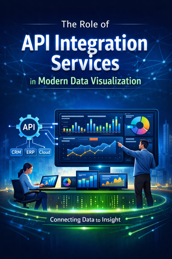
    Introduction: Why APIs Matter for Modern Power BI Analytics

    Modern organizations no longer rely on static spreadsheets or delayed reports to make decisions. Today’s analytics environments demand real-time access, scalability, and flexibility, especially when building enterprise-grade dashboards. This is where API integration services play a critical role.

    At VisualizExpert, we help businesses unlock the full potential of Power BI dashboards by integrating APIs that connect cloud platforms, CRMs, marketing tools, ERPs, and custom applications directly into a unified analytics layer. APIs allow Power BI to consume structured data dynamically, ensuring dashboards reflect the most accurate and up-to-date business performance.

    This guide explains how APIs support Power BI visualization, how to architect them correctly, and how VisualizExpert applies best-in-class business intelligence consulting practices to ensure performance, security, and decision-ready insights.


    What Is an API and How Does It Power BI?

    An API (Application Programming Interface) acts as a standardized bridge between systems. In Power BI environments, APIs enable automated data exchange without manual uploads or fragile file-based workflows.

    For example:

    • A CRM exposes customer data via an API
    • Power BI securely requests that data
    • Dashboards refresh automatically based on defined intervals

    This architecture supports real-time data dashboards, eliminates duplication, and improves reporting accuracy across teams.


    Choosing the Right API Strategy for Power BI

    Not all APIs are designed equally for analytics workloads. Choosing the right approach impacts dashboard responsiveness, scalability, and user trust.

    Common API Types Used in BI

    • REST APIs for operational and transactional data
    • GraphQL APIs for flexible, selective data retrieval
    • Secure OAuth-based APIs for enterprise authentication

    VisualizExpert evaluates API readiness as part of our analytics and reporting consulting process, ensuring the source systems can support Power BI refresh schedules and concurrency demands.


    Designing APIs for Power BI Data Modeling

    Poor API design leads to slow dashboards, broken refreshes, and inconsistent KPIs. That’s why API structure must align with Power BI modeling principles.

    Power BI Star Schema Design (H2)

    A well-designed API should support Power BI Star Schema Design, separating fact data (metrics) from dimension data (attributes). This enables:

    • Faster query performance
    • Cleaner DAX calculations
    • Scalable Power BI data modeling services

    VisualizExpert ensures APIs expose analytics-ready entities, minimizing transformations during report development.


    Structuring API Data for Performance and Accuracy

    When APIs are built for analytics use cases, they must deliver consistent data types, predictable pagination, and stable field naming.

    Key considerations include:

    • Date formatting compatible with Power BI time intelligence
    • Numeric precision for financial and KPI reporting
    • Logical aggregation levels for executive dashboards

    This foundation enables interactive business dashboards that remain performant even as data volumes grow.


    Securing APIs for Enterprise Power BI Deployments

    Security is non-negotiable when APIs power analytics environments. Power BI dashboards often surface sensitive operational and financial data.

    VisualizExpert implements:

    • Token-based authentication
    • Role-based access controls
    • Power BI Row Level Security aligned with API permissions

    This ensures that users only see data relevant to their role, whether they are executives, analysts, or operational managers.


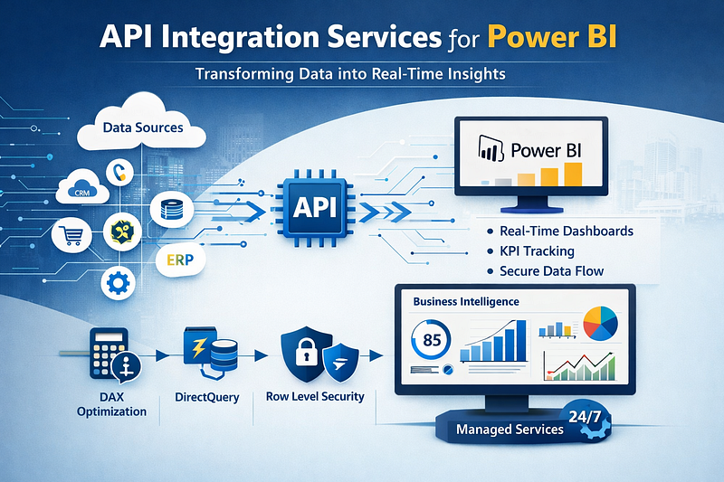
    Connecting APIs to Power BI

    Power BI supports API ingestion through:

    • Native Web connectors
    • Custom Power Query logic
    • Secure gateway configurations

    When implemented correctly, APIs enable:

    • Power BI DirectQuery performance for near real-time insights
    • Automated refresh pipelines
    • Reduced dependency on manual ETL processes

    Our Power BI integration services ensure reliable refresh cycles without throttling or data loss.


    Optimizing Power BI Dashboards with API Data

    Once API data is ingested, optimization becomes the next priority.

    DAX Formula Optimization (H2)

    API-driven models often involve high-volume datasets. DAX Formula Optimization ensures calculations remain efficient, responsive, and reusable.

    VisualizExpert applies:

    • Measure-first modeling
    • Optimized filter context handling
    • KPI-ready semantic layers

    This results in fast, reliable KPI dashboard services tailored for leadership decision-making.


    Real-World Use Cases: API-Driven Power BI Dashboards

    API integrations unlock advanced analytics across industries:

    • Executive analytics dashboards pulling live financial and operational KPIs
    • Marketing dashboards combining ad platforms, GA4, and CRM data
    • Sales performance dashboards with pipeline and conversion metrics
    • Operations dashboards monitoring real-time system health

    These solutions align directly with VisualizExpert’s data visualization services, designed for clarity, accuracy, and business impact.


    Managing and Scaling API-Powered BI Solutions

    As organizations scale, API governance becomes critical.

    VisualizExpert provides Power BI managed services that include:

    • API performance monitoring
    • Refresh failure diagnostics
    • Version control and schema change management

    This ensures long-term stability and consistent reporting across departments.


    Why VisualizExpert for API-Driven Power BI Analytics?

    VisualizExpert combines technical depth with business alignment. Our approach goes beyond dashboards — we build analytics systems that leadership trusts.

    Our expertise includes:

    • Power BI dashboard development
    • Custom Power BI consulting
    • Enterprise data visualization
    • Data analytics services for scalable growth

    We design APIs and dashboards together, ensuring insights flow seamlessly from source systems to executive decision-makers.


    Conclusion: Turning APIs Into Decision-Ready Insights

    APIs are no longer optional in modern analytics — they are foundational. When designed and integrated correctly, APIs enable Power BI to deliver real-time, scalable, and secure insights across the organization.

    With VisualizExpert’s BI dashboard solutions, businesses move beyond static reporting toward decision-ready data visualization that drives measurable outcomes.

    If your organization is ready to modernize reporting, automate data flows, and scale analytics confidently, API-powered Power BI dashboards are the next step — and VisualizExpert is the partner to make it happen.

  • The Role of API Integration Services in Modern Data Visualization


    Introduction: Why Data Visualization Depends on APIs More Than Ever

    Modern organizations don’t struggle with a lack of data.
     They struggle with connecting it, controlling it, and visualizing it in a meaningful way.

    As businesses adopt multiple platforms — CRMs, marketing tools, ERP systems, cloud databases — the need for API integration services becomes critical. APIs act as the connective layer that allows data to flow seamlessly into dashboards, analytics platforms, and executive reports.

    At Visualizexpert, we see API integration as the foundation of effective data visualization services. Without it, dashboards are delayed, incomplete, or misleading. With it, leaders get timely, accurate, and actionable insights — exactly when they need them.


    What Is an API and Why It Matters for Data Visualization

    An API (Application Programming Interface) defines how one system communicates with another. In analytics and BI, APIs enable tools like Power BI, Tableau, and Looker Studio to pull data from multiple sources in a controlled and scalable way.

    Instead of manually exporting files or relying on static reports, APIs allow:

    • Automated data refresh
    • Real-time or near–real-time updates
    • Consistent data definitions across dashboards

    This is especially important when building interactive business dashboards that decision-makers rely on daily.


    Why Businesses Use API Integration for Data Visualization

    Organizations working with Visualizexpert typically turn to API-driven analytics for four core reasons:

    1. Unified Access to Disparate Data Sources

    APIs make it possible to bring together data from:

    • CRM systems
    • Marketing platforms
    • Financial databases
    • Cloud data warehouses

    This unified access enables enterprise data visualization without forcing teams to manage fragmented datasets manually.

    2. Greater Control Over What Gets Visualized

    With APIs, data teams can filter, aggregate, and transform data before it reaches the dashboard.
     This ensures:

    • Cleaner metrics
    • Faster dashboards
    • Fewer inconsistencies across reports

    This level of control is essential for executive analytics dashboards and KPI reporting.

    3. Improved Accuracy and Trust in Reports

    When dashboards pull directly from source systems via APIs, the risk of outdated or mismatched data drops significantly.
     This builds confidence in data-driven decision making, especially for leadership teams.

    4. Performance and Scalability

    Large datasets can overwhelm BI tools if not handled correctly. APIs allow businesses to:

    • Optimize queries
    • Limit unnecessary data pulls
    • Improve dashboard performance

    This is critical for real-time data dashboards and operational reporting.


    How API Integration Services Improve BI Performance

    API Integration Services for Scalable Analytics (H2)

    At Visualizexpert, our API integration services are designed to support growth — not just reporting.

    We focus on:

    • Secure API connections
    • Optimized data pipelines
    • Scalable data models

    This ensures BI platforms like Power BI and Tableau can handle increasing data volumes without performance degradation.

    Our approach supports:

    • Power BI integration services
    • Tableau data integration
    • Cloud data warehouse integration

    The result is analytics infrastructure that grows with your business.


    API Integration in Power BI, Tableau, and Looker Studio

    Different BI tools leverage APIs in different ways:

    Power BI

    APIs enable:

    • Automated refresh schedules
    • DirectQuery optimization
    • Embedded analytics for applications

    This supports advanced use cases like Power BI dashboards, Power BI data modeling, and Power BI KPI tracking.

    Tableau

    API integration enhances:

    • Live data connections
    • Multi-source blending
    • Interactive storytelling

    This is key for Tableau dashboard services and high-impact visual narratives.

    Looker Studio

    APIs unlock:

    • Marketing and SEO dashboards
    • Real-time campaign tracking
    • Shareable stakeholder reports

    This makes Looker Studio ideal for agile, client-facing analytics.


    Two Ways to Use APIs for Data Visualization

    1. BI Tools with Built-in API Support

    Most modern BI platforms allow API connections without heavy development work. This approach is ideal when:

    • Speed matters
    • Use cases are well-defined
    • Data sources are standardized

    It’s commonly used for BI dashboard solutions and marketing analytics.

    2. Custom API and Data Pipeline Engineering

    For complex environments, custom APIs and pipelines offer full control. This approach enables:

    • Custom business logic
    • Advanced transformations
    • Enterprise-grade scalability

    Visualizexpert often applies this model for automated data pipeline engineering and large-scale analytics ecosystems.


    Best Practices for API-Driven Data Visualization

    Based on real-world projects, here are three best practices we follow:

    Use Multiple Data Sources Strategically

    APIs make it easy to combine datasets — but more isn’t always better. Focus on data that directly supports business outcomes.

    Apply Filtering and Aggregation Early

    Pre-processing data via APIs improves performance and clarity. Dashboards should answer questions, not overwhelm users.

    Balance Historical and Real-Time Data

    Not every metric needs to be real-time. APIs allow you to design dashboards that combine trend analysis with live monitoring.


    Why Visualizexpert Focuses on API-First Analytics

    At Visualizexpert, we believe dashboards are only as good as the data architecture behind them.

    Our services combine:

    • Business intelligence consulting
    • Custom analytics solutions
    • Interactive dashboard design
    • Data storytelling services

    By anchoring everything in API-driven integration, we help organizations move from static reports to decision-ready data visualization.

    We don’t just connect data — we design systems that leaders can trust.


    Conclusion: API Integration Is the Backbone of Modern BI

    Data visualization isn’t about charts.
     It’s about clarity, speed, and confidence in decisions.

    API integration services make this possible by ensuring data is accurate, timely, and scalable across BI platforms. Whether you’re building executive dashboards or operational analytics, APIs are no longer optional — they’re foundational.

    If you’re investing in analytics, investing in the right integration strategy is what separates dashboards that look good from dashboards that actually drive outcomes.

    If your dashboards need cleaner data, faster performance, and better integration, see how Visualizexpert delivers API-first data visualization solutions at https://visualizexpert.com/

  • How to Manage Charts and Pages in Looker Studio for Scalable, Role-Based Dashboards

    As analytics teams build more advanced Looker Studio reports, the challenge is no longer data availability — it’s relevance. Founders, executives, marketers, and analysts often view the same dashboard, but they don’t need the same level of detail. Without control, dashboards become cluttered, confusing, or duplicated across teams.

    This is where managing charts and pages effectively becomes critical. With recent updates, Looker Studio now supports granular visibility controls, smarter page management, and flexible report design patterns that reduce duplication and improve clarity.

    At VisualizExpert, we see this shift as a natural evolution in data analytics services — moving from static dashboards to adaptive, audience-aware reporting systems. This guide explains how to manage charts and pages in Looker Studio and why these features matter for scalable business intelligence.

    What’s Changed in Looker Studio Chart and Page Management

    Historically, teams handled different audiences by cloning reports. One version for leadership, one for clients, one for internal teams. Over time, this approach created maintenance overhead and version confusion.

    With recent updates, Looker Studio enables:

    • Chart-level control visibility
    • Page duplication and hiding
    • Role-aware dashboards using variables
    • Cleaner navigation for complex reports

    These improvements align with modern business intelligence consulting principles: one trusted dataset, one report, multiple perspectives.

    Why Visibility Control Matters More Than Design

    Dashboards fail when they try to show everything to everyone. Founders want outcomes. Teams need diagnostics. Clients expect clarity.

    Visibility controls allow teams to:

    • Hide internal calculations
    • Reduce cognitive overload
    • Keep advanced analysis accessible without overwhelming viewers

    This shift supports better data visualization services, where clarity drives decisions instead of decoration.

    How to Control Visibility for Charts and Components

    Looker Studio allows charts, text blocks, tables, and images to be conditionally displayed based on variables.

    Basic setup:

    1. Open the report in Edit mode
    2. Select a chart or component
    3. Click the three-dot menu
    4. Choose Control visibility

    You can define whether a component:

    • Is always visible
    • Is always hidden
    • Appears only when a condition is met

    This enables interactive business dashboards that adapt to the viewer without duplicating reports.

    Using Group Membership Variables (Pro Feature)

    For teams using Looker Studio Pro, group membership variables unlock identity-aware reporting.

    These variables evaluate:

    • Viewer email addresses
    • Google Group membership

    When the condition matches, the chart or page is shown.

    This is especially valuable for:

    • Agencies managing multiple clients
    • Enterprises with role-based reporting
    • Teams delivering enterprise data visualization at scale

    Instead of managing access through manual filters, visibility adapts automatically.

    Managing Pages: Duplicate, Hide, Rename, Reorder

    Chart control is only part of the experience. Page-level management shapes how users move through a report.

    Looker Studio allows you to:

    • Duplicate pages to reuse layouts
    • Rename pages for clarity
    • Reorder pages to guide narrative flow
    • Hide pages from viewers while retaining edit access

    These features support cleaner BI dashboard solutions, especially for long or multi-functional reports.

    Managing Visibility in Automated Looker Studio Dashboards

    When teams build Automated Looker Studio Dashboards, visibility management becomes essential.

    Automation removes manual updates — but without visibility rules, automation can amplify noise.

    Effective visibility management ensures:

    • Executives see KPIs, not raw tables
    • Teams access diagnostics when needed
    • Stakeholders receive clean, focused views

    This is how automation supports decision-making instead of overwhelming it.

    Practical Use Cases for Control Visibility

    1. Executive Reporting

    Executives need trends, not tables. Visibility controls allow teams to surface executive analytics dashboards without exposing underlying complexity.

    2. Multi-Team or Multi-Client Reporting

    One report can serve multiple audiences by showing only relevant sections — a core principle in scalable analytics and reporting consulting.

    3. Cleaner Marketing and Performance Reports

    Marketers can focus on outcomes while analysts retain access to deeper views, such as Looker Studio marketing analytics and performance diagnostics.

    Limitations and Governance Considerations

    Visibility controls improve UX — but they are not a replacement for security.

    Key limitations:

    • Group variables require Pro access
    • Editors can remove visibility logic if permissions allow
    • Sensitive data should still rely on proper data access controls

    This is why visibility must complement — not replace — strong KPI dashboard services and governance practices.

    Why Visibility Control Is a Strategy Decision, Not a Feature

    Visibility management reflects analytics maturity. Teams that control what users see:

    • Reduce confusion
    • Improve trust
    • Accelerate decisions

    At VisualizExpert, we view this as part of custom analytics solutions — designing dashboards that respect how decisions are actually made.

    How VisualizExpert Helps Teams Scale Looker Studio Reporting

    As a specialized Data Analytics Agency, VisualizExpert helps organizations:

    •  role-based Looker Studio reports
    • Implement visibility logic aligned with business goals
    • Build scalable reporting frameworks that reduce duplication
    • Deliver dashboards leaders actually use

    We don’t just design charts. We design systems that support data-driven decision-making.

    Final Thoughts

    Managing charts and pages in Looker Studio is no longer just a design task — it’s a strategic capability. Visibility controls, page management, and automation allow teams to move from static reporting to adaptive analytics.

    When dashboards show the right information to the right people at the right time, reporting becomes an asset instead of a burden.

    If your Looker Studio reports are growing in complexity, mastering visibility controls isn’t optional — it’s foundational.

    At VisualizExpert, we help teams build dashboards that scale with the business, not against it.

  • Why Founders Should Stop Asking for Reports and Start Asking Better Questions

    Modern founders don’t lack dashboards. They lack clarity.

    Every week, reports land in inboxes. Revenue summaries. CAC breakdowns. Funnel snapshots. Yet the most common question remains unanswered:

    “So… what should we do next?”

    This is where many data initiatives quietly fail. Not because of bad tools or missing metrics — but because founders are trained to ask for reports instead of asking better questions.

    At VisualizExpert, we see this pattern across companies investing heavily in data analytics services. Dashboards exist. Data pipelines run. But decisions still lag. The real gap isn’t visibility — it’s intent.

    This article explains why reports are no longer enough, how better questions unlock better outcomes, and how modern analytics — done right — supports founders at the moment decisions are made.

    The Hidden Problem With “Can I Get a Report?”

    A report is an output. A question is a direction.

    When founders ask for reports, they unknowingly push teams into reactive mode. Data teams scramble to pull numbers. Analysts interpret results. By the time insights surface, the context has already shifted.

    This is why many Power BI dashboards and analytics tools feel underwhelming. They weren’t designed to answer questions — they were designed to summarize activity.

    The result?

    • Lagging indicators instead of leading signals
    • Retrospective insights instead of real-time guidance
    • More explanation, less action

    The issue isn’t reporting quality. It’s the mental model behind reporting.

    Data Analytics Services Should Support Questions, Not Just Charts

    The most effective data analytics services start by reframing the conversation.

    Instead of:

    • “Can I see last month’s performance?”
    • “Can you send the CAC report?”
    • “Why don’t these numbers match?”

    High-performing founders ask:

    • “Which customer segments are scaling profitably?”
    • “Where are we overspending relative to retention?”
    • “What changed this week that could impact next quarter?”

    This shift changes everything.

    Dashboards stop being static summaries and become decision tools. Metrics align around intent. Teams move faster because they’re solving the right problems, not just delivering outputs.

    Why Reports Create Distance Between Founders and Decisions

    Traditional reporting creates a translation layer:

    Business question → analyst interpretation → data model → visualization → explanation → decision

    Each step introduces delay and ambiguity.

    Even the best business intelligence consulting can’t fully compensate if dashboards are built around reports instead of questions. Founders end up consuming information instead of engaging with insight.

    This is why many executives feel disconnected from their own data — despite having access to dozens of dashboards.

    How Executive Analytics Dashboards Change the Dynamic

    Well-designed executive analytics dashboards reverse this flow.

    Instead of asking teams for reports, founders interact directly with outcomes:

    • Growth vs profitability tradeoffs
    • Channel performance in context
    • Customer behavior over time

    These dashboards are intentionally minimal. They surface only what matters most, aligned to leadership decisions — not operational noise.

    At VisualizExpert, this is where custom Power BI consulting becomes critical. Executive dashboards require a different design philosophy than operational reports. They prioritize clarity, trust, and speed over completeness.

    Asking Better Questions Starts With the Right Data Model

    Behind every great dashboard is a solid foundation.

    Strong Power BI data modeling services ensure metrics behave consistently across views. Revenue means the same thing everywhere. CAC isn’t recalculated five different ways. Cohorts remain stable.

    This structure allows founders to explore data without fear of misinterpretation — turning dashboards into safe environments for strategic thinking.

    Without this foundation, even the most polished visuals fail to support confident decisions.

    Interactive Business Dashboards Replace Static Reporting

    Static reports answer one question once.

    Interactive business dashboards allow founders to explore why something happened — and what to do next. Filters, drill-downs, and comparisons enable curiosity without friction.

    This is where analytics shifts from consumption to collaboration.

    Founders don’t wait for explanations. They discover insights themselves.

    KPI Dashboard Services That Align With Strategy

    Most KPI dashboards track activity. Few track progress.

    Effective KPI dashboard services align metrics to strategic goals:

    • Are we growing efficiently?
    • Are customers staying longer?
    • Is revenue quality improving?

    When KPIs reflect strategy, founders naturally ask better questions — because the dashboard mirrors how they think about the business.

    Decision-Ready Data Visualization Matters More Than Volume

    More data doesn’t create better decisions. Decision-ready data visualization does.

    Clean layouts. Clear hierarchies. Contextual benchmarks.

    This is the difference between “interesting data” and actionable insight. It’s where data visualization services meet leadership psychology.

    Good dashboards reduce cognitive load. Great dashboards reduce hesitation.

    Why Power BI Managed Services Support Long-Term Clarity

    As businesses evolve, questions change.

    New markets. New pricing models. New growth levers.

    Without ongoing support, dashboards slowly drift out of alignment. Metrics lose relevance. Trust erodes.

    This is why Power BI Managed Services matter — not just for maintenance, but for continuity. Dashboards must evolve alongside strategy to remain useful.

    When Founders Stop Asking for Reports, Teams Move Faster

    When founders ask better questions:

    • Data teams focus on insight, not extraction
    • Analysts spend less time reconciling numbers
    • Leadership conversations shift from explanation to action

    This is the true ROI of analytics — not prettier dashboards, but organizational velocity.

    How VisualizExpert Approaches Founder-Level Analytics

    At VisualizExpert, we design analytics around how leaders think, not how tools work.

    As a specialized Data Analytics Agency, our approach blends:

    • Business intelligence consulting
    • Custom Power BI reports aligned to decisions
    • Scalable data models and governance
    • Executive-ready dashboards built for clarity

    We don’t start with visuals. We start with questions.

    Final Thoughts: Reports Don’t Build Companies — Decisions Do

    Founders don’t win by knowing more.

    They win by knowing what matters now.

    If your analytics still revolve around reports, the limitation isn’t your data — it’s the questions being asked.

    When dashboards are designed to answer better questions, insight becomes immediate, decisions become confident, and growth becomes intentional.

    That’s where analytics stops being a function — and starts becoming a leadership advantage.

    👉 Learn how VisualizExpert helps founders move from reporting to real decision-making

  • How API Integration Services Enable Data Visualization in Power BI Dashboards

    Modern businesses don’t struggle with a lack of data—they struggle with fragmented data. Sales lives in one system, marketing in another, finance somewhere else, and operations in spreadsheets no one fully trusts. This is where API Integration Services become the foundation of scalable analytics.

    At VisualizExpert, we see a recurring pattern: organizations invest in Power BI dashboards, but insights remain delayed or incomplete because the data pipeline feeding those dashboards is brittle or manual. APIs solve this problem by enabling systems to communicate continuously, creating a live data backbone that fuels meaningful analytics.

    This article explains how APIs enable Power BI visualization, what it takes to build them correctly, and why this approach delivers far more than faster reports.


    Why APIs Matter More Than Ever in Business Analytics

    APIs act as standardized messengers between systems. Instead of exporting files, scheduling uploads, or relying on human intervention, APIs allow platforms to exchange data automatically and securely.

    For analytics teams, this unlocks something critical: trust. When dashboards update reliably and consistently, leaders stop questioning numbers and start acting on them. This is the hidden value behind effective data analytics services—not charts, but confidence.

    As businesses scale, APIs become the only sustainable way to support advanced analytics and reporting consulting without operational drag.


    APIs as the Foundation of Power BI Dashboard Development

    A Power BI dashboard is only as good as the data model behind it. APIs allow Power BI to pull data directly from CRMs, ERPs, marketing platforms, and operational tools, eliminating manual syncs.

    When implemented correctly, APIs support:

    • Near real-time refresh cycles
    • Consistent schema definitions
    • Scalable data ingestion

    This is essential for Power BI Dashboard Development that supports daily decision-making instead of retrospective reporting.


    Defining the Objective Before Building an API

    Every effective API starts with a business question. Is the goal performance monitoring? Forecasting? Executive reporting?

    At VisualizExpert, we align API design with business intelligence consulting principles. That means defining:

    • What decisions the dashboard should enable
    • Which metrics matter most
    • How frequently data must update

    Without this clarity, APIs often become technical assets without business impact.


    Structuring APIs for Enterprise Data Visualization

    Once the objective is clear, API structure matters. Poorly structured endpoints lead to bloated models, slow dashboards, and confused users.

    Well-designed APIs support:

    • Clean fact and dimension separation
    • Scalable Power BI data modeling
    • Efficient refresh performance

    This foundation enables reliable enterprise data visualization, especially as datasets grow in size and complexity.


    Authentication, Security, and Governance

    Security is not optional. APIs must protect sensitive business data while remaining usable for analytics teams.

    Modern implementations rely on token-based authentication, role-based access, and controlled permissions. These practices align closely with Power BI integration services, ensuring only authorized data flows into dashboards.

    Strong governance builds executive trust and supports long-term analytics adoption.


    From Raw Data to Interactive Business Dashboards

    Once APIs are live, their true value appears in how data is visualized. APIs allow Power BI to surface metrics across departments in one unified view.

    This enables:

    • Cross-functional KPIs
    • Live operational monitoring
    • Consistent definitions across teams

    The result is interactive business dashboards that replace static reports and fragmented tools.


    APIs and KPI Dashboard Services

    Manual KPI tracking breaks down as businesses scale. APIs automate metric calculation and delivery, ensuring dashboards reflect reality—not outdated snapshots.

    This is why APIs are central to modern KPI dashboard services. They allow metrics to update automatically, align across teams, and support accountability at every level.


    Supporting Executive Analytics Dashboards

    Executives don’t want raw data—they want clarity. APIs enable Power BI dashboards that aggregate performance across systems without delay.

    With the right API architecture, executive analytics dashboards answer questions instantly:

    • Are we growing profitably?
    • Where are risks emerging?
    • Which channels deserve more investment?

    This is where APIs directly influence strategic outcomes.


    Why API-Driven Dashboards Outperform File-Based Reporting

    File-based reporting introduces delays, errors, and version conflicts. APIs remove these risks by creating a continuous data flow.

    This shift supports decision-ready data visualization, where insights are available when decisions are made—not weeks later.


    Power BI Managed Services and API Operations

    APIs require monitoring, maintenance, and optimization. Without ownership, integrations degrade over time.

    Through Power BI Managed Services, VisualizExpert ensures APIs remain reliable, scalable, and aligned with evolving business needs. This includes performance tuning, schema updates, and integration reviews.


    APIs Enable Advanced Power BI Reporting Solutions

    When APIs power dashboards, teams can move beyond basic charts to advanced analytics:

    • Trend detection
    • Anomaly monitoring
    • Cross-platform comparisons

    This elevates dashboards into full Power BI reporting solutions that support both tactical and strategic use cases.


    The Role of Data Visualization Services

    APIs deliver data—but visualization delivers understanding. Strong data visualization services ensure API-fed dashboards communicate insight clearly, without clutter or confusion.

    This balance between engineering and design defines analytics maturity.


    APIs as Part of a Strategic BI Roadmap

    API integration is not a one-off project. It’s a core pillar of Strategic BI Roadmap Development.

    Organizations that treat APIs as long-term assets achieve:

    • Faster analytics delivery
    • Lower operational costs
    • Higher analytics adoption

    This approach ensures dashboards evolve alongside the business.


    From Data Access to Data Driven Decision Making

    Ultimately, APIs exist to support better decisions. When systems talk seamlessly, leaders act confidently.

    This is how API-driven dashboards enable true Data Driven Decision Making—not by adding more data, but by removing friction.


    Why Founders and Leaders Should Care

    For founders, speed matters. APIs eliminate delays between activity and insight, allowing rapid course correction.

    For leaders, accuracy matters. APIs reduce manual errors and inconsistencies, strengthening trust in analytics.

    Both benefit from dashboards that are always current and reliable.


    VisualizExpert’s Approach to API-Powered Analytics

    At VisualizExpert, we design APIs with outcomes in mind. Our work blends engineering discipline with analytics strategy, ensuring dashboards support real decisions.

    As a specialized Data Analytics Agency, we help organizations connect systems, design scalable integrations, and transform raw data into insight leaders trust.


    Final Thoughts

    APIs are not just technical connectors—they are the nervous system of modern analytics. When designed intentionally, they turn Power BI dashboards into living tools for action.

    If your dashboards rely on delayed extracts or manual updates, the limitation isn’t Power BI—it’s the pipeline behind it.

    With the right API strategy, visibility becomes continuous, decisions become faster, and analytics finally delivers on its promise.

    At VisualizExpert, we help businesses build that foundation—so insights move at the speed of the business, not the reporting cycle.

  • Mirrored Line Chart vs 100% Stacked Area Chart in Looker Studio: A Decision-Ready Data Visualization Perspective


    Choosing the wrong chart rarely breaks a dashboard visually — but it often breaks decision-making. In Looker Studio dashboards, mirrored line charts and 100% stacked area charts are frequently used to show changing proportions over time. Both appear logical. Both are popular. Yet only one consistently supports decision-ready data visualization when the goal is clarity, speed, and trust.

    At VisualizExpert, we see this pattern across analytics engagements: leaders don’t question the data, but they hesitate on conclusions because visuals subtly introduce doubt. Understanding how chart structure shapes interpretation is essential for founders, executives, and analytics teams who rely on Looker Studio for strategic insight.

    This article explores when mirrored line charts help, where they fail, and why 100% stacked area charts often produce better business outcomes.


    Why Chart Choice Matters More Than Most Teams Realize

    Modern dashboards are packed with advanced features — parameters, sliders, calculated fields, and interactivity. But sophistication doesn’t guarantee understanding. The human brain processes visual signals faster than numbers, which means charts don’t just show data — they frame reality.

    This is why data visualization for decision making must prioritize perception over decoration. When a chart forces the viewer to mentally validate logic before interpreting insight, cognitive load increases. Decisions slow down. Confidence erodes.

    That tradeoff sits at the heart of the mirrored line vs stacked area debate.


    Mirrored Line Charts: Familiar, Expressive, and Risky

    Mirrored line charts show two complementary values — often shares that add up to 100% — reflected across a central axis. They are commonly used in media, trend storytelling, and public-facing analytics.

    The appeal is understandable:

    • Lines naturally represent time
    • Crossovers feel meaningful
    • Directional movement is easy to spot

    For storytelling, mirrored line charts can be effective. They highlight contrast, tension, and narrative flow. This is why they persist in marketing reports, public research, and trend analysis.

    However, in interactive business dashboards, mirrored lines introduce a subtle problem: redundancy.

    Because one line is mathematically derived from the other, experienced viewers instinctively question the transformation before trusting the message. The chart demands validation before insight — an unnecessary tax in executive contexts.


    The Hidden Cognitive Cost of Mirrored Views

    For data-literate users, mirrored charts often trigger a pause:
     “Is this truly mirrored?”
     “Are both series independent?”
     “What’s the actual baseline?”

    That pause matters.

    In leadership environments, hesitation equals friction. When dashboards are used in meetings, reviews, or performance discussions, visuals must be immediately interpretable. Any chart that redirects attention away from the insight toward its construction weakens impact.

    This is why mirrored line charts frequently underperform in executive analytics dashboards, even when the data itself is sound.


    100% Stacked Area Charts: Clarity Through Structure

    By contrast, 100% stacked area charts encode the same information using proportion and area rather than reflection. A single dividing line shows the relationship between components over time, grounded against a stable baseline.

    This structure offers three key advantages:

    1. The total is always explicit
    2. Proportions are visually intuitive
    3. Redundancy is eliminated

    Instead of asking “Is this mirrored?”, viewers immediately see how shares evolve. The chart answers the business question without requiring explanation, making it ideal for Looker Studio reports designed for decision-making.


    When 100% Stacked Area Charts Perform Better

    Stacked area charts excel when:

    • You’re tracking distribution changes over time
    • Shares must always equal a whole
    • The audience includes executives or founders
    • The chart appears in recurring reviews

    In these contexts, clarity beats convention. The area format reduces interpretation effort and supports faster insight, aligning with Business-Aligned Metrics Framework principles.

    This doesn’t make mirrored charts “wrong” — but it makes them situational.


    Adding Interactivity Without Sacrificing Understanding

    One strength of Looker Studio is the ability to let users switch views using parameters and controls. Done well, this enhances exploration. Done poorly, it adds confusion.

    At VisualizExpert, we often recommend a default 100% stacked area chart, with an optional toggle for a mirrored view. This respects advanced users without forcing validation overhead on everyone else.

    This pattern supports Interactive Dashboard Design while preserving interpretability.


    Design Choices That Separate Insight From Noise

    Beyond chart type, design discipline matters:

    • Clear color logic
    • Stable baselines
    • Minimal annotations
    • Consistent scales

    Over-styling undermines trust. Business dashboards should not require narration. This philosophy underpins our data visualization services and is especially critical in Looker Studio, where flexibility can easily lead to excess.


    Why This Matters for Founders and Executives

    Founders don’t open dashboards to admire charts. They open them to decide:

    • Should we invest more?
    • Are we gaining or losing share?
    • Is momentum real or temporary?

    Charts that slow interpretation delay action. This is why visualization choices directly affect business outcomes, especially in growth, marketing, and product analytics.

    Clear visuals support Data Driven Decision Making. Ambiguous ones quietly undermine it.


    Looker Studio Consulting With Intentional Visualization

    Effective Looker Studio consulting starts by defining the decision, not the chart. Only after the question is clear should visualization options be considered.

    Whether working with marketing data, operational metrics, or leadership reporting, VisualizExpert applies a decision-first lens. This ensures visuals reduce cognitive load rather than add to it.


    Strategic Context: Visualization as Part of the BI Roadmap

    Chart selection is not a design detail — it’s a governance decision. As organizations scale analytics, consistency matters.

    Within Strategic BI Roadmap Development, we treat visualization standards as part of platform maturity. This prevents dashboard sprawl, misinterpretation, and trust erosion over time.


    Final Thoughts: Convention Should Never Override Clarity

    Mirrored line charts have their place. They tell stories, show contrast, and feel familiar. But familiarity is not the same as effectiveness.

    When the goal is decision speed, trust, and adoption, 100% stacked area charts often provide a clearer, more honest view of change.

    In Looker Studio, the best dashboards don’t impress — they inform.

    If your charts require explanation, the design — not the data — needs attention. At VisualizExpert, we help teams replace visual ambiguity with confidence, ensuring analytics supports decisions instead of distracting from them.

    Because in business, clarity is not a nice-to-have — it’s the competitive edge.

  • How to Build an AI-Ready Analytics Strategy for 2026

    In 2026, expectations for AI and analytics are rising faster than tolerance for wasted effort. Organizations are no longer impressed by modern dashboards, AI pilots, or advanced platforms unless those investments translate into real decisions and measurable outcomes. This is why Strategic BI Roadmap Development has become a critical leadership capability — not a documentation exercise.

    At VisualizExpert, we see a clear pattern across industries: data initiatives fail not because of missing tools, but because teams invest without a clear sequence, shared meaning, or adoption strategy. As AI accelerates delivery timelines, the cost of misalignment only grows. What leaders get right in 2026 will come down to focus — where to invest, what to standardize, what to operationalize, and what to stop building altogether.


    Why Adoption Is the Defining Challenge of 2026

    Across analytics, BI, AI, and data platforms, one theme consistently separates success from failure: organizational adoption.

    Dashboards that go unused, metrics that spark debate instead of decisions, and AI outputs that no one trusts are symptoms of the same root problem — analytics disconnected from how the business actually operates.

    Modern BI environments now include:

    • Self-service analytics
    • AI-assisted querying
    • Real-time dashboards
    • Embedded analytics in business workflows

    Yet adoption still breaks down when users don’t trust the numbers or understand how insights connect to decisions. VisualizExpert helps organizations address this gap by aligning analytics delivery with business intent — before tools, platforms, or automation.


    Strategic BI Roadmap Development: The Foundation for AI-Ready Analytics

    A BI roadmap in 2026 must do more than list initiatives. It must act as a decision framework that aligns analytics, AI, engineering, and governance around shared outcomes.

    A strong roadmap:

    • Anchors analytics investments to business priorities
    • Sequences foundational work before automation and AI
    • Makes trade-offs explicit when priorities compete
    • Aligns stakeholders on what “success” actually means

    Without this structure, AI accelerates confusion instead of clarity.

    This is where Strategic BI Roadmap Development becomes essential — ensuring analytics maturity grows in a way the organization can trust, govern, and adopt.


    Priority 1: Standardize Meaning Before Scaling Analytics and AI

    The fastest way to kill analytics adoption is inconsistent definitions.

    Revenue, margin, customer, conversion, and performance metrics often mean different things across departments. When leaders see conflicting numbers, trust erodes — and dashboards are abandoned.

    AI does not solve this problem. It amplifies it.

    AI-powered analytics can surface insights faster, but they rely entirely on the logic beneath them. Without standardized KPIs and governed semantic layers, AI accelerates disagreement rather than alignment.

    VisualizExpert helps organizations:

    • Identify KPI inconsistencies across teams
    • Consolidate logic into shared data models
    • Design executive and operational dashboards that reflect one version of truth

    Standardized meaning is the prerequisite for scalable analytics, self-service BI, and AI-driven insights.


    Priority 2: Treat Governance as a Control Layer, Not Documentation

    In 2026, governance is no longer about policies sitting in folders. It is the mechanism that makes analytics and AI explainable, controllable, and trustworthy.

    As AI systems influence decisions, leaders must be able to answer:

    • Where did this data come from?
    • What does this metric actually represent?
    • Who owns this logic?
    • Where is AI allowed to act — and where is it not?

    Governance must be operationalized directly into dashboards, data models, and reporting workflows. VisualizExpert embeds governance into BI environments through:

    • Unified reporting data models
    • Controlled access via row-level security
    • Clear metric ownership and documentation
    • Executive-ready dashboards designed for accountability

    Governance is not a brake on innovation. It is what allows analytics and AI to scale safely.


    Priority 3: Get Data Engineering Fundamentals Right Before AI

    AI raises the bar for data quality and discipline.

    Poor data is easy to spot in a dashboard. It is far harder to detect once it feeds AI systems. Errors compound silently, degrading trust and outcomes over time.

    Before scaling AI, organizations must get the fundamentals right:

    • Reliable data ingestion
    • Clean, well-modeled data
    • Atomic-level traceability
    • Scalable, governed pipelines

    VisualizExpert’s work across Power BI, Tableau, Looker Studio, and cloud data platforms reinforces a simple truth: proven modeling approaches and clean architecture are not outdated — they are what make AI usable.

    AI accelerates what already exists. It does not fix weak foundations.


    Priority 4: Align Data Teams to Business Decisions, Not Outputs

    In 2026, analytics teams will not be judged by how much they deliver — but by how effectively they influence decisions.

    Many organizations still measure success by:

    • Number of dashboards built
    • Speed of delivery
    • Volume of reports

    These metrics say nothing about impact.

    High-performing organizations align data work to:

    • Specific business decisions
    • Clear success metrics
    • Operational workflows

    VisualizExpert helps bridge the gap between insight and action by designing dashboards that are:

    • Decision-oriented, not exploratory by default
    • Embedded into leadership and operational reviews
    • Aligned with business KPIs and performance management

    When analytics is built around decisions, adoption becomes a natural outcome.


    Priority 5: Build Only What the Organization Can Govern and Adopt

    More technology does not equal more value.

    In 2026, successful organizations will resist overbuilding platforms they cannot govern, maintain, or explain. Novelty fades quickly when adoption stalls.

    Modern BI and analytics environments must be:

    • Governable at scale
    • Understandable to business users
    • Flexible enough to evolve without chaos

    VisualizExpert advises clients to prioritize readiness over novelty — building platforms and dashboards designed for long-term adoption, not short-term experimentation.


    Priority 6: Make AI Useful Through Iterative, Bounded Execution

    Most organizations use AI to summarize, explain, or recommend. Real ROI comes when AI helps teams do the work — within clear guardrails.

    Leaders must:

    • Start with targeted, low-risk use cases
    • Define where AI can act and where it cannot
    • Ensure auditability and recovery paths
    • Iterate quickly based on real usage

    AI value compounds through iteration, not grand launches. VisualizExpert supports this approach by integrating analytics, automation, and reporting into existing workflows — rather than creating isolated AI experiences.


    Priority 7: Strengthen Delivery Discipline as AI Speeds Everything Up

    AI compresses timelines, but it does not eliminate the need for planning.

    Faster delivery increases the risk of misalignment if goals are unclear. Many analytics initiatives fail quietly — delivered on time, but never adopted.

    Strong delivery discipline ensures:

    • Every initiative ties back to a business problem
    • Success is defined before work begins
    • Adoption is measured, not assumed

    VisualizExpert emphasizes repeatable delivery frameworks that keep analytics grounded in outcomes, even as AI accelerates execution.


    What This Means for Data Leaders in 2026

    The organizations that succeed in 2026 will:

    • Standardize meaning before automation
    • Treat governance as an operational layer
    • Invest in strong data foundation
    • Align analytics to decisions, not outputs
    • Build platforms designed for adoption
    • Use AI iteratively and responsibly
    • Reinforce delivery discipline

    At the center of all of this is clarity — and that clarity comes from a well-defined BI roadmap.


    Why VisualizExpert

    VisualizExpert helps organizations move from fragmented analytics to decision-ready BI through:

    • Business-aligned dashboard design
    • Executive and operational analytics
    • Power BI, Tableau, and Looker Studio expertise
    • KPI strategy and data modeling
    • Analytics adoption and roadmap consulting

    We don’t just build dashboards. We help organizations make analytics stick.

    Ready to Build an Analytics Strategy That Actually Gets Adopted?

    If your organization is investing in AI and analytics but struggling with trust, adoption, or ROI, it’s time to rethink the roadmap.

    VisualizExpert helps data leaders design BI strategies that align people, platforms, and decisions — so analytics delivers value in 2026 and beyond. 

  • How to Build a Scalable Data Strategy That Turns Analytics Into Action


    How to Build a Scalable Data Strategy That Turns Analytics Into Action

    Introduction: Why Most Data Strategies Still Fail to Drive Action

    Organizations are investing heavily in data, dashboards, and analytics platforms. Yet many leadership teams still struggle to turn insights into consistent decisions. Reports exist. Dashboards look impressive. But adoption remains uneven, and business impact is often unclear.

    This gap exists because scalability is not about tools alone. A scalable data strategy connects people, metrics, and technology in a way that grows with the business. At VisualizExpert, we work with teams across industries to design analytics strategy services that go beyond reporting and enable confident, repeatable decision-making.

    This guide outlines a practical framework for building a data strategy that scales, adapts, and actually gets used.


    Start With Business Decisions, Not Dashboards

    The most common mistake organizations make is starting with visualizations instead of decisions. A scalable data strategy begins by identifying the questions leaders must answer regularly.

    Examples include:

    • How efficiently are we acquiring customers?
    • Which channels are driving profitable growth?
    • Where are operational bottlenecks emerging?

    By grounding analytics in decision workflows, companies avoid vanity metrics and focus on business-aligned metrics frameworks that matter across teams. This approach ensures dashboards evolve with strategy, not the other way around.

    At VisualizExpert, we often begin engagements with KPI strategy consulting to define success metrics before selecting tools or building reports.


    Design a Unified Reporting Data Model Early

    Scalability breaks down quickly when every team defines metrics differently. Marketing, sales, and finance may all report “revenue” or “users” differently, eroding trust.

    A unified reporting data model creates a shared foundation:

    • Common definitions for core KPIs
    • Consistent date logic and attribution rules
    • Centralized transformations for reuse

    This model becomes the backbone for Power BI data modeling, Tableau dashboard services, and Looker Studio marketing reports, ensuring insights remain consistent as usage grows.


    Choose Platforms Based on Use Cases, Not Trends

    No single BI tool solves every problem. A scalable strategy acknowledges that different teams have different needs.

    • Power BI dashboards are ideal for operational reporting, finance, and executive scorecards
    • Tableau visual analytics excels in exploratory analysis and storytelling
    • GA4 analytics dashboards and Looker Studio support agile marketing and performance tracking

    The key is integration, not standardization at all costs. VisualizExpert helps organizations design BI dashboard solutions that allow tools to coexist while maintaining governance and consistency.


    Build Executive Trust With Decision-Ready Dashboards

    Executives do not want more charts. They want clarity.

    Scalable analytics focuses on:

    • Executive analytics dashboards with clear context
    • Fewer metrics, stronger narratives
    • Consistent refresh cycles and definitions

    An executive summary dashboard should answer “What changed?” and “What should we do next?” in seconds. This is where data storytelling services play a critical role, transforming analytics into leadership conversations rather than technical reviews.


    Automate Data Pipelines to Reduce Manual Risk

    Manual data preparation does not scale. As volume and complexity increase, so does the risk of errors and delays.

    Modern strategies rely on:

    • Automated data pipeline engineering
    • Reliable ETL and ELT consulting
    • API-based ingestion for marketing, CRM, and finance data

    Automation ensures analytics teams spend less time fixing data and more time improving insights. It also supports real-time data dashboards where speed matters.


    Optimize Performance as Data Grows

    As dashboards expand, performance issues often emerge. Slow reports quickly undermine trust and adoption.

    Scalable strategies include:

    • Efficient data models
    • Aggregation strategies
    • Optimization for Power BI DirectQuery performance

    Whether using embedded analytics or enterprise deployments, performance planning must be proactive, not reactive.


    Govern Access Without Blocking Adoption

    Security and accessibility must scale together. Too little governance creates risk; too much creates friction.

    Effective strategies implement:

    • Power BI Row Level Security for controlled access
    • Role-based permissions aligned with job functions
    • Clear ownership of metrics and dashboards

    This balance supports enterprise needs while still enabling interactive business dashboards across teams.


    Align Analytics With Growth and Change

    A scalable data strategy anticipates change:

    • New markets
    • New channels
    • New products

    That means designing dashboards and models that adapt without constant rework. VisualizExpert focuses on analytics and reporting consulting that supports long-term evolution, not one-off projects.


    Measure Adoption, Not Just Accuracy

    Perfect data that no one uses delivers zero value.

    Organizations should track:

    • Dashboard usage trends
    • Decision latency improvements
    • Reduction in ad-hoc reporting requests

    These signals indicate whether analytics is becoming part of daily operations. Adoption metrics are as important as data quality metrics.


    Build Internal Capability Alongside Technology

    Tools do not create data-driven cultures. People do.

    Scalable strategies invest in:

    • Analytics training and support
    • Clear documentation
    • Shared data language across teams

    This ensures analytics remains sustainable as teams grow and roles change.


    Summary: Turning Investment Into Impact

    With nearly 90% of executives increasing analytics investment, the differentiator is no longer access to data, but how effectively it is used.

    A scalable data strategy:

    • Anchors analytics to decisions
    • Standardizes metrics without stifling flexibility
    • Automates pipelines and optimizes performance
    • Builds trust through clarity, not complexity

    At VisualizExpert, we design data analytics services that help organizations move from reports to results. Our focus is not just on building dashboards, but on enabling confident, repeatable, decision-making at scale.

    If your analytics investment isn’t delivering action, it’s time to rethink the strategy behind it.

    👉 Talk to a VisualizExpert analytics consultant and build a data strategy that scales with your business.

  • Monitor Tableau Cloud Deployments of Any Size with the Platform Data API for Enterprise Tableau Solutions

    In modern analytics environments, visibility is everything. As organizations scale their Tableau Cloud usage from a handful of users to thousands across regions and business units, governance and performance can quickly become challenging. At VisualizExpert, we help organizations design enterprise Tableau solutions that remain secure, performant, and business-aligned even as adoption accelerates. The introduction of the Tableau Cloud Platform Data API marks a pivotal shift in how administrators and analytics leaders can monitor, govern, and optimize Tableau deployments at scale.

    This article explores why observability matters, what the Platform Data API enables, and how organizations can turn raw platform telemetry into strategic insight and operational control.

    The reality of scaling Tableau Cloud deployments

    Tableau has always excelled at democratizing analytics. Teams can publish dashboards quickly, connect to diverse data sources, and empower business users with self-service insights. But success brings complexity.

    As Tableau Cloud adoption grows, administrators begin to face familiar pain points:

    • Rapid growth in workbooks, data sources, and extracts
    • Increasingly complex permission models across sites and groups
    • Performance variability due to extract schedules, query patterns, and usage spikes
    • Compliance and audit requirements that demand traceability
    • Limited time and tooling to manually monitor platform activity

    In small deployments, these issues are manageable through built-in admin views and hands-on support. At enterprise scale, however, manual approaches break down. What’s needed is continuous, data-driven observability.

    Why observability is critical for modern analytics platforms

    Observability goes beyond basic monitoring. It answers not only what is broken, but what is happening, why it is happening, and what should be done next.

    For Tableau Cloud administrators, true observability supports three foundational responsibilities:

    1. Security and compliance
      Detect unusual access patterns, permission changes, or administrative actions that could indicate risk or non-compliance.
    2. Operational reliability and performance
      Monitor extract refresh behavior, background tasks, and usage trends to proactively address failures or bottlenecks.
    3. Business value optimization
      Understand which dashboards are actually used, which content is stale, and where investment in analytics delivers real impact.

    Historically, gaining this level of insight required stitching together partial data sources or relying on external tools with limited coverage. The Platform Data API changes that equation.

    What the Tableau Cloud Platform Data API delivers

    The Platform Data API introduces a centralized, pull-based mechanism to access event log data across an entire Tableau Cloud deployment. Instead of relying on isolated views or vendor-specific push integrations, organizations can retrieve detailed, structured event data and analyze it in the tools of their choice.

    Key capabilities include:

    • Comprehensive event coverage
      Track logins, administrative actions, permission changes, content updates, and extract refresh activity, including Bridge-managed refreshes.
    • Unified, deployment-wide visibility
      Access data across sites and environments through consistent API endpoints.
    • Platform-agnostic integration
      Pull data into data warehouses, SIEM platforms, or custom analytics pipelines without being locked into a specific ecosystem.
    • Scalable retention and freshness
      Near real-time data and extended retention windows are available for organizations with advanced monitoring and resiliency needs.

    For the first time, Tableau Cloud customers of all editions can access the same foundational observability data, leveling the playing field for governance and operational excellence.

    Turning raw events into actionable intelligence

    While the Platform Data API provides the data, value is realized only when that data is transformed into insight. This is where analytics architecture and visualization expertise matter.

    Organizations commonly use Platform Data API outputs to:

    • Build security and audit dashboards highlighting sensitive actions
    • Analyze usage trends by department, geography, or role
    • Identify underutilized or redundant dashboards
    • Monitor extract reliability and refresh performance
    • Feed alerts and automation workflows for proactive issue resolution

    By integrating platform telemetry with business context, analytics leaders can move from reactive firefighting to strategic platform stewardship.

    Enterprise Tableau solutions powered by platform observability

    How enterprise Tableau solutions benefit from the Platform Data API

    For large organizations, the Platform Data API is more than a technical enhancement. It becomes a cornerstone of scalable analytics governance.

    Well-designed enterprise Tableau solutions use this data to establish:

    • Standardized governance frameworks
      Clear policies for content lifecycle management, access control, and certification, backed by measurable data.
    • Performance accountability
      Objective metrics for refresh reliability, dashboard response times, and system usage patterns.
    • Data-driven enablement
      Insights that inform training, content optimization, and adoption strategies based on real user behavior.
    • Automation and resilience
      Event-driven workflows that reduce manual admin effort and improve platform uptime.

    At VisualizExpert, we see the Platform Data API as an accelerator for mature analytics operating models, enabling organizations to manage Tableau Cloud as a strategic enterprise platform rather than a collection of dashboards.

    What’s next: the future of Tableau Cloud observability

    The Platform Data API is the foundation for a broader observability roadmap.

    Two upcoming advancements are particularly impactful:

    • Entity snapshots
      Event data explains what happened, but snapshots reveal the current state. With snapshots of users, workbooks, data sources, and groups, organizations can answer questions about inactivity, ownership gaps, and content sprawl.
    • Accelerated admin insights
      By re-architecting admin analytics on top of this new data pipeline, Tableau is paving the way for faster refresh cycles and more timely operational insights

    Together, these capabilities point toward a future where analytics platforms are managed with the same rigor and transparency as core enterprise systems.

    How VisualizExpert helps organizations get value faster

    Access to observability data is only the first step. Many teams struggle with designing the right metrics, building scalable data models, and presenting insights that drive action.

    VisualizExpert supports organizations by:

    • Designing analytics-ready schemas for platform telemetry
    • Building executive-ready dashboards for governance and performance monitoring
    • Aligning Tableau platform metrics with business and risk objectives
    • Enabling automation and alerting based on event patterns
    • Establishing long-term analytics governance frameworks

    Our approach blends deep platform expertise with business-focused analytics design, ensuring that observability translates into measurable outcomes.

    Conclusion: from visibility to control

    As Tableau Cloud deployments grow, the cost of poor visibility increases. Without observability, platforms drift toward inefficiency, risk, and declining trust. The Tableau Cloud Platform Data API represents a major step forward in giving organizations the insight they need to lead their analytics environments with confidence.

    By combining this new level of platform telemetry with thoughtful analytics design and governance, organizations can unlock the full potential of Tableau at scale. With the right strategy, tools, and partners, observability becomes not just a monitoring function, but a driver of sustained analytics value.

    If you are managing a growing Tableau Cloud environment and need visibility, control, and governance at scale,
     VisualizExpert can help you turn platform data into actionable insights.
     👉 Talk to a Tableau Consulting Expert

  • How to Fix Data Discrepancies in GA4 Looker Studio Dashboards


    Introduction: Why GA4 and Looker Studio Rarely Match Perfectly

    If you’ve ever built GA4 Looker Studio dashboards, you’ve likely faced the uncomfortable moment when numbers don’t align with what stakeholders see in Google Analytics 4. While exact matches across analytics tools aren’t always achievable, understanding why discrepancies occur — and how to manage them — helps set realistic expectations and build trust.

    At VisualizExpert, we frequently work with marketing teams, analysts, and executives who rely on dashboards for decision-making. This guide explains the most common causes of GA4 and Looker Studio data differences and provides practical solutions you can confidently share with clients and internal teams.


    Verify Data Before Building Dashboards

    Before opening Looker Studio, always validate critical metrics directly in GA4. This simple step prevents wasted effort and avoids painful rework after a dashboard is already live.

    User-based metrics are especially sensitive to discrepancies. Validating them upfront helps ensure your GA4 Looker Studio dashboards are grounded in accurate expectations rather than assumed parity.

    Best practice:
     Document baseline GA4 numbers (date range, filters, and attribution settings) before building any visualizations.


    Metrics Most Prone to Discrepancies

    Not all metrics behave the same across tools. The following are the most common sources of variance:

    User-Related Metrics

    • Active users (1-day, 7-day, 28-day)
    • Stickiness metrics (DAU/WAU, DAU/MAU, WAU/MAU)

    These metrics rely on probabilistic models and identity resolution, making them more volatile — especially on high-traffic properties.

    Session and View Metrics

    Session counts, page views, and event totals generally align more closely, but minor differences can still occur due to processing delays or filters.

    Understanding which metrics are “estimate-heavy” helps explain why GA4 Looker Studio dashboards may never perfectly mirror the GA4 UI.


    GA4 Data Source in Looker Studio: Standard Reports vs Explorations

    GA4 Looker Studio Dashboards and Data Origins

    A common misconception is that Looker Studio pulls data from GA4 Explorations. In reality, the GA4 connector uses standard GA4 reports, including custom dimensions and metrics.

    This distinction matters because:

    • Explorations use different aggregation logic
    • Processing times vary
    • User de-duplication behaves differently

    When presenting GA4 Looker Studio dashboards, it’s essential to clarify this to stakeholders. Doing so reduces confusion when numbers differ between Explorations and dashboards.


    Looker Studio Sampling: Why It Happens and How to Manage It

    Sampling exists to improve performance on large datasets. GA4 applies sampling under certain conditions, and Looker Studio inherits that sampling automatically.

    Unlike GA4, Looker Studio does not display a sampling warning. This often leads teams to assume something is “wrong” with their dashboards.

    Key Things to Remember

    • Sampling only happens once (no double sampling)
    • The sampling rate is controlled by GA4
    • Looker Studio simply reflects the API output

    How to Reduce Sampling Impact

    • Avoid including “today” in reports
    • Use consistent date ranges across tools
    • Break large queries into smaller time windows

    These steps improve confidence in GA4 Looker Studio dashboards, even when sampling is unavoidable.


    Understanding Estimation and Calculation Methods in GA4

    GA4 uses advanced estimation techniques such as HyperLogLog++ (HLL++) to count users efficiently. This approach dramatically improves performance but introduces small margins of error.

    Metrics like:

    • Active users
    • Sessions

    are approximations, not raw counts.

    Because GA4 Looker Studio dashboards connect through the GA4 Data API, they inherit these estimates. Small discrepancies are expected — and normal.


    Avoiding Misleading Metrics in Data Blending

    Data blending is one of the most common sources of inflated or misleading metrics in Looker Studio.

    When blending GA4 data with external sources:

    • Users may be double-counted
    • Aggregations can behave unexpectedly
    • Filters may not apply evenly

    Recommended Approach

    Instead of blending:

    • Keep GA4 as a primary data source
    • Add contextual data (annotations, notes) separately
    • Sync date ranges using controls

    At VisualizExpert, we often advise performing joins outside Looker Studio and then importing clean datasets to maintain trustworthy GA4 Looker Studio dashboards.


    GA4 Exploration Data Downloads: Why Numbers Change

    When you download GA4 Exploration data and upload it into Looker Studio, you may notice totals no longer match the GA4 interface.

    This happens because:

    • GA4 Explorations show modeled totals
    • Downloaded data reflects row-level values
    • Looker Studio aggregates raw rows using SUM logic

    As a result, dashboards match the downloaded file — not the Exploration UI.

    This distinction is critical when building historical GA4 Looker Studio dashboards for reporting or audits.


    GA4 Exploration Data and Aggregation in Looker Studio

    Here’s a real-world scenario we often see:

    • GA4 Exploration shows: 15,602 users
    • Looker Studio shows: 20,251 users
    • Manual SUM() in Sheets: 20,251 users

    The dashboard is correct — but it’s correct based on the downloaded structure, not GA4’s modeled view.

    Understanding this nuance helps avoid false alarm discussions around GA4 Looker Studio dashboards.


    Why GA4 Exploration Data Changes Over Time

    GA4 data is not static. Even if you don’t modify a report, numbers may change days later due to:

    • Delayed event processing
    • Modeled key events updated post-hoc
    • Backend GA4 recalculations

    When aggregated externally, even small GA4 adjustments can compound into visible changes in GA4 Looker Studio dashboards.


    How to Explain Discrepancies to Clients and Executives

    Clear communication is just as important as technical accuracy.

    What to Say

    • GA4 uses estimation models
    • Looker Studio reflects API outputs
    • Small variances are expected and acceptable
    • Trends matter more than absolute precision

    This framing reinforces trust and positions dashboards as decision-support tools, not forensic accounting systems.


    Summary: Building Trustworthy GA4 Looker Studio Dashboards

    Data discrepancies between GA4 and Looker Studio are not bugs — they’re a byproduct of modern analytics systems designed for scale and speed.

    By understanding:

    • Sampling behavior
    • Estimation logic
    • Aggregation differences
    • Data blending risks

    you can confidently build GA4 Looker Studio dashboards that stakeholders trust and use.

    At VisualizExpert, we specialize in designing dashboards that balance accuracy, performance, and clarity — so decision-makers focus on insights, not inconsistencies.

    Stop guessing why your GA4 and Looker Studio data don’t match.
     Get expert guidance, proven frameworks, and decision-ready dashboards built by analytics specialists.
     👉 Talk to a GA4 & Looker Studio Expert